Matplotlibis a widely used data visualization library in Python that provides powerful tools for creating a variety of plots. One of the most useful features of Matplotlib is its ability to create multiple subplots within a single figure using the plt.subplots() method. This allows users to display multiple related visualizations side by side, making data analysis more insightful and effective.
What are subplots in matplotlib?
Subplots in Matplotlib refer to multiple plots arranged within a single figure. Thematplotlib.pyplot.subplots()method provides an easy way to create a figure with multiple plots. Given the number of rows and columns, it returns a tuple (fig, ax), wherefig is the entire figure object andax is an array of axes objects representing individual subplots.
Creating subplots using plt.subplots()
Below are different ways to create subplots in Matplotlib along with examples demonstrating their usage.
1. Creating a grid of subplots
The following example creates a 3x3 grid of subplots, iterating over them to plot random lines.
Pythonimportmatplotlib.pyplotaspltimportnumpyasnp# Creating subplotsfig,ax=plt.subplots(3,3)# Plot random data in each subplotforrowinax:forcolinrow:col.plot(np.random.randint(0,5,5),np.random.randint(0,5,5))plt.show()
Output
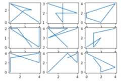
Explanation: This code creates a 3×3 grid of subplots using Matplotlib. It then iterates over each subplot and plots random integer data usingNumPy. Each subplot receives a unique set of random values, generating different plots within the grid.
2. Creating Subplots for Different Mathematical Functions
The following example creates a 2x2 grid and plots the sine, cosine, tangent, and sinc functions with different line styles and colors.
Pythonimportmatplotlib.pyplotaspltimportnumpyasnp# Creating subplotsfig,ax=plt.subplots(2,2)# Generating datax=np.linspace(0,10,1000)# Plot functions with different stylesax[0,0].plot(x,np.sin(x),'r-.',label='sin(x)')ax[0,1].plot(x,np.cos(x),'g--',label='cos(x)')ax[1,0].plot(x,np.tan(x),'y-',label='tan(x)')ax[1,1].plot(x,np.sinc(x),'c.-',label='sinc(x)')# Adding legends and showing the figureforaxesinax.flat:axes.legend()plt.tight_layout()plt.show()
Output

Explanation:This code creates a 2×2 grid of subplots using Matplotliband plots different mathematical functions (sin, cos, tan, and sinc) with distinct line styles. It generates xvalues using NumPy and assigns each function to a specific subplot.
3. Line plots in subplots
This example generates sine, cosine, and tangent functions and plots them in separate subplots.
Pythonimportmatplotlib.pyplotaspltimportnumpyasnp# Generate random data for subplotsx=np.linspace(0,10,100)y1=np.sin(x)y2=np.cos(x)y3=np.tan(x)# Create subplots with line plotsfig,axes=plt.subplots(nrows=1,ncols=3,figsize=(12,4))axes[0].plot(x,y1,color='blue',label='sin(x)')axes[1].plot(x,y2,color='green',label='cos(x)')axes[2].plot(x,y3,color='orange',label='tan(x)')# Add titles and legendsaxes[0].set_title('Sine Function')axes[1].set_title('Cosine Function')axes[2].set_title('Tangent Function')foraxinaxes:ax.legend()# Adjust layout for better spacingplt.tight_layout()# Display the figureplt.show()Output:

Explanation:This code creates a single-row, three-column subplot layout using Matplotlib, plotting sin(x), cos(x) and tan(x) with distinct colors. Titles and legends are added for clarity and plt.tight_layout() ensures proper spacing before displaying the figure.
4. Bar plots in subplots
This example creates a DataFrame and generates three bar charts to visualize categorical data.
Pythonimportmatplotlib.pyplotaspltimportpandasaspd# Create a DataFrame with random categorical datadata={'Category':['A','B','C','D'],'Value1':np.random.randint(1,10,4),'Value2':np.random.randint(1,10,4),'Value3':np.random.randint(1,10,4)}df=pd.DataFrame(data)# Create subplots with bar plotsfig,axes=plt.subplots(nrows=1,ncols=3,figsize=(12,4))df.plot(kind='bar',x='Category',y='Value1',color='skyblue',ax=axes[0])df.plot(kind='bar',x='Category',y='Value2',color='lightgreen',ax=axes[1])df.plot(kind='bar',x='Category',y='Value3',color='coral',ax=axes[2])# Add titlesaxes[0].set_title('Value1 Distribution')axes[1].set_title('Value2 Distribution')axes[2].set_title('Value3 Distribution')# Adjust layout for better spacingplt.tight_layout()# Display the figureplt.show()Output:

Explanation: This code creates aDataFramewith random categorical data and a 1×3 subplot layout, plotting bar charts for Value1, Value2 and Value3 with distinct colors, adding titles and adjusting spacing for clarity.
5. Pie charts in subplots
The following example generates three pie charts in subplots.
Pythonimportmatplotlib.pyplotasplt# Generate random data for subplotslabels=['Category 1','Category 2','Category 3']sizes1=np.random.randint(1,10,3)sizes2=np.random.randint(1,10,3)sizes3=np.random.randint(1,10,3)# Create subplots with pie chartsfig,axes=plt.subplots(nrows=1,ncols=3,figsize=(12,4))axes[0].pie(sizes1,labels=labels,autopct='%1.1f%%',colors=['lightcoral','lightblue','lightgreen'])axes[1].pie(sizes2,labels=labels,autopct='%1.1f%%',colors=['gold','lightseagreen','lightpink'])axes[2].pie(sizes3,labels=labels,autopct='%1.1f%%',colors=['lightskyblue','lightgreen','lightcoral'])# Add titlesaxes[0].set_title('Pie Chart 1')axes[1].set_title('Pie Chart 2')axes[2].set_title('Pie Chart 3')# Adjust layout for better spacingplt.tight_layout()# Display the figureplt.show()Output:

Explanation: This code creates a 1×3 subplot layout using Matplotlib, generating three pie charts with random category sizes and distinct colors. Titles are added for clarity andplt.tight_layout()ensures proper spacing before displaying the figure.
6. Customizing Subplots using gridspec
This example demonstrates creating a custom subplot layout using GridSpec in Matplotlib. It arranges four subplots in a non-standard grid, displaying a line plot, scatter plot, bar plot and pie chart.
Pythonimportmatplotlib.pyplotaspltimportmatplotlib.gridspecasgridspecimportnumpyasnp# Creating a custom layout with different subplot sizesfig=plt.figure(figsize=(12,6))# Using gridspec to define the layoutgs=gridspec.GridSpec(2,3,width_ratios=[1,2,1],height_ratios=[2,1])# Creating subplots based on the layoutax1=plt.subplot(gs[0,0])ax2=plt.subplot(gs[0,1])ax3=plt.subplot(gs[0,2])ax4=plt.subplot(gs[1,:])# Customizing each subplot with different visualizations# Subplot 1: Line Plotx=np.linspace(0,10,100)y1=np.sin(x)ax1.plot(x,y1,color='blue')ax1.set_title('Line Plot - Sine Function')# Subplot 2: Scatter Plotx=np.random.rand(30)y2=3*x+np.random.randn(30)ax2.scatter(x,y2,color='green')ax2.set_title('Scatter Plot')# Subplot 3: Bar Plotcategories=['A','B','C','D']values=np.random.randint(1,10,4)ax3.bar(categories,values,color='orange')ax3.set_title('Bar Plot')# Subplot 4: Pie Chartlabels=['Category 1','Category 2','Category 3']sizes=np.random.randint(1,10,3)ax4.pie(sizes,labels=labels,autopct='%1.1f%%',colors=['lightcoral','lightblue','lightgreen'])ax4.set_title('Pie Chart')# Adjusting layout for better spacingplt.tight_layout()# Displaying the figureplt.show()Output:
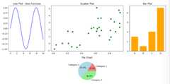
Explanation: This code uses GridSpecto create a custom 2×3 subplot layout with varying sizes. It plots a sine wave (line plot), a scatter plot, a bar chart and a pie chart in separate subplots. Titles are added for clarity and plt.tight_layout() ensures proper spacing before displaying the figure.
Explore
Python Fundamentals
Python Data Structures
Advanced Python
Data Science with Python
Web Development with Python
Python Practice