
State of CSS 2022
Web styling features of today and tomorrow, as seen at Google IO 2022, plus some extras.

The year 2022 is set to be one of CSS's greatest years, in both features andcooperative browser feature releases, with a collaborative goal to implement 14features!
Note: Watch the talkThe State of CSS from Google I/O '22:Overview
This post is the article form ofthe talk given at Google IO 2022. It's notmeant to be an in-depth guide on each feature, rather an introduction and briefoverview to pique your interest, providing breadth instead of depth. If yourinterest is piqued, check the end of a section for resource links to more information.
Table of contents
Use the list below to jump to topics of interest:
Browser compatibility
A primary reason so many CSS features are set to cooperatively release is due tothe efforts ofInterop 2022. Before studyingthe Interop efforts, it's important to look atCompat2021’s efforts.
Compat 2021
The goals for 2021, driven by developer feedback via surveys, were to stabilizecurrent features, improve the test suite and increase passing scores of browsersfor five features:
stickypositioningaspect-ratiosizingflexlayoutgridlayouttransformpositioning and animation
Test scores were raised across the board, demonstrating upgraded stability andreliability. Big congratulations to the teams here!
Interop 2022
This year, browsers met together to discuss the features and priorities theyintended to work on, uniting their efforts. They planned to deliver thefollowing web features for developers:
@layer- Color spaces and functions
- Containment
<dialog>- Form compatibility
- Scrolling
- Subgrid
- Typography
- Viewport units
- Web compat
This is an exciting and ambitious list that I can't wait to see unfold.
Fresh for 2022
Unsurprisingly, the state of CSS 2022 is dramatically impacted by the Interop2022 work.
Cascade layers
Before@layer, the discovered order of loaded stylesheets was very important,as styles loaded last can overwrite previously loaded styles. This led tometiculously managed entry stylesheets, where developers needed to load lessimportant styles first and more important styles later. Entire methodologiesexist to assist developers in managing this importance, such asITCSS.
With@layer, the entry file can pre-define layers, and their order, ahead oftime. Then, as styles load, are loaded or defined, they can be placed within alayer, allowing a preservation of style override importance but without themeticulously managed loading orchestration.
The video shows how the defined cascade layers allow for a more liberated andfreestyle authoring and loading process, while still maintaining the cascade asneeded.
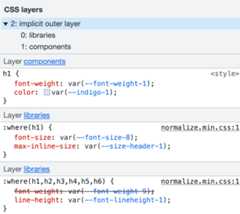
Chrome DevTools is helpful for visualizing which styles are coming from whichlayers:
Resources
- CSS Cascade 5 specification
- Cascade layers explainer
- Cascade layers on MDN
- Una Kravets:CascadeLayers
- Ahmad Shadeed:Hello, CSS CascadeLayers
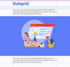
Subgrid
Beforesubgrid, a grid inside of another grid couldn't align itself to itsparent cells or grid lines. Each grid layout was unique. Many designers place asingle grid over their whole design and constantly align items within it, whichcouldn't be done in CSS.
Aftersubgrid, a child of a grid can adopt its parents’ columns or rows as itsown, and align itself or children to them!
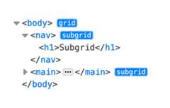
In the following demo, the body element creates a classic grid of three columns:the middle column is calledmain, and the left and right columnsname theirlinesfullbleed. Then, each element in the body,<nav> and<main>, adopts thenamed lines from body by settinggrid-template-columns: subgrid.
body{display:grid;grid-template-columns:[fullbleed-start]auto[main-start]min(90%,60ch)[main-end]auto[fullbleed-end];}body >*{display:grid;grid-template-columns:subgrid;}Lastly, children of<nav> or<main> can align or size themselves using thefullbleed andmain columns and lines.
.main-content{grid-column:main;}.fullbleed{grid-column:fullbleed;}Devtools can help you see the lines and subgrids (Firefox only at the moment).In the following image, the parent grid and subgrids have been overlaid. It nowresembles how designers were thinking about the layout.
In the elements panel of devtools you can see which elements are grids andsubgrids, which is very helpful for debugging or validating layout.
Resources
Container queries
Before@container, elements of a webpage could only respond to the size of thewhole viewport. This is great for macro layouts, but for micro layouts, wheretheir outer container isn't the whole viewport, it's impossible for the layoutto adjust accordingly.
After@container, elements can respond to a parent container size or style!The only caveat is the containers must declare themselves as possible querytargets, which is a small requirement for a large benefit.
/* establish a container */.day{container-type:inline-size;container-name:calendar-day;}These styles are what make the Mon, Tues, Wed, Thurs, and Fri columns in thefollowing video able to be queried by the event elements.
Here is the CSS for querying thecalendar-day container for its size, thenadjusting a layout and font sizes:
@containercalendar-day(max-width:200px){.date{display:block;}.date-num{font-size:2.5rem;display:block;}}Here's another example: one book component adapts itself to the space availablein the column that it's dragged to:
Una is correct in assessing the situation asthe newresponsive. Thereare many exciting and meaningful design decisions to make when using@container.
Resources
- Container Queries specification
- Container Queries explainer
- Container Queries on MDN
- The new responsive on web.dev
- Calendar demo by Una
- Awesome container queries collection
- How we built Designcember on web.dev
- Ahmad Shadeed:Say Hello To CSSContainerQueries
accent-color
Beforeaccent-color, when you wanted a form with brand matching colors, youcould end up with complex libraries or CSS solutions that became hard to manageover time. While they gave you all the options, and hopefully includedaccessibility, the choice to use the built-in components or adopt your ownbecomes tedious to continue to choose.
Afteraccent-color, one line of CSS brings a brand color to the built-incomponents. In addition to a tint, the browser intelligently chooses propercontrasting colors for ancillary parts of the component and adapts to systemcolor schemes (light or dark).
/* tint everything */:root{accent-color:hotpink;}/* tint one element */progress{accent-color:indigo;}
To learn more aboutaccent-color,check out my post onweb.dev where I explore many more aspects ofthis useful CSS property.
Resources
- accent-color specification
- accent-color on MDN
- accent-color on web.dev
- Bramus:Tint User-Interface Controls with CSSaccent-color
Color level 4 and 5
The web has been dominated by sRGB for the past decades, but in an expandingdigital world of high-definition displays and mobile devices pre-equipped withOLED or QLED screens, sRGB is not enough. Furthermore, dynamic pages that adaptto user preferences are expected, and color management has been a growingconcern for designers, design systems, and code maintainers.
Not in 2022 though—CSS has a number of new color functions and spaces:- Colors that reach into the HD color capabilities of displays.- Color spaces that match an intent, such as perceptual uniformity.- Color spaces for gradients that drastically change the interpolation outcomes.- Color functions to help you mix and contrast, and choose which space you do the work in.
Before all these color features, design systems needed to precalculate propercontrasting colors, and ensure appropriately vibrant palettes, all whilepreprocessors or JavaScript did the heavy lifting.
After all these color features, the browser and CSS can do all the work,dynamically and just in time. Instead of sending many KBs of CSS and JavaScriptto users to enable theming and data visualization colors, CSS can do theorchestrating and calculations. CSS is also better equipped to check for supportbefore usage or handle fallbacks gracefully.
@media(dynamic-range:high){.neon-pink{--neon-glow:color(display-p3101);}}@supports(color:lab(0%00)){.neon-pink{--neon-glow:lab(150%1600);}}hwb()
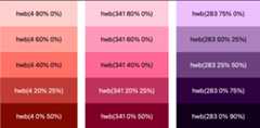
HWB stands for hue, whiteness, and blackness. It presents itself as ahuman-friendly way of articulating color, as it's just a hue and an amount ofwhite or black to lighten or darken. Artists who mix colors with white or blackmay find themselves appreciating this color syntax addition.
Using this color function results in colors from the sRGB color space, the sameas HSL and RGB. In terms of newness for 2022, this doesn’t give you new colors,but it may make some tasks easier for fans of the syntax and mental model.
Resources
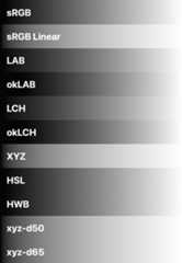
Color spaces
The way colors are represented is done with a color space. Each color spaceoffers various features and trade-offs for working with color. Some may pack allthe bright colors together; some may line them up first based on theirlightness.
2022 CSS is set to offer 10 new color spaces, each with unique features toassist designers and developers in displaying, picking, and mixing colors.Previously, sRGB was the only option for working with color, but now CSS unlocksnew potential and a new default color space, LCH.
color-mix()
Beforecolor-mix(), developers and designers needed preprocessors likeSass to mix the colors before the browser saw them.Most color-mixing functions also didn't provide the option to specify whichcolor space to do the mixing in, sometimes resulting in confusing results.
Aftercolor-mix(), developers and designers can mix colors in the browser,alongside all their other styles, without running build processes or includingJavaScript. Additionally, they can specify which color space to do the mixingin, or use the default mixing color space of LCH.
Often, a brand color is used as a base and variants are created from it, such aslighter or darker colors for hover styles. Here's what that looks like withcolor-mix():
.color-mix-example{--brand:#0af;--darker:color-mix(var(--brand)25%,black);--lighter:color-mix(var(--brand)25%,white);}and if you wanted to mix those colors in a different color space, like srgb,change it:
.color-mix-example{--brand:#0af;--darker:color-mix(insrgb,var(--brand)25%,black);--lighter:color-mix(insrgb,var(--brand)25%,white);}Here follows a theming demo usingcolor-mix(). Try changing the brand colorand watch the theme update:
Enjoy mixing colors in various color spaces in your stylesheets in 2022!
Resources
- color-mix() specification
- color-mix() on MDN
- Theming demo
- Another theming demo
- Fabio Giolito:Create a color theme withthese upcoming CSSfeatures
color-contrast()
Beforecolor-contrast(), stylesheet authors needed to know accessible colorsahead of time. Often a palette would show black or white text on a color swatch,to indicate to a user of the color system which text color would be needed toproperly contrast with that swatch.
Aftercolor-contrast(), stylesheet authors can offload the task entirely tothe browser. Not only can you employ the browser to automatically pick a blackor white color, you can give it a list of design system appropriate colors andhave it pick the first to pass your desired contrast ratio.
Here's a screenshot of anHWB color palette setdemo where the text colors areautomatically chosen by the browser based on the swatch color:
The basics of the syntax look like this, where gray is passed to the functionand the browser determines if black or white have the most contrast:
color:color-contrast(gray);The function can also be customized with a list of colors, from which it willpick the highest contrasting color from the selection:
color:color-contrast(grayvsindigo,rebeccapurple,hotpink);Lastly, in case it's preferable not to pick the highest contrasting color fromthe list, a target contrast ratio can be provided, and the first color to passit is chosen:
color:color-contrast(var(--bg-blue-1)vsvar(--text-lightest),var(--text-light),var(--text-subdued)toAA/* 4.5 could also be passed */);This function can be used for more than just text color, though I estimate thatwill be its primary use case. Think about how much easier it will be to deliveraccessible and legible interfaces once the choosing of proper contrasting colorsis built into the CSS language itself.
Resources
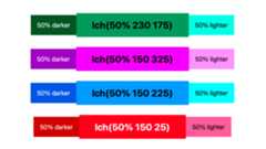
Relative color syntax
Before relative color syntax, to compute on color and make adjustments, thecolor channels needed to be individually placed into custom properties. Thislimitation also made HSL the primary color function for manipulating colorsbecause the hue, saturation, or lightness could all be adjusted in astraightforward way withcalc().
After relative color syntax, any color in any space can be deconstructed,modified, and returned as a color, all in one line of CSS. No more limitationsto HSL—manipulations can be done in any color space desired, and many lesscustom properties need to be created to facilitate it.
In the following syntax example, a base hex is provided and two new colors arecreated relative to it. The first color--absolute-change creates a new colorin LCH from the base color, then proceeds to replace the base color’s lightnesswith75%, maintaining the chroma (c) and hue (h). The second color--relative-change creates a new color in LCH from the base color, but thistime reduces the chroma (c) by 20%.
.relative-color-syntax{--color:#0af;--absolute-change:lch(fromvar(--color)75%ch);--relative-change:lch(fromvar(--color)lcalc(c-20%)h);}It's akin to mixing colors, but it's more similar to alterations than it ismixing. You get to cast a color from another color, getting access to the threechannel values as named by the color function used, with an opportunity toadjust those channels. All in all, this is a very cool and powerful syntax forcolor.
In the following demo I've used relative color syntax to create lighter anddarker variants of a base color, and usedcolor-contrast() to ensure thelabels have proper contrast:
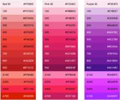
This function can also be used for color palette generation. Here is a demowhere entire palettes are generated off a provided base color. This one set ofCSS powers all the various palettes, each palette simply provides a differentbase. As a bonus, since I've used LCH, look at how perceptually even thepalettes are—no hot or dead spots to be seen, thanks to this color space.
:root{--_color-base:#339af0;--color-0:lch(fromvar(--_color-base)98%10h);--color-1:lch(fromvar(--_color-base)93%20h);--color-2:lch(fromvar(--_color-base)85%40h);--color-3:lch(fromvar(--_color-base)75%46h);--color-4:lch(fromvar(--_color-base)66%51h);--color-5:lch(fromvar(--_color-base)61%52h);--color-6:lch(fromvar(--_color-base)55%57h);--color-7:lch(fromvar(--_color-base)49%58h);--color-8:lch(fromvar(--_color-base)43%55h);--color-9:lch(fromvar(--_color-base)39%52h);--color-10:lch(fromvar(--_color-base)32%48h);--color-11:lch(fromvar(--_color-base)25%45h);--color-12:lch(fromvar(--_color-base)17%40h);--color-13:lch(fromvar(--_color-base)10%30h);--color-14:lch(fromvar(--_color-base)5%20h);--color-15:lch(fromvar(--_color-base)1%5h);}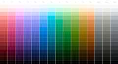
Hopefully by now you can see how color spaces and different color functions canall be used for different purposes, based on their strengths and weaknesses.
Resources
- Relative color syntaxspecification
- Building color palettes with relative colorsyntax
- Building color variants with relative colorsyntax
Gradient color spaces
Before gradient color spaces, sRGB was the default color space used. sRGB isgenerally reliable, but does have some weaknesses like thegray deadzone.

After gradient color spaces, tell the browser which color space to use for thecolor interpolation. This gives developers and designers the ability to choosethe gradient they prefer. The default color space also changes to LCH instead ofsRGB.
The syntax addition goes after the gradient direction, uses the newin syntax,and is optional:
background-image:linear-gradient(torightinhsl,black,white);background-image:linear-gradient(torightinlch,black,white);Here's a basic and essential gradient from black to white. Look at the range ofresults in each color space. Some reach dark black earlier than others, somefade to white too late.
In this next example, black is transitioned to blue because it's a known problemspace for gradients. Most color spaces creep into purple during colorinterpolation or, as I like to think of it, as colors travel inside their colorspace from point A to point B. Since the gradient will take a straight line frompoint A to point B, the shape of the color space drastically changes the stopsthat the path takes along the way.
Note:okLCH andokLAB are specialized color spaces that account for various drifts, like this one into purple, making them especially accurate for gradients.
For more deep explorations, examples and comments, readthis Twitterthread.
Resources
- Gradient interpolationspecification
- Demo comparing gradients in spaces
- Observable notebook comparinggradients
inert
Beforeinert, it was good practice to guide the user's focus to areas of thepage or app that needed immediate attention. This guided focus strategy becameknown as focus trapping because developers would place focus into an interactivespace, listen for focus change events and, if the focus left the interactivespace, then it was forced back in. Users on keyboards or screen readers areguided back to the interactive space to ensure the task is complete beforemoving on.
Afterinert, no trapping is required because you can freeze or guard entiresections of the page or app. Clicks and focus change attempts are just simplynot available while those parts of a document are inert. One could also think ofthis like guards instead of a trap, whereinert is not interested in makingyou stay somewhere, rather making other places unavailable.
A good example of this is the JavaScriptalert() function:
Notice in the preceding video how the page was mouse and keyboard accessibleuntil analert() was called. Once the alert dialog popup was shown, the restof the page was frozen, orinert. Users’ focus is placed inside the alertdialog and has nowhere else to go. Once the user interacts and completes thealert function request, the page is interactive again.inert empowersdevelopers to achieve this same guided focus experience with ease.
Here's a small code sample to show how it works:
<body> <div> <h2>Modal Title</h2> <p>...<p> <button>Save</button> <button>Discard</button> </div> <main inert> <!-- cannot be keyboard focused or clicked --> </main></body>A dialog is a great example, butinert is also helpful for things such as theslide-out side menu user experience. When a user slides out the side menu, it'snot OK to let the mouse or keyboard interact with the page behind it; that's abit tricky for users. Instead, when the side menu is showing, make the pageinert, and now users must close or navigate within that side menu, and won'tever find themselves lost somewhere else in the page with an open menu.
Resources
COLRv1 Fonts
Before COLRv1 fonts, the web hadOT-SVG fonts,also an open format for fonts with gradients and built-in colors and effects.These could grow very large though, and while they allowed editing the text,there wasn't much scope for customization.
AfterCOLRv1 fonts, the webhas smaller footprint, vector-scalable, repositionable, gradient-featuring, andblend-mode powered fonts that accept parameters to customize the font per usecase or to match a brand.
Here's an example from the Chrome Developer blog post about emojis. Maybe you'venoticed that if you scale up the font size on an emoji, it doesn't stay sharp.It's an image and not vector art. Often in applications when an emoji is used,it's swapped out for a higher quality asset. With COLRv1 fonts, the emojis arevector and beautiful:
Icon fonts could do some amazing things with this format, offering customduo-tone color palettes, and more. Loading a COLRv1 font is just like any otherfont file:
@importurl(https://fonts.googleapis.com/css2?family=Bungee+Spice);Customizing the COLRv1 font is done with@font-palette-values, a special CSSat-rule for grouping and naming a set of customization options into a bundle forlater reference. Notice how you specify a custom name just like a customproperty, starting with--:
@importurl(https://fonts.googleapis.com/css2?family=Bungee+Spice);@font-palette-values--colorized{font-family:"Bungee Spice";base-palette:0;override-colors:0hotpink,1cyan,2white;}With--colorized as an alias for the customizations, the last step is to applythe palette to an element that is using the color font family:
@importurl(https://fonts.googleapis.com/css2?family=Bungee+Spice);@font-palette-values--colorized{font-family:"Bungee Spice";base-palette:0;override-colors:0hotpink,1cyan,2white;}.spicy{font-family:"Bungee Spice";font-palette:--colorized;}
With more and more variable fonts and color fonts becoming available, webtypography is on a very magnificent path towards rich customization and creativeexpression.
Resources
Viewport units

Before the new viewport variants, the web offered physical units to assist infitting viewports. There was one for height, width, smallest size (vmin), andlargest side (vmax). These worked well for many things, but mobile browsersintroduced a complexity.
On mobile, when loading a page, the status bar with the url is shown, and thisbar consumes some of the viewport space. After a few seconds and someinteractivity, the status bar may slide away to allow a bigger viewportexperience for the user. But when that bar slides out, the viewport height haschanged, and anyvh units would shift and resize as their target size changed.In later years, thevh unit specifically needed to decide which of the twoviewport sizes it was going to use, because it was causing jarring visual layoutissues on mobile devices. It was determined that thevh would always representthe largest viewport.
.original-viewport-units{height:100vh;width:100vw;--size:100vmin;--size:100vmax;}After the new viewport variants, small, large, and dynamic viewport units aremade available, with the addition oflogicalequivalents to the physical ones. The idea isto give developers and designers the ability to choose which unit they want touse for their given scenario. Maybe it's ok to have a small jarring layout shiftwhen the status bar goes away, so thendvh (dynamic viewport height) could beused without worry.
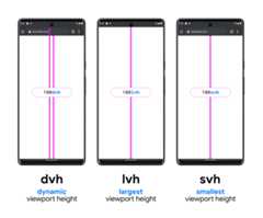
Here's a complete list of all the new viewport unit options made available withthe new viewport variants:
.new-height-viewport-units{height:100vh;height:100dvh;height:100svh;height:100lvh;block-size:100vb;block-size:100dvb;block-size:100svb;block-size:100lvb;}
.new-width-viewport-units{width:100vw;width:100dvw;width:100svw;width:100lvw;inline-size:100vi;inline-size:100dvi;inline-size:100svi;inline-size:100lvi;}
.new-min-viewport-units{--size:100vmin;--size:100dvmin;--size:100svmin;--size:100lvmin;}
.new-max-viewport-units{--size:100vmax;--size:100dvmax;--size:100svmax;--size:100lvmax;}
Hopefully these will give developers and designers the flexibility needed toachieve their viewport responsive designs.
Resources
:has()
Before:has(), thesubjectof aselector was always at the end. For example, thesubject of this selector is a list item:ul > li. Pseudo selectors can alterthe selector but they don't change the subject:ul > li:hover orul >li:not(.selected).
After:has(), a subject higher in the element tree can remain the subjectwhile providing a query about children:ul:has(> li). It is easy to understandhow:has() got a common name of "parent selector", as the subject of theselector is now the parent in this case.
Here's a basic syntax example where the class.parent remains the subject butis only selected if a child element has the.child class:
.parent:has(.child){...}Here's an example where a<section> element is the subject, but the selectoronly matches if one of the children has:focus-visible:
section:has(*:focus-visible){...}:focus-within already behaves similarly tosection:has(*:focus-visible) and should be used instead.The:has() selector starts to become a fantastic utility once more practicaluse cases become apparent. For example, it's not currently possible to select<a> tags when they wrap images, making it difficult to teach the anchor taghow to change its styles when in that use case. It is possible with:has()though:
a:has(>img){...}These have all been examples where:has() only looks like a parent selector.Consider the use case of images inside of<figure> elements and adjustingstyles on the images if the figure has a<figcaption>. In the followingexample, figures with figcaptions are selected and then images within thatcontext.:has() is used and doesn't change the subject, as the subject we'retargeting is images not figures:
figure:has(figcaption)img{...}The combinations are seemingly endless. Combine:has() withquantityqueries and adjustCSS grid layouts based on the number of children. Combine:has() withinteractive pseudo classstates and createapplications that respond in new creative ways.
Checking for support is made simple with@supports anditsselector()function, which tests if the browser understands the syntax before using it:
@supports(selector(:has(works))){/* safe to use :has() */}Resources
2022 and beyond
There are still a number of things that will be hard to do after all theseamazing features land in 2022. The next section takes a look at some of theremaining problems and the solutions that are actively being developed toresolve them. These solutions are experimental, even though they may bespecified or available behind flags in browsers.
The upshot from the next sections should be comfort that the problems listedhave many people from many companies seeking resolution—not that these solutionsare going to be released in 2023.
Loosely typed custom properties
CSScustom propertiesare amazing. They allow all sorts of things to be stored inside of a namedvariable, which then can be extended, calculated upon, shared, and more. Infact, they're so flexible, it would be nice to have some that are less flexible.
Consider a scenario where abox-shadow uses custom properties for its values:
box-shadow:var(--x)var(--y)var(--blur)var(--spread)var(--color);This all works well until any one of the properties is changed into a value thatCSS doesn't accept there, such as--x: red. The entire shadow breaks if anyone of the nested variables is missing or is set to an invalid value type.
This is where@property comes in:--x canbecome a typed custom property, no longer loose and flexible, but safe with somedefined boundaries:
@property--x{syntax:'<length>';initial-value:0px;inherits:false;}Now, when thebox-shadow usesvar(--x) and later--x: red is attempted,red will be ignored as it's not a<length>. This means the shadow continuesto work, even though an invalid value was given to one of its custom properties.Instead of failing, it reverts to itsinitial-value of0px.
Animation
In addition to type safety, it also opens up many doors for animation. Theflexibility of CSS syntax makes animating some things impossible, such asgradients.@property helps here because the typed CSS property can inform thebrowser about a developer's intent inside of otherwise overly complexinterpolation. It essentially limits the scope of possibility insomuch that abrowser can animate aspects of a style that it couldn't before.
Consider this demo example, where a radial gradient is used to make a portion ofan overlay, creating a spotlight focus effect. JavaScript sets the mouse x and ywhen the alt/opt key is pressed, and then changes the focal-size to a smallervalue such as 25%, creating the spotlight focus circle at the mouse position:
.focus-effect{--focal-size:100%;--mouse-x:center;--mouse-y:center;mask-image:radial-gradient(circleatvar(--mouse-x)var(--mouse-y),transparent0%,transparentvar(--focal-size),black0%);}Gradients can't be animated though. They are too flexible and too complex forthe browser to "just derive" how you want them to animate. With@property,though, one property can be typed and animated in isolation, for which thebrowser can easily understand the intent.
Video games that use this focus effect always animate the circle, from a largecircle to a pinhole circle. Here's how to use@property with our demo so thebrowser animates the gradient mask:
@property--focal-size{syntax:'<length-percentage>';initial-value:100%;inherits:false;}.focus-effect{--focal-size:100%;--mouse-x:center;--mouse-y:center;mask-image:radial-gradient(circleatvar(--mouse-x)var(--mouse-y),transparent0%,transparentvar(--focal-size),black0%);transition:--focal-size.3sease;}The browser is now able to animate the gradient size because we've reduced thesurface area of the modification to just one property and typed the value so thebrowser can intelligently interpolate the lengths.
@property can do so much more, but these small enablements can go a long way.
Resources
- @propertyspecification
- @property on MDN
- @property on web.dev
- Zoom focus demo
- CSS Tricks: Exploring @property and its animatingpowers
Was inmin-width ormax-width
Before media query ranges, a CSS media query usesmin-width andmax-width toarticulate over and under conditions. It may look like this:
@media(min-width:320px){…}After media query ranges, the same media query could look like this:
@media(width>=320px){…}A CSS media query using bothmin-width andmax-width may look like this:
@media(min-width:320px)and(max-width:1280px){…}After media query ranges, the same media query could look like this:
@media(320px<=width<=1280px){…}Depending on your coding background, one of those will look much more legiblethan the other. Thanks to the spec additions, developers will be able to choosewhich they prefer, or even use them interchangeably.
Resources
- Media query range syntaxspecification
- Media query range syntax onMDN
- Media query range syntax PostCSSplugin
No media query variables
Before@custom-media, media queries had to repeat themselves over and over, orrely on preprocessors to generate the proper output based on static variablesduring build time.
After@custom-media, CSS allows aliasing media queries and the referencing ofthem, just like a custom property.
Naming things is very important: it can align purpose with the syntax, makingthings easier to share and easier to use in teams. Here are a few custom mediaqueries that follow me between projects:
@custom-media--OSdark(prefers-color-scheme:dark);@custom-media--OSlight(prefers-color-scheme:light);@custom-media--pointer(hover)and(pointer:coarse);@custom-media--mouse(hover)and(pointer:fine);@custom-media--xxs-and-above(width>=240px);@custom-media--xxs-and-below(width<=240px);Now that they're defined, I can use one of them like this:
@media(--OSdark){:root{…}}Find afull list of custom mediaqueries I use inside my CSS customproperty libraryOpen Props.
Resources
Nesting selectors is so nice
Before@nest, there was a lot of repetition in stylesheets. It becameespecially unwieldy when selectors were long and each was targeting smalldifferences. The convenience of nesting is one of the most common reasons foradopting a preprocessor.
After@nest, the repetition is gone. Nearly every feature ofpreprocessor-enabled nesting will be made available built into CSS.
article{color:darkgray;}article >a{color:var(--link-color);}/* with @nest becomes */article{color:darkgray; & >a{color:var(--link-color);}}What's most important about nesting to me, besides not repeatingarticle inthe nested selector, is the styling context remains within one style block.Instead of bouncing from one selector, and its styles, to another selector withstyles (example 1), the reader can remain within the context of an article andsee the article owns links inside of it. The relationship and style intent arebundled together, soarticle gets to appear to own its own styles.
The ownership could also be thought of as centralization. Instead of lookingaround a stylesheet for relevant styles, they can all be found nested togetherwithin a context. This works with parent to child relationships, but also withchild to parent relationships.
Consider a component child that wants to adjust itself when in a differentparent context, as opposed to the parent owning the style and changing a child:
/* parent owns this, adjusting children */section:focus-within >article{border:1pxsolidhotpink;}/* with @nest becomes *//* article owns this, adjusting itself when inside a section:focus-within */article{@nestsection:focus-within > &{border:1pxsolidhotpink;}}@nest helps overall with healthier style organization, centralization, andownership. Components can group and own their own styles, instead of having themspread amongst other style blocks. It may seem small in these examples, but itcan have very large impacts, for both convenience and legibility.
Resources
Scoping styles is really hard
Before@scope, many strategies existed because styles in CSS cascade, inherit,and are globally scoped by default. These features of CSS are very convenientfor many things, but for complex sites and applications, with potentially manydifferent styles of components, the global space and nature of the cascade canmake styles feel like they're leaking.
After@scope, not only can styles be scoped to only within a context, like aclass, they can also articulate where the styles end and do not continue tocascade or inherit.
In the following example,BEM naming conventionscoping can be reversed into the actual intent. The BEM selector is attemptingto scope the color of aheader element to a.card container with namingconventions. This requires that the header has this classname on it, completingthe goal. With@scope, no naming conventions are required in order to completethe same goal without marking up the header element:
.card__header{color:var(--text);}/* with @scope becomes */@scope(.card){header{color:var(--text);}}Here's another example, less component-specific and more about the global scopenature of CSS. Dark and light themes have to coexist inside a stylesheet, whereorder matters in determining a winning style. Usually this means dark themestyles come after the light theme; this establishes light as the default anddark as the optional style. Avoid the ordering and scope battling with@scope:
@scope(.light-theme){a{color:purple;}}@scope(.dark-theme){a{color:plum;}}To complete the story here,@scope also allows the establishing of where thestyle scope ends. This can't be done with any naming convention or preprocessor;it's special and only something CSS built-in to the browser can do. In thefollowing example,img and.content styles are exclusively applied when achild of a.media-block is a sibling or parent of.content:
@scope(.media-block)to(.content){img{border-radius:50%;}.content{padding:1em;}}Resources
No CSS way for a masonry layout
Before CSS masonry with grid, JavaScript was the best way to achieve a masonrylayout, as any of the CSS methods with columns or flexbox would inaccuratelyrepresent the content order.
After CSS masonry with grid, no JavaScript libraries will be required and thecontent order will be correct.
https://www.smashingmagazine.com/native-css-masonry-layout-css-grid/
The preceding demo is achieved with the following CSS:
.container{display:grid;grid-template-columns:repeat(4,1fr);grid-template-rows:masonry;}It's comforting to know that this is on the radar as a missing layout strategy,plus you cantry it today inFirefox.
Resources
- Masonry layoutspecification
- Masonry layout onMDN
- Smashing Magazine: Native CSS Masonry Layout with CSSGrid
CSS can't help users reduce data
Before theprefers-reduced-data media query, JavaScript and a server couldchange their behavior based on a user’s operating system or browser "data saver"option, but CSS could not.
After theprefers-reduced-data media query, CSS can join the user experienceenhancement and play its part in saving data.
@media(prefers-reduced-data:reduce){picture,video{display:none;}}The preceding CSS is used inthis media scrollcomponent and the savingscan be huge. Depending on how large the visiting viewport is, the more savingsto be had on page load. Saving continues as users interact with the mediascrollers. The images all haveloading="lazy" attributes on them and that,combined with CSS hiding the element entirely, means a network request for theimage is never made.

For my testing, on a medium sized viewport, 40 requests and 700kb of resourceswere initially loaded. As a user scrolls the media selection, more requests andresources are loaded. With CSS and the reduced data media query, 10 requests and172kb of resources are loaded. That's half a megabyte of savings and the userhasn't even scrolled any of the media, at which point there are no additionalrequests made.
There are more advantages to this reduced data experience than just datasavings. More titles can be seen and there's no distracting cover images tosteal attention. Many users browse in a data saver mode because they pay permegabyte of data—it's really nice to see CSS able to help out here.
Resources
- prefers-reduced-dataspecification
- prefers-reduced-data onMDN
- prefers-reduced-data in a GUIChallenge
- Smashing Magazine: Improving Core Web Vitals, A Smashing Magazine CaseStudy
Scroll snap features are too limited
Before these scroll snap proposals, writing your own JavaScript to manage acarousel, slider, or gallery could quickly get complex, with all the observersand state management. Also, if not careful, the natural scrolling speeds couldget normalized by script, making user interaction feel a bit unnatural andpotentially clunky.
New APIs
snapChanging()
As soon as the browser has released a snap child, this event fires. This allowsUI to reflect the lack of a snap child and the indeterminate snap state of thescroller, as it's now being used and will land somewhere new.
document.querySelector('.snap-carousel').addEventListener('snapchanging',event=>{console.log('Snap is changing',event.snappedTargetsList);});snapChanged()
As soon as the browser has snapped to a new child and the scroller is rested,this event fires. This lets any UI that depends on the snapped child to updateand reflect the connection.
document.querySelector('.snap-carousel').addEventListener('snapchanged',event=>{console.log('Snap changed',event.snappedTargetsList);});scroll-start
Scrolling doesn't always begin at the start. Consider swipeable components whereswiping left or right triggers different events, or a search bar that on pageload is initially hidden until you scroll to the top. This CSS property letsdevelopers specify that a scroller should begin at a specific point.
:root{--nav-height:100px}.snap-scroll-y{scroll-start-y:var(--nav-height);}:snap-target
This CSS selector will match elements in a scroll snap container that arecurrently snapped by the browser.
.card{--shadow-distance:5px;box-shadow:0var(--shadow-distance)5pxhsl(00%0%/25%);transition:box-shadow350msease;}.card:snapped{--shadow-distance:30px;}After these scroll snap proposals, making a slider, carousel, or gallery is mucheasier as the browser now offers conveniences for the task, eliminatingobservers and scroll orchestration code in favor of using built-in APIs.
It's still very early days for these CSS and JS features, but be on the lookoutfor polyfills that can help adoption, and testing, of them soon.
Resources
Cycling between known states
Beforetoggle(), only states built into the browser already could be leveragedfor styling and interaction. The checkbox input, for example, has:checked, aninternally managed browser state for the input that CSS is able to use forchanging the element visually.
Aftertoggle(), custom states can be created on any element for CSS to changeand use for styling. It allows groups, cycling, directed toggling, and more.
In the following example, the same effect of a list item strikethrough oncomplete is achieved but without any checkbox elements:
<ul class='ingredients'> <li>1 banana <li>1 cup blueberries ...</ul>And the relevant CSStoggle() styles:
li{toggle-root:checkself;}li:toggle(check){text-decoration:line-through;}If you're familiar with state machines, you may notice how much crossover thereis withtoggle(). This feature will let developers build more of their stateinto CSS, hopefully resulting in clearer and more semantic ways of orchestratinginteraction and state.
Resources
Customizing select elements
Before<selectmenu>, CSS didn't have the ability to customize<option>elements with rich HTML or change much about the display of a list of options.This led developers to load external libraries that recreated much of thefunctionality of a<select>, which ended up being a lot of work.
After<selectmenu>, developers can provide rich HTML for options elements andstyle them as much as they need, while still meeting accessibility requirementsand providing semantic HTML.
In the following example, taken from the<selectmenu>explainerpage, a new select menu is createdwith some basic options:
<selectmenu> <option>Option 1</option> <option>Option 2</option> <option>Option 3</option></selectmenu>CSS can target and style the element's parts:
.my-select-menu::part(button){color:white;background-color:red;padding:5px;border-radius:5px;}.my-select-menu::part(listbox){padding:10px;margin-top:5px;border:1pxsolidred;border-radius:5px;}
You can try the<selectmenu> element on Chromium in Canary with the webexperiments flag enabled. Watch out in 2023 and beyond for customizable selectmenu elements.
Resources
Anchoring an element to another
Beforeanchor(), position absolute and relative were position strategiesprovided for developers to have child elements move around within a parentelement.
Afteranchor(), developers can position elements to other elements, regardlessof them being a child or not. It also allows developers to specify which edge toposition against, and other niceties for creating position relationships betweenelements.
The explainer has a few great examples and code samples provided, if you'reinterested in learning more.
Resources
Except as otherwise noted, the content of this page is licensed under theCreative Commons Attribution 4.0 License, and code samples are licensed under theApache 2.0 License. For details, see theGoogle Developers Site Policies. Java is a registered trademark of Oracle and/or its affiliates.
Last updated 2022-05-11 UTC.