What's on your mind?
TEXT
POLL
- All12 posts
- General3 posts
- Editing Help0 posts
- The Longest Journey0 posts
- Dreamfall0 posts
- Dreamfall Chapters0 posts
- Characters0 posts
- Locations0 posts
- Concepts0 posts
- Questions and Answers3 posts
- News6 posts
Sort by
Card Layout

Almost four years ago, on
https://tlj.fandom.com/wiki/MediaWiki_talk:Wikia.css?section=1, [[User:Лихоку]] posted a request. It took me this long to even notice it. Apparently Лихоку even anticipated this, asking in the edit summary "Is anybody here?". :-D
At the moment, there are very few (two?) "semi-active" admins. I log in maybe once or twice a year, and this makes edits in talk pages hard to notice, because "Recent changes" goes back at most 90 days. That would be OK on Wikipedia with its thousands of admins, but not here. It's a flaw in the wiki config, if you ask me. With the small amount of edits here, wiki-wide change history should be unlimited, in my opinion.
Despite this difficulty, I still think it makes sense to edit talk pages, because it concentrates page-related discussion and keeps it accessible from the page. To make talk page edits easier to notice, I suggest we add notification posts to the general discussion area.
The current "official name" of the wiki is "TLJwiki". At least that is what the header on every page says, and what each web page title says. I assume that "TLJwiki" is a name with some history, possibly to a predecessor wiki of the same name. However, I think that a name like "The Longest Journey Wiki (TLJwiki)", possibly without the appended "(TLJwiki)", would be clearer and make it easier to understand what the site is about. Do we need to keep the current "TLJwiki" name for some reason? If not, I suggest to change it. What do you think?
EDIT:
To clarify:
The wiki's address should *stay*. My suggestion is *only* to change
what Wikia (Fandom) calls the "Community name", documented here:
https://community.fandom.com/wiki/Help:Theme_Designer#Wordmark
In the "mobile" view, the Community Name appears at the top of every
page, above the page title. In the desktop view, the community name
appears in the header, to the right of the logo and above the
wiki's menu bar (the menu that starts with "Popular Pages").
There is a separate parameter, the "site name", documented at
https://community.fandom.com/wiki/Help:Sitename, which also
currently has the value "TLJwiki". This parameter would not be
affected by a change of the community name. The site name is used
in the web page titles. For example, the Dreamfall web page's title
is "Dreamfall | TLJwiki | Fandom". The site name is also the value
of the `{{SITENAME}}` template, and is the default
project namespace. You can see the `{{SITENAME}}`
template in use at [[TLJwiki:Community Portal]], which is also a
page in the default project namespace. I have no idea what would
happen to pages in that namespace, should the site name change.
For this reason, I also do not know whether incoming links
(bookmarks) would be broken.
Looking at our Russian sister wiki, I liked their logo ("wordmark" in fandom.com terms), which shows the upper half of a balance symbol.
Our old logo with the blue calligraphy

was OKish, and better than its predecessor. But its graphical style, which stems from the The Longest Journey era, did not match TLJwikis overall style, which leans more towards Dreamfall Chapters. I think that the balance symbol looks better as a logo than the text, and it is much more iconic, easier to recognize. I went ahead and replaced the logo with the sister site's. While I was at it, I also added the same image as a header image, which now appears blurred in the header's background on the right. I hope you like this change. If not, please comment.
Discussions is a new feature developed to replace our forums. Here fans can create posts to share videos, images and discuss gameplay. Upvote your favorite and share them on social media. Be sure to read the guidelines posted to the right.
 <figcaption> </figcaption></figure></div><p>In any case, I plan to view both wikis. And therefore I can edit your wiki too, if you do not mind (:</p><p>
</p><p>P.S.: And! You guys are absolutely wonderful!Your wiki is so large and it's amazing. Really! We (the Russian community) are very grateful to all of you for your work.</p>
- <span> </span> to <span> </span>
- <span>Link color</span> to <span>new link color</span>
- to make it easy for others to compare before and after,
- to explain why and how (look at this page's source to copy the colors), and
- to be able to roll these changes back if need be (yeah, the theme editor has a roll back function, but does not outright show what was changed).
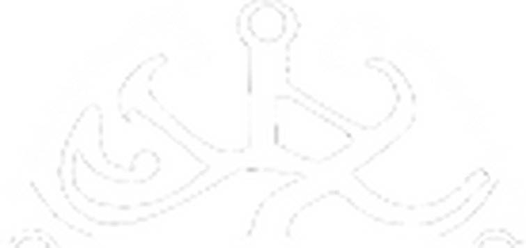
 <figcaption> <p>From 2014 to 2016, this image was used as the TLJwiki logo.</p> </figcaption></figure> At the original (and maximum) size of 250x65 pixels, the balance symbol is almost unrecognizable. I had to enlarge the image to even realize that it is a balance symbol. Before that, it looked like simply a blue orb to me, possibly a planet. The similarly colored background also makes the writing harder to read. The built-in nested frames further reduce the available space, leading to reduced font size, also making the writing harder to read.<p>
</p>For these reasons, I have made and installed a new logo, shown on the right.<figure>
- The background should be transparent instead of white. This becomes apparent when the window is narrowed.
- Centering it might help.
- The way it is, the contrast is higher than in the top navigation. I would prefer if the text color matched the navigation background.
- To make full use of the available space, the words would need to be side-by-side instead of on top of each other.