I've been trying for weeks to plot 3 sets of (x, y) data on the same plot from a .CSV file, and I'm getting nowhere. My data was originally an Excel file which I have converted to a .CSV file and have usedpandas to read it into IPython as per the following code:
from pandas import DataFrame, read_csvimport pandas as pd# define data locationdf = read_csv(Location)df[['LimMag1.3', 'ExpTime1.3', 'LimMag2.0', 'ExpTime2.0', 'LimMag2.5','ExpTime2.5']][:7]My data is in the following format:
Type mag1 time1 mag2 time2 mag3 time3M0 8.87 41.11 8.41 41.11 8.16 65.78;...M6 13.95 4392.03 14.41 10395.13 14.66 25988.32I'm trying to plottime1 vsmag1,time2 vsmag2 andtime3 vsmag3, all on the same plot, but instead I get plots oftime.. vsType, eg. for the code:
df['ExpTime1.3'].plot()I get'ExpTime1.3' (y-axis) plotted againstM0 toM6 (x-axis), when what I want is'ExpTime1.3' vs'LimMag1.3', with x-labelsM0 -M6.
How do I get
'ExpTime..'vs'LimMag..'plots, with all 3 sets of data on the same plot?How do I get the
M0-M6labels on the x-axis for the'LimMag..'values (also on the x-axis)?
Since trying askewchan's solutions, which did not return any plots for reasons unknown, I've found that I can get a plot ofExpTimevsLimMagusingdf['ExpTime1.3'].plot(),if I change the dataframe index (df.index) to the values of the x axis (LimMag1.3). However, this appears to mean that I have to convert each desired x-axis to the dataframe index by manually inputing all the values of the desired x-axis to make it the data index. I have an awful lot of data, and this method is just too slow, and I can only plot one set of data at a time, when I need to plot all 3 series for each dataset on the one graph. Is there a way around this problem? Or can someone offer a reason, and a solution, as to why I I got no plots whatsoever with the solutions offered by askewchan?\
In response to nordev, I have tried the first version again, bu no plots are produced, not even an empty figure. Each time I put in one of theax.plotcommands, I do get an output of the type:[<matplotlib.lines.Line2D at 0xb5187b8>], but when I enter the commandplt.show()nothing happens.When I enterplt.show()after the loop in askewchan's second solution, I get an error back sayingAttributeError: 'function' object has no attribute 'show'
I have done a bit more fiddling with my original code and can now get a plot ofExpTime1.3vsLimMag1.3 with the codedf['ExpTime1.3'][:7].plot(),by making the index the same as the x axis (LimMag1.3), but I can't get the other two sets of data on the same plot. I would appreciate any further suggestions you may have. I'm using ipython 0.11.0 via Anaconda 1.5.0 (64bit) and spyder on Windows 7 (64bit), python version is 2.7.4.

- Just a thought; having
M0-M6as labels on the x-axis would have no real meaning in this situation, as there arethree differentLimMag..-values for everyM..-label, meaning that every label would have to be placed three different places on the axis. This will ultimately look very confusing rather than informative.sodd– sodd2013-05-16 07:52:39 +00:00CommentedMay 16, 2013 at 7:52 - What is
pltdefined as? It shouldn't be a'function' objectAre you familiar with using matplotlib and pyplot?askewchan– askewchan2013-05-16 15:17:21 +00:00CommentedMay 16, 2013 at 15:17 - Hi askewchan, in answer to your question, I'm totally unfamiliar with matplotlib, pylab, python; in fact I've never done any sort of programming or used anything other than excel - hence the struggle..user2324693– user23246932013-05-16 15:36:57 +00:00CommentedMay 16, 2013 at 15:36
- @user2324693 Try looking here to get started with plotting:matplotlib.org/users/pyplot_tutorial.htmlaskewchan– askewchan2013-05-16 16:31:58 +00:00CommentedMay 16, 2013 at 16:31
- Hi nordev, the solution with the log x-axis is probably the best, minus the end labels, as they're not correct, ie M0 is not the lowest valued spectral class. However, when I try to run it, I get an error message with respect to the range as 'expecting integer, but got float'. The data are decimals, but I don't know how to fix this so it will expect float, as I don't understand your code.user2324693– user23246932013-06-07 14:15:00 +00:00CommentedJun 7, 2013 at 14:15
2 Answers2
If I have understood you correctly, both from this question as well as yourprevious one on the same subject, the following should be basic solutions you could customize to your needs.
Several subplots:
Note that this solution will output as many subplots as there are Spectral classes (M0, M1, ...) vertically on the same figure. If you wish tosave the plot of each Spectral class in a separate figure, the code needs some modifications.
import pandas as pdfrom pandas import DataFrame, read_csvimport numpy as npimport matplotlib.pyplot as plt# Here you put your code to read the CSV-file into a DataFrame dfplt.figure(figsize=(7,5)) # Set the size of your figure, customize for more subplotsfor i in range(len(df)): xs = np.array(df[df.columns[0::2]])[i] # Use values from odd numbered columns as x-values ys = np.array(df[df.columns[1::2]])[i] # Use values from even numbered columns as y-values plt.subplot(len(df), 1, i+1) plt.plot(xs, ys, marker='o') # Plot circle markers with a line connecting the points for j in range(len(xs)): plt.annotate(df.columns[0::2][j][-3:] + '"', # Annotate every plotted point with last three characters of the column-label xy = (xs[j],ys[j]), xytext = (0, 5), textcoords = 'offset points', va = 'bottom', ha = 'center', clip_on = True) plt.title('Spectral class ' + df.index[i]) plt.xlabel('Limiting Magnitude') plt.ylabel('Exposure Time') plt.grid(alpha=0.4)plt.tight_layout()plt.show()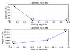
All in same Axes, grouped by rows (M0, M1, ...)
Here is another solution to get all the different Spectral classes plotted in the same Axes with a legend identifying the different classes. Theplt.yscale('log') is optional, but seeing as how the values span such a great range, it is recommended.
import pandas as pdfrom pandas import DataFrame, read_csvimport numpy as npimport matplotlib.pyplot as plt# Here you put your code to read the CSV-file into a DataFrame dffor i in range(len(df)): xs = np.array(df[df.columns[0::2]])[i] # Use values from odd numbered columns as x-values ys = np.array(df[df.columns[1::2]])[i] # Use values from even numbered columns as y-values plt.plot(xs, ys, marker='o', label=df.index[i]) for j in range(len(xs)): plt.annotate(df.columns[0::2][j][-3:] + '"', # Annotate every plotted point with last three characters of the column-label xy = (xs[j],ys[j]), xytext = (0, 6), textcoords = 'offset points', va = 'bottom', ha = 'center', rotation = 90, clip_on = True)plt.title('Spectral classes')plt.xlabel('Limiting Magnitude')plt.ylabel('Exposure Time')plt.grid(alpha=0.4) plt.yscale('log')plt.legend(loc='best', title='Spectral classes')plt.show()
All in same Axes, grouped by columns (1.3", 2.0", 2.5")
A third solution is as shown below, where the data are grouped by the series (columns 1.3", 2.0", 2.5") rather than by the Spectral class (M0, M1, ...). This example is very similar to @askewchan's solution. One difference is that the y-axis here is a logarithmic axis, making the lines pretty much parallel.
import pandas as pdfrom pandas import DataFrame, read_csvimport numpy as npimport matplotlib.pyplot as plt# Here you put your code to read the CSV-file into a DataFrame dfxs = np.array(df[df.columns[0::2]]) # Use values from odd numbered columns as x-valuesys = np.array(df[df.columns[1::2]]) # Use values from even numbered columns as y-valuesfor i in range(df.shape[1]/2): plt.plot(xs[:,i], ys[:,i], marker='o', label=df.columns[0::2][i][-3:]+'"') for j in range(len(xs[:,i])): plt.annotate(df.index[j], # Annotate every plotted point with its Spectral class xy = (xs[:,i][j],ys[:,i][j]), xytext = (0, -6), textcoords = 'offset points', va = 'top', ha = 'center', clip_on = True)plt.title('Spectral classes')plt.xlabel('Limiting Magnitude')plt.ylabel('Exposure Time')plt.grid(alpha=0.4) plt.yscale('log')plt.legend(loc='best', title='Series')plt.show()


19 Comments

You can callpyplot.plot(time, mag) three different times in the same figure. It would be wise to give a label to them. Something like this:
import matplotlib.pyplot as plt...fig = plt.figure()ax = fig.add_subplot(111)ax.plot(df['LimMag1.3'], df['ExpTime1.3'], label="1.3")ax.plot(df['LimMag2.0'], df['ExpTime2.0'], label="2.0")ax.plot(df['LimMag2.5'], df['ExpTime2.5'], label="2.5")plt.show()If you want to loop it, this would work:
fig = plt.figure()ax = fig.add_subplot(111)for x,y in [['LimMag1.3', 'ExpTime1.3'],['LimMag2.0', 'ExpTime2.0'], ['LimMag2.5','ExpTime2.5']]: ax.plot(df[x], df[y], label=y)plt.show()
13 Comments

df is formatted correctly, then @askewchan's code should be working perfectly. At least I have no problem creating the plots from his code (pandas 0.11.0 & matplotlib 1.2.1).'ExpTime..' should be on the y-axis, and'LimMag..' on the x-axis.
Explore related questions
See similar questions with these tags.