

Note
Go to the endto download the full example code.
ggplot style sheet#
This example demonstrates the "ggplot" style, which adjusts the style toemulateggplot (a popular plotting package forR).
These settings were shamelessly stolen from[1] (with permission).
[1]https://everyhue.me/posts/sane-color-scheme-for-matplotlib/
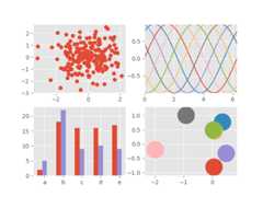
importmatplotlib.pyplotaspltimportnumpyasnpplt.style.use('ggplot')# Fixing random state for reproducibilitynp.random.seed(19680801)fig,axs=plt.subplots(ncols=2,nrows=2)ax1,ax2,ax3,ax4=axs.flat# scatter plot (Note: `plt.scatter` doesn't use default colors)x,y=np.random.normal(size=(2,200))ax1.plot(x,y,'o')# sinusoidal lines with colors from default color cycleL=2*np.pix=np.linspace(0,L)ncolors=len(plt.rcParams['axes.prop_cycle'])shift=np.linspace(0,L,ncolors,endpoint=False)forsinshift:ax2.plot(x,np.sin(x+s),'-')ax2.margins(0)# bar graphsx=np.arange(5)y1,y2=np.random.randint(1,25,size=(2,5))width=0.25ax3.bar(x,y1,width)ax3.bar(x+width,y2,width,color=list(plt.rcParams['axes.prop_cycle'])[2]['color'])ax3.set_xticks(x+width,labels=['a','b','c','d','e'])# circles with colors from default color cyclefori,colorinenumerate(plt.rcParams['axes.prop_cycle']):xy=np.random.normal(size=2)ax4.add_patch(plt.Circle(xy,radius=0.3,color=color['color']))ax4.axis('equal')ax4.margins(0)plt.show()