

Note
Go to the endto download the full example code.
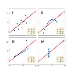
Anscombe's quartet#
Anscombe's quartet is a group of datasets (x, y) that have the same mean,standard deviation, and regression line, but which are qualitatively different.
It is often used to illustrate the importance of looking at a set of datagraphically and not only relying on basic statistic properties.
importmatplotlib.pyplotaspltimportnumpyasnpx=[10,8,13,9,11,14,6,4,12,7,5]y1=[8.04,6.95,7.58,8.81,8.33,9.96,7.24,4.26,10.84,4.82,5.68]y2=[9.14,8.14,8.74,8.77,9.26,8.10,6.13,3.10,9.13,7.26,4.74]y3=[7.46,6.77,12.74,7.11,7.81,8.84,6.08,5.39,8.15,6.42,5.73]x4=[8,8,8,8,8,8,8,19,8,8,8]y4=[6.58,5.76,7.71,8.84,8.47,7.04,5.25,12.50,5.56,7.91,6.89]datasets={'I':(x,y1),'II':(x,y2),'III':(x,y3),'IV':(x4,y4)}fig,axs=plt.subplots(2,2,sharex=True,sharey=True,figsize=(6,6),gridspec_kw={'wspace':0.08,'hspace':0.08})axs[0,0].set(xlim=(0,20),ylim=(2,14))axs[0,0].set(xticks=(0,10,20),yticks=(4,8,12))forax,(label,(x,y))inzip(axs.flat,datasets.items()):ax.text(0.1,0.9,label,fontsize=20,transform=ax.transAxes,va='top')ax.tick_params(direction='in',top=True,right=True)ax.plot(x,y,'o')# linear regressionp1,p0=np.polyfit(x,y,deg=1)# slope, interceptax.axline(xy1=(0,p0),slope=p1,color='r',lw=2)# add text box for the statisticsstats=(f'$\\mu$ ={np.mean(y):.2f}\n'f'$\\sigma$ ={np.std(y):.2f}\n'f'$r$ ={np.corrcoef(x,y)[0][1]:.2f}')bbox=dict(boxstyle='round',fc='blanchedalmond',ec='orange',alpha=0.5)ax.text(0.95,0.07,stats,fontsize=9,bbox=bbox,transform=ax.transAxes,horizontalalignment='right')plt.show()
References
The use of the following functions, methods, classes and modules is shownin this example:
matplotlib.axes.Axes.tick_params/ matplotlib.pyplot.tick_params`