
In this article, we will explore advanced plotting techniques offeredin tidyplots. We will cover the rasterization of plot components, datasubsetting for highlighting selected data points, and the constructionof powerful plotting pipelines. Moreover, we will discuss thevisualization of paired and missing data, generate multiplot layouts andintroduce the concepts of plot orientation, dodging, coloring, plot areapadding, and more. We will conclude by discussing the compatibility oftidyplots with ggplot2.
Rasterization
Generally, vector graphics like PDF and SVG are superior to rasterimages like PNG and JPG because they maintain high quality and sharpnessat any scale. This makes them ideal for printing, resizing, and zoomingwithout losing detail.
However, in plots with many data points, such as busy scatter plotsor heatmaps, the presence of too many vector shapes can slow downperformance without providing extra information. In these cases,rasterization of individual layers of the plot can be beneficial, as itreduces file size and rendering time, making the graphs more manageableand quicker to load or display.
Ideally, the rasterization only affects the problematic layers of theplot, while the rest of the plot still uses vector shapes. In tidyplotsthis can be achieved with the argumentsrasterize = TRUEandrasterize_dpi which are available inadd_heatmap() andadd_data_points()functions.
In the examples below I intentionally chose a low resolution of of 30to 50 dpi, to make the rastering more obvious. A typical resolution forprint would be 300 dpi.
library(tidyplots)gene_expression|>tidyplot(x=sample, y=external_gene_name, color=expression)|>add_heatmap(scale="row", rasterize=TRUE, rasterize_dpi=30)|>adjust_size(height=100)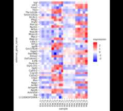
And here another example usingadd_data_points().
study|>tidyplot(x=treatment, y=score, color=treatment)|>add_data_points(rasterize=TRUE, rasterize_dpi=50)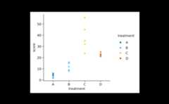
Custom styling
Maintaining a consistent look in graphs throughout a paper enhancesreadability, supports accurate comparisons, and improves thecommunication of the paper’s findings.
In tidyplots you can create a custom style by defining a functionalsequence like the one below, calledmy_style().
my_style<-function(x){x|>adjust_colors(colors_continuous_bluepinkyellow)|>adjust_font(family="mono", face="bold")|>remove_x_axis_ticks()|>remove_y_axis_ticks()}Each individual plot can then be piped intomy_style()as the final step.
study|>tidyplot(group,score, color=treatment)|>add_mean_bar(alpha=0.4)|>add_sem_errorbar()|>add_data_points_beeswarm()|>my_style()
energy_week|>tidyplot(date,power, color=energy_source)|>add_areastack_relative()|>my_style()
Data subsetting
In general, data wrangling should be done before plotting graphs,including subsetting the data to include only the points that shouldappear in the plot.
However, there are times when you have one large data frame thatserves as the basis for multiple plots or when you want to highlightspecific parts of the data while showing the entire dataset in thebackground. For these situations, tidyplots enables subsetting the dataduring the plotting process.
Let’s say you have a scatter plot of animals displaying their weightand size, and you want to highlight in red all animals larger than 300cm.
animals|>tidyplot(x=weight, y=size)|>add_data_points()|>add_data_points(data=filter_rows(size>300), color="red")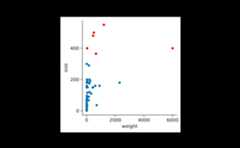
In addition, you might want to show the name of the three animalswith the highest body weight.
animals|>tidyplot(x=weight, y=size)|>add_data_points()|>add_data_points(data=filter_rows(size>300), color="red")|>add_data_labels_repel(data=max_rows(weight, n=3), label=animal, color="black")
You can also adjust the shape used for highlighting.
animals|>tidyplot(x=weight, y=size)|>add_data_points()|>add_data_points(data=max_rows(weight, n=3), color="red", shape=1, size=3)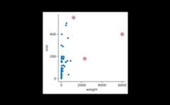
Combining this with the previously described rastering of individuallayers, you can choose to raster all data points, while keeping thehighlight as a vector shape.
animals|>tidyplot(x=weight, y=size)|>add_data_points(rasterize=TRUE, rasterize_dpi=50)|>add_data_points(data=max_rows(weight, n=3), color="red", shape=1, size=3)
Plotting pipelines
A unique feature of tidyplots is, that you can view and save multiplestages or variations of a plot in a single pipeline by usingview_plot() andsave_plot().
Let’s say you gradually build up a plot but want to save allintermediate stages as individual PDF files.
study|>tidyplot(x=treatment, y=score, color=treatment)|>add_mean_dash()|>save_plot(filename="stage_1.pdf")|>add_sem_errorbar()|>save_plot(filename="stage_2.pdf")|>add_data_points_beeswarm()|>save_plot(filename="stage_3.pdf")Or you have a big data frame with multiple genes and you quickly wantto generate plots for two of them.
gene_expression|>tidyplot(x=condition, y=expression, color=sample_type)|>add_mean_dash()|>add_sem_errorbar()|>add_data_points_beeswarm()|>view_plot(data=filter_rows(external_gene_name=="Apol6"), title="Apol6")|>view_plot(data=filter_rows(external_gene_name=="Bsn"), title="Bsn")

Note that in this example, thedata argument togetherwith thefilter_rows() function is used to subset the datato one gene at a time. In addition, thetitle argument letsyou include a plot title to avoid confusing individual plots.
Paired data
When dealing with paired data, you might wish to connect paired datapoints. In the example below, all participants switched the treatmentgroup after a certain time period. Thus for each participant the datasetcontains a score “on placebo” and a score “on treatment”.
The connecting line can be added by using thegroupargument ofadd_line() to specify the groupingvariable.
study|>tidyplot(x=treatment, y=score, color=group)|>add_mean_dash()|>add_sem_errorbar()|>add_line(group=participant, color="grey")|>add_data_points()
As a final step, you might want to rearrange the order of the x-axislabels to have grouped data points side by side.
study|>tidyplot(x=treatment, y=score, color=group)|>add_mean_dash()|>add_sem_errorbar()|>add_data_points()|>add_line(group=participant, color="grey")|>reorder_x_axis_labels("A","C")
Missing data
Proper handling missing values (NA) is an essentialfeature of R. It helps to prevent skewed results and make more reliableinferences.
However, sometimes the handling of missing values can lead tounanticipated results. For example, when looking at the proportions ofhaving zero, two, four or six legs in a (non-representative) dataset ofanimals,add_barstack_absolute() delivers some interestinginsights.
animals|>tidyplot(x=number_of_legs, color=family)|>add_barstack_absolute()
While mammals in this dataset have either zero, two or four legs,insects consistently have six legs, respectively. Now, when looking atthe same data withadd_areastack_absolute() the picturebecomes a little obscure.
animals|>tidyplot(x=number_of_legs, color=family)|>add_areastack_absolute()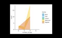
What happened? Because all insects have six legs, the function couldnot find another point on the x-axis to draw a connecting line and plotthe area underneath. As a result, insects completely disappeared. Thesame happened to fish and birds, which always have zero and two legs,respectively.
What the function needs is the information that insects with lessthan six legs are missing in the dataset because they do not exist. Thusit is save to replace the informationcount = NA with theinformationcount = 0.
You can fix the plot by settingreplace_na = TRUE.
animals|>tidyplot(x=number_of_legs, color=family)|>add_areastack_absolute(replace_na=TRUE)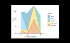
Multiplot layouts
Often times you have to generate identical plots for many differentsubsets of the same dataset. For example, you might look at a geneexpression dataset likegene_expression including manyindividual genes.
In such a case you can build your plot as usual using the entiredataset and then split the plot by the gene name using thesplit_plot() function.
gene_expression|># filter down to 4 genes for demonstrationdplyr::filter(external_gene_name%in%c("Apol6","Bsn","Vgf","Mpc2"))|># start plottingtidyplot(x=condition, y=expression, color=sample_type)|>add_mean_dash()|>add_sem_errorbar()|>add_data_points_beeswarm()|>add_test_asterisks(hide_info=TRUE)|>adjust_size(width=30, height=25)|>split_plot(by=external_gene_name, ncol=2, nrow=2)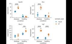
In case there are too many genes to fit on one page, you can alsospread them across a multipage PDF. To do so, just specify the maximumnumber of columnsncol and rowsnrow you wantto have on one page.
gene_expression|>tidyplot(x=condition, y=expression, color=sample_type)|>add_mean_dash()|>add_sem_errorbar()|>add_data_points_beeswarm()|>add_test_asterisks(hide_info=TRUE)|>adjust_size(width=30, height=25)|>split_plot(by=external_gene_name, ncol=3, nrow=3)|>save_plot("test.pdf")Orientation
Some plot elements like bars, areas or curve fits have an orientationthat needs to be inferred from the variables mapped to thex andy axis. For example, the following coderesults in vertical bars.
animals|>tidyplot(x=diet, y=weight)|>add_mean_bar(alpha=0.4)|>add_sem_errorbar()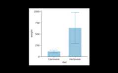
As expected, swapping thex andy argumentsresults in horizontal bars.
animals|>tidyplot(x=weight, y=diet)|>add_mean_bar(alpha=0.4)|>add_sem_errorbar()
In most cases the auto-detection of the orientation works well. Incase it does not fit your needs, you can manually set theorientation to either"x" or"y".
time_course|>tidyplot(x=score, y=day)|>add_curve_fit(orientation="x")|>add_title("orientation = x")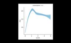
time_course|>tidyplot(x=score, y=day)|>add_curve_fit(orientation="y")|>add_title("orientation = y")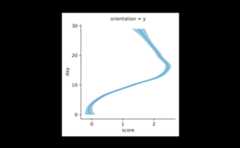
Padding
Per default, tidyplots gives the data points a little bit of extraspace towards the border of the plot area.
animals|>tidyplot(x=weight, y=speed)|>add_data_points()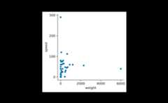
Thispadding, also known asexpansion in ggplot2,is 0.05 by default and can be changes using theadjust_padding() function.
animals|>tidyplot(x=weight, y=speed)|>add_data_points()|>adjust_padding(top=0.2, right=0.2, bottom=0.2, left=0.2)
To completely remove the padding, you can use theremove_padding() function. However, note that this willcause extreme values to fall onto the border of the plot area and bepartially cut off.
animals|>tidyplot(x=weight, y=speed)|>add_data_points()|>remove_padding()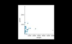
When using certain types of plot components, tidyplots automaticallyadapts the padding to improve the look of the plot. For example, inbar andarea plots the padding between thebar orarea and the axis is removed.
study|>tidyplot(x=treatment, y=score, color=treatment)|>add_mean_bar(alpha=0.4)|>add_sem_errorbar()|>add_data_points()
You can re-introduce the bottom padding like so.
study|>tidyplot(x=treatment, y=score, color=treatment)|>add_mean_bar(alpha=0.4)|>add_sem_errorbar()|>add_data_points()|>adjust_padding(bottom=0.05)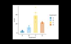
Dodging
Dodging refers to the distance between grouped objects. In plots withat least one discrete axis the default is 0.8 and looks like this.
study|>tidyplot(x=group, y=score, color=dose)|>add_mean_bar(alpha=0.4)|>add_sem_errorbar()|>add_data_points()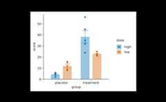
Decreasing thedodge_width in thetidyplots() function call decreases the spacing betweengrouped bars.
study|>tidyplot(x=group, y=score, color=dose, dodge_width=0.4)|>add_mean_bar(alpha=0.4)|>add_sem_errorbar()|>add_data_points()
Settingdodge_width = 0 results in completelyoverlapping positions.
study|>tidyplot(x=group, y=score, color=dose, dodge_width=0)|>add_mean_bar(alpha=0.4)|>add_sem_errorbar()|>add_data_points()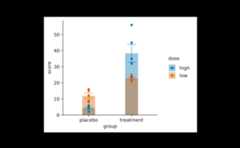
In plots with two continuous axes the defaultdodge_width is zero. However, you can always override thedefault using thedodge_width argument of thetidyplot() function.
time_course|>tidyplot(x=day, y=score, color=treatment)|>add_mean_line()|>add_mean_dot()
Coloring
tidyplots follows are quite straight forward approach when dealingwith color. The variable that should be encoded by colors is passed viathecolor argument to thetidyplot()function.
study|>tidyplot(x=group, y=score, color=dose)|>add_mean_bar(alpha=0.4)|>add_sem_errorbar()|>add_data_points()
In ggplot2, the plotting package that underlies tidyplots, colors arelittle more complicated. ggplot2 distinguishes between the fill color ofan objectfill and the stroke color of an objectcolor. Some objects like bars can have both, while otherobjects like lines just have a strokecolor but nofill.
Usually, tidyplots users do not have to care about these details.Internally, tidyplots matches bothfill andcolor to the same color. And this is the color that comesin as thecolor argument into thetidyplot()function.
In some cases though, you might want to take manual control over thefill and strokecolor of specific objects.
For example, you want to plot a boxplot without thefillcolor.
study|>tidyplot(x=group, y=score, color=dose)|>add_boxplot(fill=NA)
Or with a black strokecolor.
study|>tidyplot(x=group, y=score, color=dose)|>add_boxplot(color="black")
Or you want to have black text labels.
study|>tidyplot(x=group, y=score, color=dose)|>add_mean_bar(alpha=0.4)|>add_mean_value(color="black")
Alpha versus saturation
Sometimes you want to decrease the intensity of your colors.
study|>tidyplot(x=group, y=score, color=dose)|>add_mean_bar()|>theme_minimal_y()
One way to do this is to reduce the opacity by decreasing the alphaargument. Note how the horizontal lines start to shine through thebars.
study|>tidyplot(x=group, y=score, color=dose)|>add_mean_bar(alpha=0.4)|>theme_minimal_y()
In theadd_mean_bar() family of functions, inadd_violin() and inadd_boxplots() functions,tidyplots offers one additional method using thesaturationargument.
study|>tidyplot(x=group, y=score, color=dose)|>add_mean_bar(saturation=0.3)|>theme_minimal_y()
Note how here the saturation is decreased without making the barstransparent. Thus, the horizontal lines do not shine through thebars.
Special characters
When it comes to scientific plots, titles often contain specialcharacters like Greek symbols, subscript or superscript. For thispurpose, tidyplots supportsplotmath expressions.
Besides finding out how to use theplotmathexpression syntax, please note that in tidyplots all plotmathexpressions need to start and end with a$ character.Moreover, you can not mix plotmath with plain text in one string,instead the entire string needs to be a valid plotmath expression thatincludes the plain text.
study|>tidyplot(x=treatment, y=score, color=treatment)|>add_data_points()|>add_mean_bar(alpha=0.4)|>add_sem_errorbar()|>adjust_title("$H[2]*O$")|>adjust_x_axis_title("$E==m*c^{2}$")|>adjust_y_axis_title("$TNF*alpha~level$")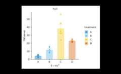
ggplot2 compatibiliy
tidyplots is built on ggplot2, yet the two packages differ in severalkey aspects. The most noticeable difference is probably that tidyplotsconsistently uses the pipe|> to add plot componentswhile ggplot uses+ .
There is still a certain compatibility of both systems. For example,you can transform a ggplot to tidyplot using theas_tidyplot() function.
Also, you can add ggplot code to a tidyplot using theadd() helper function.
study|>tidyplot(x=treatment, y=score, color=treatment)|>add_mean_bar(alpha=0.4)|>add(ggplot2::geom_point())
However, be ready to experience unexpected hiccups, when mixingggplot and tidyplots, since ensuring compatibility in every edge casewas not a priority when developing the tidyplots package.
What’s more?
To dive deeper into code-based plotting, here a couple ofresources.
tidyplots documentation
Packageindex
Overview of all tidyplots functionsGetstarted
Getting started guideVisualizingdata
Article with examples for common data visualizationsAdvancedplotting
Article about advanced plotting techniques and workflowsColorschemes
Article about the use of color schemes
Other resources
Hands-OnProgramming with R
Free online book by Garrett GrolemundR for Data Science
Free online book by Hadley WickhamFundamentals of DataVisualization
Free online book by Claus O. Wilke