Uh oh!
There was an error while loading.Please reload this page.
- Notifications
You must be signed in to change notification settings - Fork2.8k
Description
I love our playground. It has so many great features that have made so many tools I used to maintain completely obsolete.
Well... On my desktop/laptop.
Now a days the majority of my maintenance is done from mobile. In particular reviewing issues.
Unfortunately on mobile the playground is pretty much unusable because the left bar takes up most of the screen:
If you put chrome into "desktop mode" it's a little more usable, except Monaco will capture touch actions - meaning if you zoom in on the editor you get stuck and cannot escape!
Additionally we rely solely on hover to expose error messages. On mobile there is no hover, meaning you cannot see error messages!
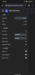
Contrast this to the new eslint playground:https://new.eslint.org/play
 |  |
It has an entire section dedicated to showing the errors - meaning hover isn't necessary.
Additionally the design is such that config becomes a hidden full screen modal.
Finally the editor is a fixed size and zoom is disabled - meaning you can't get stuck!
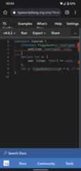
Another good example is the TS playground. They hit many of the same beats - a separate area to show errors, fixed size editor and config as a modal.
 |  |  |
Though there are definitely more than a few quirks in the TS playground's UI on mobile - I find it is still fully usable for most of what I want to do.
I think that we can definitely do better here!
Some quick ideas for based on the examples:
- add a new panel that shows by default which lists the problems currently visible in the editor.
- eg this would show both eslint and TypeScript errors.
- this would replace our "none" state for the right panel.
- responsive layout which restructures the page on small width screens
- hide the config bar behind a button
- put the right panel below the editor
- fix the editor width to max screen width and ensure its not 100vh in height
- disable zooming
