- Notifications
You must be signed in to change notification settings - Fork0
React library of essential UI components and form controls
License
svar-widgets/react-core
Folders and files
| Name | Name | Last commit message | Last commit date | |
|---|---|---|---|---|
Repository files navigation


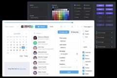
SVAR React Core is a lightweight, fast, and mobile-friendly React component library that offers 20+ reusable, pre-styled UI components. It includes form controls, popups, date & time pickers, toast notifications, and more. All components are customizable, support light and dark themes, and come with full TypeScript support.
The library is fully compatible with React 18 and 19.
Along with theCore library, you can use the following SVAR React components to build a unified app interface:
- Menu - create basic menu bar, actions or context menu;
- Toolbar - create button and icon panels with configurable, responsive layouts;
- Tasklist - basic to-do list component to add, edit, check or delete tasks;
- Comments - nice-looking comments section with bubbles or flow views;
- File uploader - simple file uploader component.
To start using the components from theCore package, simply import the package and include the desired component in your React file:
import{Button}from"@svar-ui/react-core";import"@svar-ui/react-core/all.css";constmyComponent=>(<Button>Click me</Button>);
See thegetting started guide to quickly set up and begin using SVAR Core components in your React projects.
Post an Issue or use ourcommunity forum.
About
React library of essential UI components and form controls
Topics
Resources
License
Uh oh!
There was an error while loading.Please reload this page.
Stars
Watchers
Forks
Packages0
Contributors3
Uh oh!
There was an error while loading.Please reload this page.