Uh oh!
There was an error while loading.Please reload this page.
- Notifications
You must be signed in to change notification settings - Fork26
Tidy Plots for Scientific Papers
License
Unknown, MIT licenses found
Licenses found
jbengler/tidyplots
Folders and files
| Name | Name | Last commit message | Last commit date | |
|---|---|---|---|---|
Repository files navigation


The goal oftidyplots is to streamline the creation ofpublication-ready plots for scientific papers. It allows to graduallyadd, remove and adjust plot components using a consistent and intuitivesyntax.
Engler, Jan Broder. 2025. “Tidyplots Empowers Life Scientists With EasyCode-Based Data Visualization.”iMeta e70018.https://doi.org/10.1002/imt2.70018
You can install the released version of tidyplots fromCRAN with:
install.packages("tidyplots")And the development version fromGitHub with:
# install.packages("pak")pak::pak("jbengler/tidyplots")
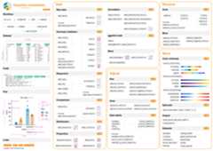
This cheatsheet gives a high level overview of available functions.
Here are some examples.
Also have a look at thegetting startedguide andthefulldocumentation. Formore example plots, check out thetidyplots usecases website.
library(tidyplots)study|> tidyplot(x=treatment,y=score,color=treatment)|> add_mean_bar(alpha=0.4)|> add_sem_errorbar()|> add_data_points_beeswarm()

energy|> tidyplot(x=year,y=energy,color=energy_source)|> add_barstack_absolute()

energy|>dplyr::filter(year%in% c(2005,2010,2015,2020))|> tidyplot(y=energy,color=energy_source)|> add_donut()|> adjust_size(width=25,height=25)|> split_plot(by=year)

energy_week|> tidyplot(x=date,y=power,color=energy_source)|> add_areastack_absolute()

energy_week|> tidyplot(x=date,y=power,color=energy_source)|> add_areastack_relative()

study|> tidyplot(x=group,y=score,color=dose)|> add_mean_bar(alpha=0.4)|> add_mean_dash()|> add_mean_value()

time_course|> tidyplot(x=day,y=score,color=treatment)|> add_mean_line()|> add_mean_dot()|> add_sem_ribbon()

climate|> tidyplot(x=month,y=year,color=max_temperature)|> add_heatmap()

study|> tidyplot(x=treatment,y=score,color=treatment)|> add_boxplot()|> add_test_pvalue(ref.group=1)

gene_expression|>dplyr::filter(external_gene_name%in% c("Apol6","Col5a3","Vgf","Bsn"))|> tidyplot(x=condition,y=expression,color=sample_type)|> add_mean_dash()|> add_sem_errorbar()|> add_data_points_beeswarm()|> add_test_asterisks(hide_info=TRUE)|> remove_x_axis_title()|> adjust_size(width=25,height=25)|> split_plot(by=external_gene_name)

study|> tidyplot(x=treatment,y=score,color=treatment)|> add_mean_bar(alpha=0.4)|> add_sem_errorbar()|> add_data_points_beeswarm()|> view_plot(title="Default color scheme: 'friendly'")|> adjust_colors(colors_discrete_apple)|> view_plot(title="Alternative color scheme: 'apple'")


Package index
Overview of all tidyplots functionsGetstarted
Getting started guideVisualizingdata
Article with examples for common data visualizationsAdvancedplotting
Article about advanced plotting techniques and workflowsColorschemes
Article about the use of color schemes
I would like to thank Lars Binkle-Ladisch for our insightful discussionsand for consistently challenging my decisions regarding the naming offunctions and their arguments.
Many thanks to the R and tidyverse communities. tidyplots is built upontheir software and coding paradigms, and it would not have been possiblewithout their contributions.
tidyplots relies on several fantastic packages that handle all the heavylifting behind the scenes. These include cli, dplyr, forcats,ggbeeswarm, ggplot2, ggpubr, ggrastr, ggrepel, glue, Hmisc, htmltools,lifecycle, purrr, rlang, scales, stringr, tidyr, and tidyselect.
About
Tidy Plots for Scientific Papers
Resources
License
Unknown, MIT licenses found
Licenses found
Uh oh!
There was an error while loading.Please reload this page.
Stars
Watchers
Forks
Sponsor this project
Uh oh!
There was an error while loading.Please reload this page.

Packages0
Uh oh!
There was an error while loading.Please reload this page.
Contributors3
Uh oh!
There was an error while loading.Please reload this page.