- Notifications
You must be signed in to change notification settings - Fork29
An iOS progress indicator view library written in SwiftUI
License
exyte/ProgressIndicatorView
Folders and files
| Name | Name | Last commit message | Last commit date | |
|---|---|---|---|---|
Repository files navigation
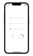
Create a progress indicator like this:
ProgressIndicatorView(isVisible: $showProgressIndicator, type:.bar(progress: $progress))
whereshowProgressIndicator - bool value you may change to display or hide the indicatortype - value fromProgressIndicatorView.IndicatorType enum
You may alter it with standard SwiftUI means like this:
ProgressIndicatorView(isVisible: $showProgressIndicator, type:.bar(progress: $progress)).frame(width:50.0, height:50.0).foregroundColor(.red)
default - progress indicator looks like default iOS UIActivityIndicator.bar - line progress bar with a Binding progress value and background color, default isColor.clear:
ProgressIndicatorView(isVisible: $showProgressIndicator, type:.bar(progress: $progress, backgroundColor:.gray)).frame(height:8.0).foregroundColor(.red)
impulseBar - impulse line bar, works asbar indicator with an impulse effect.dashBar - discrete line bar, with number of pieces, default is 8:
ProgressIndicatorView(isVisible: $showProgressIndicator, type:.dashBar(progress: $progress, numberOfItems:8)).frame(height:8.0).foregroundColor(.red)
circle - cirle progress indicator, withlineWidth andstrokeColor:
ProgressIndicatorView(isVisible: $showProgressIndicator, type:.circle(progress: $progress, lineWidth:8.0, strokeColor:.red)).frame(height:8.0).foregroundColor(.red)
To try the ProgressIndicatorView examples:
- Clone the repo
https://github.com/exyte/ProgressIndicatorView.git - Open
ProgressIndicatorViewExample.xcodeprojin the Xcode - Try it!
dependencies:[.package(url:"https://github.com/exyte/ProgressIndicatorView.git", from:"0.0.1")]
- iOS 13+ / watchOS 6+ / tvOS 13+ / macOS 10.15+
- Xcode 11+
PopupView - Toasts and popups library
AnchoredPopup - Anchored Popup grows "out" of a trigger view (similar to Hero animation)
Grid - The most powerful Grid container
ScalingHeaderScrollView - A scroll view with a sticky header which shrinks as you scroll
AnimatedTabBar - A tabbar with a number of preset animations
MediaPicker - Customizable media picker
Chat - Chat UI framework with fully customizable message cells, input view, and a built-in media picker
OpenAI Wrapper lib forOpenAI REST API
AnimatedGradient - Animated linear gradient
ConcentricOnboarding - Animated onboarding flow
FloatingButton - Floating button menu
ActivityIndicatorView - A number of animated loading indicators
FlagAndCountryCode - Phone codes and flags for every country
SVGView - SVG parser
LiquidSwipe - Liquid navigation animation
About
An iOS progress indicator view library written in SwiftUI
Resources
License
Uh oh!
There was an error while loading.Please reload this page.
Stars
Watchers
Forks
Packages0
Uh oh!
There was an error while loading.Please reload this page.
Contributors5
Uh oh!
There was an error while loading.Please reload this page.


