- Notifications
You must be signed in to change notification settings - Fork16
SSJetPackComposeProgressButton is an elegant button with a different loading animations. 🚀
License
SimformSolutionsPvtLtd/SSJetPackComposeProgressButton
Folders and files
| Name | Name | Last commit message | Last commit date | |
|---|---|---|---|---|
Repository files navigation

SSJetPackComposeProgressButton is an elegant button with a different loading animations which makes your app attractive.


- Android’s modern toolkit - Jetpack Compose support.
- Newly designed loading animation make your app attractive.
- Blinking icon button for your hot-feature.
- Button with text, right and left icon.
- Different types of state makes it easy to manage button. (Idle, Loading, Success, Failure)
- Fully customized button (Corner radius, background, colors, animation speed etc.)
- Customize button loading animation with your logo and special animation effect.
- Supports displaying GIFs via URL or local file in the button's loading state.
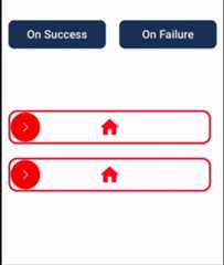
- Supports swipe to animate buttons.
| On Success | On Failure |
|---|---|
 |  |
| On Success | On Failure |
|---|---|
 |  |
| On Success | On Failure |
|---|---|
 |  |
Add it in your root build.gradle at the end of repositories:
allprojects {repositories {...maven { url'https://jitpack.io' }}}
Add the dependency in your app's build.gradle file
dependencies { implementation'com.github.SimformSolutionsPvtLtd:SSJetPackComposeProgressButton:<LATEST_TAG>' }
Just use SSJetPackComposeProgressButton where you want button.
var submitButtonState by remember { mutableStateOf(SSButtonState.IDLE) }SSJetPackComposeProgressButton( type=SSButtonType.CLOCK, width=300.dp, height=50.dp, onClick= {//Perform action on click of button and make it's state to LOADING submitButtonState=SSButtonState.LOADING }, assetColor=Color.Red, buttonState= submitButtonState )
// On Success change submitButtonState to success state submitButtonState=SSButtonState.SUCCESS
// On Failure change submitButtonState to failure state submitButtonState=SSButtonState.FAILIURE
Migration guide from releasev1.0.9
- Added support displaying GIFs via URL or local file in the button's loading state.
- Added
blinkingIconColorto animate with your custom color. - You can now apply different tints by using these updated variables:
leftImageIconTintColorrightImageTintColorsuccessIconTintColorfailureIconTintColorThese variables allow you to customize tints as per your specific requirements, while defaulting tonullif not specified. - Changed default
cornerRadiusvalue to0from20. - Renamed
blinkingIcontoisBlinkingIconinSSJetPackComposeProgressButton. - Renamed
colorChangerinfadeInOutinSSCustomLoadingEffect. - Removed
buttonBorderStrokeand instead usebuttonBorderWidth,buttonBorderColorandanimatedButtonBorderColorto offer more control over button borders. - Removed default values for
successIconPainterandfailureIconPainterand set tonullto offermore control over what is displayed when animation is completed. - Removed default value for
customLoadingIconPainterand set tonullto offermore control over what is displayed when animation is in progress.
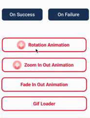
You can customize loading icon and animation effect according to your requirement.You can applymultiple animation effect from rotation, zoom-in-out and fade-in-out too.
var submitButtonState by remember { mutableStateOf(SSButtonState.IDLE) }SSJetPackComposeProgressButton( type=SSButtonType.CUSTOM, width=480.dp, height=60.dp, onClick= {//Perform action on click of button and make it's state to LOADING submitButtonState=SSButtonState.LOADINGCoroutineScope(Dispatchers.Default).launch {// Do your heavy work once completed show success or failure delay(2000) submitButtonState=SSButtonState.SUCCESS } }, cornerRadius=20, assetColor=Color.Red, buttonState= submitButtonState, successIconPainter= rememberVectorPainter(image=Icons.Default.Done), successIconTintColor=LIGHT_PINK, failureIconPainter= rememberVectorPainter(image=Icons.Outlined.Info), failureIconTintColor=LIGHT_PINK, colors=ButtonDefaults.buttonColors( containerColor=Color.White, disabledContainerColor=Color.White ), padding=PaddingValues(12.dp), text= stringResource(id=R.string.app_name), textModifier=Modifier.padding(10.dp), fontWeight=FontWeight.Bold, leftImagePainter= painterResource(id=R.drawable.baby_pink_android), isBlinkingIcon=true, blinkingIconColor=Color.White, buttonBorderWidth=3.dp, animatedButtonBorderColor=LIGHT_PINK, buttonBorderColor=LIGHT_PINK, customLoadingIconPainter= painterResource(id=R.drawable.baby_pink_android), customLoadingEffect=SSCustomLoadingEffect( zoomInOut=true, ) )
// On Success change submitButtonState to success state submitButtonState=SSButtonState.SUCCESS
// On Failure change submitButtonState to failure state submitButtonState=SSButtonState.FAILIURE
| Attribute | Description | Default |
|---|---|---|
type | Choose type of animation from:[CIRCLE, WHEEL, ZOOM_IN_OUT_CIRCLE, CLOCK, SPIRAL, CUSTOM] | None |
width | Width to be applied to the button. | None |
height | Height to be applied to the button. | None |
onClick | Will be called when the user clicks the button. | None |
assetColor | Color to be applied to icon and text inside button. | None |
buttonState | Represent the state of button from IDLE, LOADING, SUCCESS, FAILIURE from SSButtonState. | None |
buttonBorderWidth | Border width to draw around the button. | 0.dp |
buttonBorderColor | Border color to be applied around the button. | 0.dp |
animatedButtonBorderColor | Border color to be applied around the button when button is in LOADING state. | 0.dp |
isBlinkingIcon | Icon will be blink with size and color. | false |
blinkingIconColor | Color which will be used with Icon tintColor whenisBlinkingIcon is enabled. | null |
cornerRadius | Corner radius to be applied to the button. | 20 |
speedMillis | Speed of the animation while changing the state. | 1000 |
enabled | Controls the enabled state of the button. | true |
elevation | It is used to resolve the elevation for this button in different. | ButtonDefaults.elevatedButtonElevation() |
colors | Colors that will be used to resolve the background and content color for this button in different states | ButtonDefaults.buttonColors() |
padding | The spacing values to apply internally between the container and the content. | PaddingValues(0.dp) |
alphaValue | The alpha of the drawn area. | 1f |
leftImagePainter | Painter to draw inside this left Icon. | null |
leftImageTintColor | Color to be applied to left image. | null |
rightImagePainter | Painter to draw inside this right Icon. | null |
rightImageTintColor | Color to be applied to right image. | null |
successIconPainter | Painter to draw inside this success state Icon. | null |
successIconTintColor | Color to be applied to success icon. | null |
failureIconPainter | Painter to draw inside this failure state Icon. | null |
failureIconTintColor | Color to be applied to failure icon. | null |
text | The text to be displayed. | null |
textModifier | To apply to this text layout node. | Modifier |
fontSize | The size of glyphs to use when painting the text. | TextUnit.Unspecified |
fontStyle | The typeface variant to use when drawing the letters (e.g., italic). | null |
fontFamily | The font family to be used when rendering the text. | null |
fontWeight | The typeface thickness to use when painting the text (e.g., [FontWeight.Bold]). | null |
hourHandColor | Color will be apply to hour hand in clock type animation only. | Color.Black |
customLoadingIconPainter | painter [Painter] to draw your custom loading icon. | painterResource(id = R.drawable.simform_logo) |
customLoadingEffect | Custom loading animation type like roation, zoom in out etc. | SSCustomLoadingEffect( rotation = false, zoomInOut = false, colorChanger = false) |
customLoadingPadding | Spacing between button border and loading icon. | 0.dp |
shouldAutoMoveToIdleState | In case of success/failure state after defined time it move back to idle state. | true |
swipeAbleButtonPadding | Spacing for swipeAble button icon. | true |
swipeAbleButtonThreshold | Threshold for swipe button, once this threshold will reach it will consider button as loading state based onshouldAutomateSwipeToAnimate. | 0.5f |
shouldAutomateSwipeToAnimate | Based on this it will determine if button should move to loading state onceswipeAbleButtonThreshold has been reached or should wait for user to stop swipe. | false |
onSwipeAbleButtonDragPercentageUpdate | This will give callback of the progress update when the swipe is in progress. | None |
onSwiped | This will give callback once swipe is reached at threshold and button moves to loading state. | None |
SSComposeCookBook : A Collection of major Jetpack compose UI components which are commonly used.
Support it by joiningstargazers for this repository.⭐
Whether you're helping us fix bugs, improve the docs, or a feature request, we'd love to have you! 💪Check out ourContributing Guide for ideas on contributing.
For bugs, feature requests, and discussion please useGitHub Issues.
For more info go toProgress Button using JetPack Compose : SSJetPackComposeProgressButton
- Check out our other availableawesome mobile libraries
Distributed under the MIT License. SeeLICENSE for details.
About
SSJetPackComposeProgressButton is an elegant button with a different loading animations. 🚀
Topics
Resources
License
Code of conduct
Contributing
Uh oh!
There was an error while loading.Please reload this page.
Stars
Watchers
Forks
Packages0
Contributors10
Uh oh!
There was an error while loading.Please reload this page.