- Notifications
You must be signed in to change notification settings - Fork0
RussCob/D3.JS-Project
Folders and files
| Name | Name | Last commit message | Last commit date | |
|---|---|---|---|---|
Repository files navigation
Welcome to the newsroom! You've just accepted a data visualization position for a major metro paper. You're tasked with analyzing the current trends shaping people's lives, as well as creating charts, graphs, and interactive elements to help readers understand your findings.
The editor wants to run a series of feature stories about the health risks facing particular demographics. She's counting on you to sniff out the first story idea by sifting through information from the U.S. Census Bureau and the Behavioral Risk Factor Surveillance System.
The data set included with the assignment is based on 2014 ACS 1-year estimates:https://factfinder.census.gov/faces/nav/jsf/pages/searchresults.xhtml, but you are free to investigate a different data set. The current data set includes data on rates of income, obesity, poverty, etc. by state. MOE stands for "margin of error."
Create a new repository for this project called
D3-challenge.Do not add this homework to an existing repository.Clone the new repository to your computer.
Inside your local git repository, create a directory for the D3 challenge. Use the folder name to correspond to the challenge:D3_data_journalism.
This homeworks utilizes bothhtml andJavascript so be sure to add all the necessary files. These will be the main files to run for analysis.
Push the above changes to GitHub or GitLab.
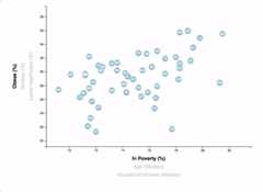
You need to create a scatter plot between two of the data variables such asHealthcare vs. Poverty orSmokers vs. Age.
Using the D3 techniques we taught you in class, create a scatter plot that represents each state with circle elements. You'll code this graphic in theapp.js file of your homework directory—make sure you pull in the data fromdata.csv by using thed3.csv function. Your scatter plot should ultimately appear like the image at the top of this section.
Include state abbreviations in the circles.
Create and situate your axes and labels to the left and bottom of the chart.
Note: You'll need to use
python -m http.serverto run the visualization. This will host the page atlocalhost:8000in your web browser.
Why make a static graphic when D3 lets you interact with your data?
You're going to include more demographics and more risk factors. Place additional labels in your scatter plot and give them click events so that your users can decide which data to display. Animate the transitions for your circles' locations as well as the range of your axes. Do this for two risk factors for each axis. Or, for an extreme challenge, create three for each axis.
- Hint: Try binding all of the CSV data to your circles. This will let you easily determine their x or y values when you click the labels.
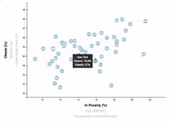
While the ticks on the axes allow us to infer approximate values for each circle, it's impossible to determine the true value without adding another layer of data. Enter tooltips: developers can implement these in their D3 graphics to reveal a specific element's data when the user hovers their cursor over the element. Add tooltips to your circles and display each tooltip with the data that the user has selected. Use thed3-tip.js plugin developed byJustin Palmer—we've already included this plugin in your assignment directory.
- Check outDavid Gotz's example to see how you should implement tooltips with d3-tip.
Your final product will be assessed on the following metrics:
Creation of anew repository on GitHub called
D3-Challenge(note the kebab-case). Do not add to an already existing repo.Completion of all steps in the core assignment
Coherency of scatter plot (labels, ticks)
Visual attraction
Professionalism
Ensure your repository has regular commits (i.e. 20+ commits) and a thorough README.md file
Good luck!
Trilogy Education Services © 2019. All Rights Reserved.
About
Analyzing the current trends shaping people's lives, as well as creating charts, graphs, and interactive elements to help readers understand your findings.
Topics
Resources
Uh oh!
There was an error while loading.Please reload this page.


