

Using the analytics dashboards
This pageapplies toApigee andApigee hybrid.
View Apigee Edge documentation.
Analytics dashboards help you see and detect changes in your API ecosystem at a glance. The ability to see what has changed over time helps you identify problems and take corrective action quickly.
For a quick overview of API Analytics, who uses them, and why, seeApigee API Analytics overview.
Note: There is a limit to the amount of data that can be reported in the Analytics dashboards. If the amount of analytics data returned by the query exceeds this limit, then the dashboard will display the results for a partial set of data and a warning will be displayed on the dashboard (Public Cloud only).
As an alternative, you can export analytics data from Apigee Analytics to your own data repository, such as Google Cloud Storage or BigQuery. You can then take advantage of the powerful query and machine learning capabilities offered by Google Cloud BigQuery and TensorFlow to perform your own data analysis. SeeExport data from Analytics for more.
What can you learn from the dashboards?
Has there been a sudden spike or drop off in API traffic? Which app developers are most successful? What is the adoption rate of your API among developers? Which API methods are most popular? The Analytics dashboards are designed specifically to answer questions like these.
In the background, Apigee collects information as data passes through your APIs. The dashboards provide a powerful way to use this data immediately. If you see something of interest in a graph or chart, an anomaly or sudden change, you can then drill deeper to uncover as much detail as you require. If you notice that a particular developer is experiencing a lot of errors or a sudden drop in traffic, you can contact that developer proactively. Dashboards give you insight into your APIs that allows you to take action.
What's the delay interval for receiving data?
Can I customize the dashboards?
Yes, many dashboards let you select which metrics to analyze, date ranges, data aggregation intervals, and many other variables. If the built-in dashboards do not suit your needs, you can createcustom reports, which are dashboards you create by selecting the analytic dimensions and metrics that you wish to analyze. Custom reports let you "drill down" into your API's analytic data until you achieve the granularity you require.
What are the most common features in the dashboards?
Dashboards have a set of common features, including setting time range, click and drag zooming on charts, mouse-over hover for more details on charts and other regions, and selectors for choosing the data to display in a chart. If you understand how to use one kind of dashboard, you'll be comfortable using the others.
Note:For the specific features of each dashboard, view the documentation for that dashboard.The following figure highlights these common feature areas:
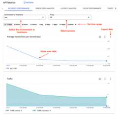
- Environment or Host name - Select the environment or host name in the organization.
Set the time range - Set the time range over which the dashboard displays its data.
Note: For Cloud-based installations, data older than six months from the current date is not accessible by default. If you want to access data older than six months, contactGoogle Cloud Customer Care.- Zoom in - You can zoom in on chart data by clicking and dragging a region of the chart. When you complete the drag, the chart zooms in to the selected region.
- Export data to file - Download a single CSV file that contains the set of data for the chart.
- Hover mouse over graphs - You can mouse over any point on a graph for more context about the data at that point.
Except as otherwise noted, the content of this page is licensed under theCreative Commons Attribution 4.0 License, and code samples are licensed under theApache 2.0 License. For details, see theGoogle Developers Site Policies. Java is a registered trademark of Oracle and/or its affiliates.
Last updated 2026-02-19 UTC.