

Geomap dashboard
This pageapplies toApigee andApigee hybrid.
View Apigee Edge documentation.
What does this dashboard tell me?
The Geomap dashboard tracks traffic patterns, error patterns, and quality of service across geographical locations. You can view information about all your APIs, or zoom in on specific ones. This dashboard helps you assess:
- API growth trends - Use theSum of traffic metric to see where your traffic is coming from. By using different time periods you can see which countries generate the most traffic at which times. You can also record traffic rates over different time periods to see trends in growth.
- Error trends - Use theSum of error count metric to see where API errors are coming from. By using different time periods you can see which countries generate the most errors at which times. You can also record error rates over different time periods to see trends in growth.
- Quality of service - Use theAverage of total response time andAverage of target response time metrics to see how your backend services are performing by country.
The Geomap Dashboard
Required roles: To access theGeomap dashboard, you must have the following IAM predefined roles:roles/apigee.analyticsViewerroles/apigee.analyticsEditorroles/apigee.addonsconfig.get
For more information, seeHow to specify a predefined role.
To access the Geomap dashboard:
In the Google Cloud console, go to theAnalytics> End user analysis> Geomap page.
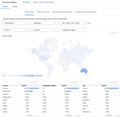
The dashboard opens as shown:
What does this dashboard measure?
By default, the dashboard displays theSum of traffic metric. The following table describes each of the metrics tracked by the Geomap dashboard:
| Metric | Description |
|---|---|
| Sum of traffic | Also known as throughput. The number of API requests and resulting responses seen by the organization. |
| Sum of error count | The total number of all API requests that are unsuccessful, that is, the request does not deliver a response as desired by the end user. |
| Average of total response time | The time an API takes to respond to an incoming request. |
| Average of target response time | The average time it takes the target endpoint to respond to an incoming request for the selected period. |
Using the dashboard
The dashboard has a set of dropdown menus that you can use to filter the information shown in it. The filter dropdown menus are dynamic. For example, if you select an environment from the Environments dropdown, then any proxies, hostnames, countries, and regions associated with that environment are automatically selected in the other dropdown menus, charts, and tables. For more information, seeAbout filter properties in the Looker Studio documentation.
Use the date selector to pick a start and end date to measure. The date selector only lets you select dates in day increments. You can't select a time range increment that is smaller than a day.
The map is interactive. Click a country to see traffic for that country. You can right-click a data table for actions like sorting and exporting data.
Note: Seeing a dimension entity named(not set)? For more information, see What does an analytics entity named (not set) mean?What else do I need to know about this dashboard?
By default, the dashboard displays metrics for all API proxies. Alternatively, select an API proxy to measure from theProxies dropdown menu.
Select an entry under theCountries andGeographical regions lists to drill down on specific countries, states, and cities (depending on the specific geography of the country you are interested in). For example, you can look at United States data, then select a geographical region, and then view a list of cities from which traffic is generated. You can click a city name in the table to see traffic for that city.
This dashboard uses standard controls, like the date selector, hovering over maps for more context, exporting data to CSV, and so on. To learn more, seeUsing the analytics dashboards.
Make a copy in Looker Studio
You can edit, save, and share a copy of the dashboard inLooker Studio. To get started:
- ClickMake a copy in Looker Studio.
- From the dropdown menu, select the report you wish to copy.
- In Looker Studio, clickSave and share.
- ClickAcknowledge and save.
You can now edit the copy saved in your user account. For details on using Looker Studio to edit and create reports, see theLooker Studio documentation.
Note: Any changes you make in Looker Studio are not reflected back in the Apigee dashboard.Except as otherwise noted, the content of this page is licensed under theCreative Commons Attribution 4.0 License, and code samples are licensed under theApache 2.0 License. For details, see theGoogle Developers Site Policies. Java is a registered trademark of Oracle and/or its affiliates.
Last updated 2025-12-17 UTC.