CSS properties to customize Places UI Kit
The Places UI Kit supports a variety of settings and custom CSS properties to configure the display elements. Use thisCSS properties reference table to see how these properties can be applied to the UI Kit.
Use theCustomization tool to visualize how different sets of properties will affect the appearance of a Places Details element and access the code in HTML/CSS, Kotlin/XML, and Swift.
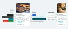
The Places UI Kit offers a design system approach to visual customization roughly based onMaterial Design (with some Google Maps-specific modifications). See Material Design's reference forColor andTypography. By default, the style adheres to the Google Maps visual design language.
Important: When making visual modifications, you must adhere to theAttribution requirements.CSS properties
| Property | Details Compact Element | Details Element | Usage |
|---|---|---|---|
| Color (system) | |||
--gmp-mat-color-surface | ✔ | ✔ | Container and dialog background |
--gmp-mat-color-on-surface | ✔ | ✔ | Headings, dialog content |
--gmp-mat-color-on-surface-variant | ✔ | ✔ | Place information |
--gmp-mat-color-primary | ✔ | ✔ | Links, loading indicator, overview icons |
--gmp-mat-color-disabled-surface | ✔ | Unfilled star rating | |
--gmp-mat-color-positive | ✔ | ✔ | Place "Open" now label |
--gmp-mat-color-positive-container | ✔ | Available EV charger badge | |
--gmp-mat-color-on-positive-container | ✔ | Available EV charger badge content | |
--gmp-mat-color-negative | ✔ | ✔ | Place "Closed" now label |
--gmp-mat-color-info | ✔ | ✔ | Accessible entrance icon |
--gmp-mat-color-secondary-container | ✔ | ✔ | Button background |
--gmp-mat-color-on-secondary-container | ✔ | ✔ | Button text and icon |
--gmp-mat-color-neutral-container | ✔ | ✔ | Review date badge, loading placeholder shapes |
--gmp-mat-color-on-neutral-container | ✔ | ✔ | Review date, loading error |
--gmp-mat-color-outline-decorative | ✔ | ✔ | Container border |
| Typography (system) | |||
--gmp-mat-font-family | ✔ | ✔ | Base font-family for all typography |
--gmp-mat-font-display-small | ✔ | Place name | |
--gmp-mat-font-headline-medium | ✔ | ✔ | Dialog headings |
--gmp-mat-font-title-small | ✔ | Place name | |
--gmp-mat-font-body-medium | ✔ | Place information, dialog content | |
--gmp-mat-font-body-small | ✔ | Place information | |
--gmp-mat-font-label-large | ✔ | ✔ | Button content |
--gmp-mat-font-label-medium | ✔ | Badge content | |
| Container (component) | |||
border (on :host) | ✔ | ✔ | Container |
border-radius (on :host) | ✔ | ✔ | Container |
Default color scheme
By default, Places UI Kit components automatically adapt to the user's preferred color scheme, detecting whether the user has their browser or system set to light or dark mode. The component's appearance will automatically adjust to match the user's preference.
When applying your own custom styles, ensure you test your changes in both light and dark modes to prevent visual inconsistencies. If your application uses a single, fixed theme, the automatic theme switching can lead to a poor user experience. For example, a dark-themed component might appear in your light-themed app. To prevent this, you can force the component to always render in a specific theme by settingcolor-scheme in CSS.
Google Maps brand attribution
| Property | Details Compact Element | Details Element | Usage |
|---|---|---|---|
| (black | white | gray) | ✔ | ✔ | Google Maps brand attribution, Google Maps disclosure button |
Google Maps' terms of service require you to use one of three brand colors for the Google Maps attribution. This attribution must be visible and accessible when customization changes have been made. See theAttribution requirements for more information.
We offer a choice of three brand colors that can be independently set for light and dark themes:
- Light theme:
PlaceAttributionElement.lightSchemeColorwith attributes for white, gray, and black. - Dark theme:
PlaceAttributionElement.darkSchemeColorwith attributes for white, gray, and black.
<gmp-place-content-config> <gmp-place-attribution light-scheme-color="black" dark-scheme-color="white" ></gmp-place-attribution></gmp-place-content-config>
Except as otherwise noted, the content of this page is licensed under theCreative Commons Attribution 4.0 License, and code samples are licensed under theApache 2.0 License. For details, see theGoogle Developers Site Policies. Java is a registered trademark of Oracle and/or its affiliates.
Last updated 2025-12-18 UTC.