
Widgets

Page Summary
Widgets are UI elements that provide structure, information, and actions within Google Workspace add-ons.
There are three main widget categories: structural, informational, and user interaction widgets, each with various specific widget types.
Cards, sections, and headers are structural widgets used to organize and contain other widgets, supporting navigation and layout functionalities.
Informational widgets like images, decorated text, and paragraphs present data to the user, supporting HTML formatting for enhanced visual representation.
User interaction widgets enable user input and actions, triggering responses like opening links, running functions, or displaying new content through elements like buttons, input fields, and selection inputs.
A widget is a UI element that provides one or more of the following:
- Structure for other widgets such as cards and sections,
- Information to the user such as text and images, or
- Affordances for action such as buttons, text input fields, or checkboxes.
Sets of widgets added to card sections define the overalladd-on UI. The widgetshave the same appearance and function on both web and mobile devices. Thereference documentationdescribes several methods for building widget sets.
Widget types
Add-on widgets are generally categorized into threegroups: structural widgets,informational widgets, and user interaction widgets.
Structural widgets
Structural widgets provide containers and organization for the other widgetsused in the UI.
- Button set—Acollection of one or more text or image buttons, grouped together in ahorizontal row.
- Card—A single contextcard that contains one or more card sections. You define how users can movebetween cards by configuringcard navigation.
- Card header—Theheader for a given card. Card headers can have titles, subtitles, and animage.Card actions anduniversal actions appear inthecard header if the add-on uses them.
- Card section—Acollected group of widgets, divided from the other card sections by ahorizontal rule and optionally having a section header. Each card must haveat least one card section. You cannot add cards or card headers to a cardsection.

In addition to these basic structural widgets, in aGoogle Workspace add-on you can usetheCard service to create structures that overlap the current card:fixed footers andpeek cards:
Fixed footer
You can add a fixed row of buttons to the bottom of your card. This rowdoesn't move or scroll with the rest of the card content.

The followingcode excerpt shows how to define an example fixed footer and add it to a card:
varfixedFooter=CardService.newFixedFooter().setPrimaryButton(CardService.newTextButton().setText("Primary").setOpenLink(CardService.newOpenLink().setUrl("https://www.google.com"))).setSecondaryButton(CardService.newTextButton().setText("Secondary").setOnClickAction(CardService.newAction().setFunctionName("secondaryCallback")));varcard=CardService.newCardBuilder()//(...).setFixedFooter(fixedFooter).build();Peek card

When newcontextual contentis triggered by a user action, such as opening aGmail message, you can either display the new contextual content immediately(default behavior) or display apeek card notification at the bottom of thesidebar. If a user clicks Backto return to yourhomepage while acontextual trigger is active, a peek card appears to help users find thecontextual content again.
To display a peek card when new contextual content is available, instead ofimmediately displaying the new contextual content, add.setDisplayStyle(CardService.DisplayStyle.PEEK) to yourCardBuilderclass. A peek card only appears if a single card object is returned with yourcontextual trigger; otherwise, the returned cards immediately replace thecurrent card.
To customize the peek card’s header, add the.setPeekCardHeader() method witha standardCardHeaderobject when building your contextual card. By default, a Peek card headercontains only the name of your add-on.

The following code, based on theCats Google Workspace add-on quickstart,notifies users about new contextual content with a Peek card and customizesthe Peek card's header to display the selected Gmail messagethread's subject.
varpeekHeader=CardService.newCardHeader().setTitle('Contextual Cat').setImageUrl('https://www.gstatic.com/images/icons/material/system/1x/pets_black_48dp.png').setSubtitle(text);...varcard=CardService.newCardBuilder().setDisplayStyle(CardService.DisplayStyle.PEEK).setPeekCardHeader(peekHeader);Informational widgets
Informational widgets present information to the user.
- Image—An imageindicated by a hosted and publicly accessbile URL you provide.
- DecoratedText—Atextcontent string that you can pair with other elements such as top and bottomtext labels, and an image or icon. DecoratedText widgets can also include aButton orSwitch widget. Added switchescan be toggles orcheckboxes. The content textof the DecoratedText widget can useHTML formatting; the topand bottom labels must use plain text.
- Text paragraph—Atext paragraph, which can includeHTML formatted elements.

User interaction widgets
User interaction widgets allow the add-on to respond to actions taken by theusers. You can configure these widgets with action responses todisplay different cards, open URLs, show notifications, compose draft emails,or run other Apps Script functions. See theBuilding Interactive Cards guide fordetails.
- Card action—A menuitem placed in the add-on header bar menu. The header bar menu can alsocontain items defined asuniversal actions,which appear on every card the add-on defines.
- DateTime pickers—widgetsthat allow users to select a date, time, or both. SeeDate and time pickersbelow for more information.
- Image button—Abutton that uses an image instead of text. You can use one of severalpredefined icons or a publicly-hosted image indicated by its URL.
- Selection input—Aninput field that represents a collection of options. Selection input widgetspresent as checkboxes, radio buttons or drop-down selection boxes.
- Switch—A togglewidget. You can only use switches in conjunction with aDecoratedText widget. By defaultthese display as a toggle switch, but you can cause them to display asacheckbox instead.
- Text button—Abutton with a text label. You can specify a background color fill for textbuttons (the default is transparent). You can also disable the button asneeded.
- Text input—A textinput field. The widget can have title text, hint text and multiline text.The widget can trigger actions when the text value changes.
- Grid—A multi-columnlayout that represents a collection of items. You can represent items with animage, title, subtitle, and a range of customization options such as borderand crop styles.


DecoratedText checkboxes
You can define aDecoratedTextwidget that has a checkbox attached, instead of a button or binary toggleswitch. Like with switches, the value of the checkbox is included in theaction event objectthat is passed to theActionattached to thisDecoratedTextby thesetOnClickAction(action)method.

The following code excerpt shows how to define a checkboxDecoratedTextwidget, which you can then add to a card:
vardecoratedText=CardService.newDecoratedText()//(...).setSwitch(CardService.newSwitch().setFieldName('form_input_switch_key').setValue('switch_is_on').setControlType(CardService.SwitchControlType.CHECK_BOX));Date and time pickers
You can define widgets that allow users to select a time, a date, or both.You can usesetOnChangeAction() to assign a widget handler function toexecute when the value of the picker changes.
The following code excerpt shows how to define a date-only picker, a time-onlypicker, and a date-time picker, which you can then add to a card:
vardateOnlyPicker=CardService.newDatePicker().setTitle("Enter a date").setFieldName("date_field")//SetdefaultvalueasMay242019.Eithera//numberorstringisacceptable..setValueInMsSinceEpoch(1558668600000).setOnChangeAction(CardService.newAction().setFunctionName("handleDateChange"));vartimeOnlyPicker=CardService.newTimePicker().setTitle("Enter a time").setFieldName("time_field")//Setdefaultvalueas23:30..setHours(23).setMinutes(30).setOnChangeAction(CardService.newAction().setFunctionName("handleTimeChange"));vardateTimePicker=CardService.newDateTimePicker().setTitle("Enter a date and time").setFieldName("date_time_field")//SetdefaultvalueasMay24201903:30AMUTC.//Eitheranumberorstringisacceptable..setValueInMsSinceEpoch(1558668600000)//EDTtimeis4hoursbehindUTC..setTimeZoneOffsetInMins(-4*60).setOnChangeAction(CardService.newAction().setFunctionName("handleDateTimeChange"));The following is an example of a date-time picker widget handler function. Thishandler formats and logs a string representing the date-time chosen bythe user in a date-time picker widget with the ID "myDateTimePickerWidgetID":
functionhandleDateTimeChange(event){vardateTimeInput=event.commonEventObject.formInputs["myDateTimePickerWidgetID"];varmsSinceEpoch=dateTimeInput.msSinceEpoch;varhasDate=dateTimeInput.hasDate;varhasTime=dateTimeInput.hadTime;//Thefollowingrequiresyoutoconfiguretheadd-ontoreaduserlocale//andtimezone.//Seehttps://developers.google.com/workspace/add-ons/how-tos/access-user-localevaruserTimezoneId=event.userTimezone.id;//Formatandlogthedate-timeselectedusingtheuser's timezone.varformattedDateTime;if(hasDate &&hasTime){formattedDateTime=Utilities.formatDate(newDate(msSinceEpoch),userTimezoneId,"yyy/MM/dd hh:mm:ss");}elseif(hasDate){formattedDateTime=Utilities.formatDate(newDate(msSinceEpoch),userTimezoneId,"yyy/MM/dd")+", Time unspecified";}elseif(hasTime){formattedDateTime="Date unspecified, "+Utilities.formatDate(newDate(msSinceEpoch),userTimezoneId,"hh:mm a");}if(formattedDateTime){console.log(formattedDateTime);}}
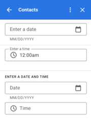
The following table shows examples of the picker selection UIs on desktop and mobiledevices. When selected, the date picker opens a month-based calendar UI to allowthe user to quickly select a new date.
When the user selects the time picker on desktop devices, a drop-down menu openswith a list of times separated in 30 minute increments that the user can selectfrom. The user can also type in a specific time. On mobile devices selecting atime picker opens the built-in mobile "clock" time picker.
| Desktop | Mobile |
|---|---|
 |  |
 |  |
Grid
Display items in a multi-column layout with the grid widget. Each item candisplay an image, title, and subtitle. Use additional configuration options toset the positioning of text relative to the image in a grid item.
You can configure a grid item with an identifier that's returned as a parameterto the action defined on the grid.

vargridItem=CardService.newGridItem().setIdentifier("item_001").setTitle("Lucian R.").setSubtitle("Chief Information Officer").setImage(imageComponent);varcropStyle=CardService.newImageCropStyle().setImageCropType(CardService.ImageCropType.RECTANGLE_4_3);varimageComponent=CardService.newImageComponent().setImageUrl("https://developers.google.com/workspace/images/cymbal/people/person1.jpeg").setCropStyle(cropStyle)vargrid=CardService.newGrid().setTitle("Recently viewed").addItem(gridItem).setNumColumns(2).setOnClickAction(CardService.newAction().setFunctionName("handleGridItemClick"));Text formatting
Some text-based widgets can support simple text HTML formatting. When settingthe text content of these widgets, just include the corresponding HTML tags.
The supported tags and their purpose are shown in the followingtable:
| Format | Example | Rendered result |
|---|---|---|
| Bold | "This is <b>bold</b>." | This isbold. |
| Italics | "This is <i>italics</i>." | This isitalics. |
| Underline | "This is <u>underline</u>." | This isunderline. |
| Strikethrough | "This is <s>strikethrough</s>." | This is |
| Font color | "This is <font color=\"#FF0000\">red font</font>." | This is . |
| Hyperlink | "This is a <a href=\"https://www.google.com\">hyperlink</a>." | This is ahyperlink. |
| Time | "This is a time format: <time>2023-02-16 15:00</time>." | This is a time format:. |
| Newline | "This is the first line. <br> This is a new line." | This is the first line. This is a new line. |
Except as otherwise noted, the content of this page is licensed under theCreative Commons Attribution 4.0 License, and code samples are licensed under theApache 2.0 License. For details, see theGoogle Developers Site Policies. Java is a registered trademark of Oracle and/or its affiliates.
Last updated 2025-12-11 UTC.