In this lesson, we will go through the steps of usingPlotly.js inReact. Plotly.js is an Open Source Graphing Library. At the end of this lesson, you should be able to do a simple plot with Plotly.js.
Prerequisite
- Must be familiar with JavaScript
- Must be familiar with installing NPM packages
- Must have React installed
Procedure
Create a new react project calledreact-plotly by typing the following in the command terminal.
npx create-react-app react-plotlyNavigate into thereact-plotly project folder by typing the following in the command terminal.
cd react-plotlyInstall Plotly.js for React by typing the following in the command terminal.
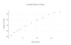
npm install react-plotly.js plotly.jsConsider a fictional scenario, where a doctor or nurse needs to see the growth rate of boys. In this example we will be plotting this data. The x-axis contains the age and the y-axis contains the height.
Clear the styling of the React app by opening theApp.css file and deleting all the contents.
Replace the contents in theApp.js file with the code below. (Note: The values are fictional).
import "./App.css";import Plot from "react-plotly.js";function App() { return ( <div className="App" style={{ display: "flex", justifyContent: "center", alignItems: "center", height: "100vh", }} > <Plot data={[ { x: [1, 2, 3, 4, 6, 8, 10, 12, 14, 16, 18], y: [32, 37, 40.5, 43, 49, 54, 59, 63.5, 69.5, 73, 74], mode: "markers", type: "scatter", }, ]} layout={{ title: "Growth Rate in Boys", xaxis: { title: "Age (years)", }, yaxis: { title: "Height (inches)", }, }} /> </div> );}export default App;Run the React app typing the following in the command terminal.
npm startOn the browser go tohttp://localhost:3000. You will see the following graph in the middle of the screen.
Thedata property contains thex data,y data, themode and thetype. In this example, thex array contains the ages and they array contains the heights. The mode is set tomarkers. Some other modes arelines,lines+markers,markers+text andnone. The type is set toscatter. Some other types arebar,pie andsunburst. Thelayout property sets the title of the plot, x-axis label and y-axis label. For example, the x-label is set using the following code snippet.
xaxis: { title: "Age (years)",},There are other types of charts which can be foundhere.
Multiple plots can be displayed on the same graph. In this example, we will include the growth rate of girls.
In order to distinguish the two plots add thename property undertype as shown below. This will be shown in the legend.
{ x: [1, 2, 3, 4, 6, 8, 10, 12, 14, 16, 18], y: [32, 37, 40.5, 43, 49, 54, 59, 63.5, 69.5, 73, 74], mode: "markers", type: "scatter", name: "Boys",}Add the following snippet of code in thedata property as shown below. The age and height data for the girls are added. (Note: The values are fictional). Plotly.js automatically assigns different colors for each plot. The color for the plot can be changed. In this example, the color for the girls’ data was changed to red.
{ x: [1, 2, 3, 4, 6, 8, 10, 12, 14, 16, 18], y: [32, 37, 40.5, 43, 49, 54, 59, 63.5, 69.5, 73, 74], mode: "markers", type: "scatter", name: "Boys",},{ x: [1, 2, 3, 4, 6, 8, 10, 12, 14, 16, 18], y: [30, 36, 39, 42, 48, 53, 58, 62, 67.5, 68, 68.5], mode: "lines+markers", type: "scatter", name: "Girls", marker: { color: "red" },},The size of the plot can be changed. Edit thewidth andheight as seen below.
layout={{ title: "Growth Rate in Boys", xaxis: { title: "Age (years)", }, yaxis: { title: "Height (inches)", }, width: 600, height: 500,}}The entire should look like this. The title was changed toGrowth Rate in Children.
import "./App.css";import Plot from "react-plotly.js";function App() { return ( <div className="App" style={{ display: "flex", justifyContent: "center", alignItems: "center", height: "100vh", }} > <Plot data={[ { x: [1, 2, 3, 4, 6, 8, 10, 12, 14, 16, 18], y: [32, 37, 40.5, 43, 49, 54, 59, 63.5, 69.5, 73, 74], mode: "markers", type: "scatter", name: "Boys", }, { x: [1, 2, 3, 4, 6, 8, 10, 12, 14, 16, 18], y: [30, 36, 39, 42, 48, 53, 58, 62, 67.5, 68, 68.5], mode: "lines+markers", type: "scatter", name: "Girls", marker: { color: "red" }, }, ]} layout={{ title: "Growth Rate in Children", xaxis: { title: "Age (years)", }, yaxis: { title: "Height (inches)", }, width: 600, height: 500, }} /> </div> );}export default App;On the browser go tohttp://localhost:3000. You will see the following graph in the middle of the screen.
If you hover over the plot, there are some controls at the top as shown below.
These allow you to download the plot as a png, zoom, pan, select, zoom in, zoom out, auto-scale and reset axes. You can also hover the points to see their values.
This concludes our lesson. For more information on Plotly.js, check the documentationhere.
Top comments(0)
For further actions, you may consider blocking this person and/orreporting abuse


