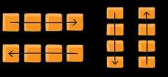
How many times did you writedisplay: flex? This goes so common thatsome people tried applyingdisplay: flex to almost all elements on the page.
In this post we will go through the thoughts process behind the API decisions for the most used component.
I've been thinking to write this for a while as I continue to see different implementations of aflexbox component, each with own API. I think we should stop inventing and standardize this.
Start
In this article I'm going to use React andstitches (I amstill in love with it). But the main idea of this article is to justify the API decisions that can be then applied in Vue, Svelte, Lit, or any other front-end tool.
Let's start simple:
import{styled}from'@stitches/react'exportconstFlex=styled('div',{display:'flex',})For the sake of simplicity, I'm using pre-configuredstyled directly fromstitches, but I in your libraries I encourage to usetheme tokens for consistent layout properties, colors, font sizes, etc.
Wrapping
Let's start simple and addflex-wrap control:
import{styled}from'@stitches/react'exportconstFlex=styled('div',{display:'flex',variants:{wrap:{'wrap':{flexWrap:'wrap',},'no-wrap':{flexWrap:'nowrap',},'wrap-reverse':{flexWrap:'wrap-reverse',},},},})I'm usingstitches variants that produce nice TypeScript props forFlex component
That was the simplest API decision to make, we only removedflex word to avoid repetitiveness, because all props exist in the context ofFlex element already. Bear in mind, that the default browser value isnowrap, so using<Flex wrap="wrap"> can be a common thing. Although it might feel weird, it's still easier to learn and use (likeflex-wrap: wrap), comparing to a made-up API.
Flow direction
Let's move on to the second prop:flex-direction.
I've seendirection used in some Design Systems, but for some people (me) it can be even worse than writingcosnt, especially because it's a commonly used prop.
Other Design Systems incorporateRow andColumn components – they provide great context for the consumer:
// Flex defined as beforeexportconstRow=styled(Flex,{flexDirection:'row',})exportconstColumn=styled(Flex,{flexDirection:'column'})Although now we also need to handle the cases when we want to useflex-direction: row-reverse; // or column-reverse. So, we either addreverse boolean prop (since it's not a common prop to be used):
// Flex defined as beforeexportconstRow=styled(Flex,{flexDirection:'row',variants:{reverse:{true:{flexDirection:'row-reverse'}}}})exportconstColumn=styled(Flex,{flexDirection:'column',variants:{reverse:{true:{// neat way to create boolean variants in stitchesflexDirection:'column-reverse'}}}})... or we define flow direction directly in theFlex component:
exportconstFlex=styled('div',{display:'flex',variants:{wrap:{},// defined as beforeflow:{'row':{flexDirection:'row',},'column':{flexDirection:'column',},'row-reverse':{flexDirection:'row-reverse',},'column-reverse':{flexDirection:'column-reverse',},},},})As youmight know,flex-flow is a shorthand forflex-direction andflex-wrap, so we're not making up the API again, but adopting it.
The usage so far would be (overriding browser defaults):
<Flexflow="row-reverse"wrap="wrap"/><Flexflow="column"/>// or with dedicated components<Rowreversewrap="wrap"/><Column/>Which API you like the most is up to you, both of them work great. I would prefer having justFlex or having all 3 of them.Flex itself is easy to maintain and it provides enough context straight away looking atflow prop, especially when it needs to change based on screen size, usingresponse styles:
<Flexflow={{'@tablet':'row','@mobile':'column'}}/>Imagine doing this with dedicatedRow andColumn components.
Alignment
So, making quite a good progress here, let's move on to the most interesting part: alignments.
While the official API for this would be to usejustify-content andalign-items, I always thought that both of these words make little sense to me when writing CSS. Maybe it's because I'm not a native English speaker, or maybe they don't make much sense when thinking about flex boxes.
One of the greatest articles that helped me to understand these properties wasA Complete Guide to Flexbox (most of us still referring to). It has awesome visualizations that show how these properties affect items positions by the change of what is calledmain axis andcross axis. What really helped me though, wasflutter'sFlex widget. It has these two awesome attributes:mainAxisAlignment andcrossAxisAlignment and the usage is:
Flex(mainAxisAlignment:MainAxisAlignment.spaceEvenly,crossAxisAlignment:CrossAxisAlignment.end,)What's really great about this API, is that it's really easy to visualize in your head. If you have arow, your main axis is horizontal, if you have acolumn, it is vertical. So, no matter the direction, you can imagine your items evenly spaced on the main axis and aligned to the end of the container on the cross axis.
Knowing this, we can incorporate new API into our own component:
exportconstFlex=styled('div',{display:'flex',variants:{wrap:{},flow:{},main:{'start':{justifyContent:'flex-start',},'center':{justifyContent:'center',},'end':{justifyContent:'flex-end',},'stretch':{justifyContent:'stretch',},'space-between':{justifyContent:'space-between',},},cross:{start:{alignItems:'flex-start',},center:{alignItems:'center',},end:{alignItems:'flex-end',},stretch:{alignItems:'stretch',},},},})Comparing toflutter'sFlex API, I shortenedmainAxisAlignment tomain andcrossAxisAlignment tocross. While TypeScript provides great autocomplete experience, seeing these long property names when composing multipleFlex components was hurting my eyes. Since both of the properties exist in the context ofFlex component, I believe it's enough to understand them.
Now, the usage would be:
<Flexflow="column"main="space-between"cross="center"/>The thought process for this component is fairly easy (or the one you can get used to): it's a column, so items will be evenly distributed across the main axis (y), and across axisx they will be centred.
By the way,new Chrome Dev Tools flexbox visual debugging is awesome.
Spacing
Now, the last prop we need to add is the one that controls spacing between the child elements. There were two approaches, generally:no-side-effects-but-nested-divs-one which wraps every children into box with negative margins to allow proper wrapping behaviour without changing the child nodes styles, andflex-gap-polyfill one, that changes the styles of its children through> * selector. Gladly, we don't need to talk about them today, since Safary 14.1 was the last one among the big folks to bereleased with the support offlexbox gap property. Thankfully, Apple is quite pushing in regards to updates, so we can seeglobal browser support growing pretty fast.
exportconstFlex=styled('div',{display:'flex',variants:{// the rest of the variantsgap:{none:{gap:0,},sm:{gap:'4px',},md:{gap:'8px',},lg:{gap:'16px',},},},})Few things to comment here. First, you can still use pollyfilled option here, seean example from an awesomeJoe Bell. Second, usexs,sm, etc tokens only if they are already incorporated in your Design System, otherwise, you may considerTailwindCSS number-tokens instead. Third, we don't implement powerfulrow-gap andcolumn-gap CSS properties, but you can do them same way as for thegap. Third, we keep'none' option to be able to setgap conditionally in a clear way, for example through@media breakpoints:gap={{ '@desktop': 'none', '@tablet': 'lg' }}.
End
And that's it! I really hope that more and more people would start seeing their UIs as a composition of layout and interactive elements, writing very little of CSS.
You can see some usage exampleshere. As with many things, you get the taste in the process, so feel free to play around with the playgrounds, see how such props help your intuition with visualizing the items.
Full example
import{stlyed}from'@stitches/react'exportconstFlex=styled('div',{display:'flex',variants:{wrap:{'wrap':{flexWrap:'wrap',},'no-wrap':{flexWrap:'nowrap',},'wrap-reverse':{flexWrap:'wrap-reverse',},},flow:{'row':{flexDirection:'row',},'column':{flexDirection:'column',},'row-reverse':{flexDirection:'row-reverse',},'column-reverse':{flexDirection:'column-reverse',},},main:{'start':{justifyContent:'flex-start',},'center':{justifyContent:'center',},'end':{justifyContent:'flex-end',},'stretch':{justifyContent:'stretch',},'space-between':{justifyContent:'space-between',},},cross:{start:{alignItems:'flex-start',},center:{alignItems:'center',},end:{alignItems:'flex-end',},stretch:{alignItems:'stretch',},},gap:{none:{gap:0,},sm:{gap:'4px',},md:{gap:'8px',},lg:{gap:'16px',},},display:{flex:{display:'flex',},inline:{display:'inline-flex',},},},})
Key takeaways:
- keep the API as close to the official specs as possible, making it easy to learn
- make up own API is possible, but maybe there's some solution that is fairly common and people are used to it
- learning other tools, like
Fluttercan open new perspectives
Top comments(0)
For further actions, you may consider blocking this person and/orreporting abuse


