Contribution Points
Contribution Points are a set of JSON declarations that you make in thecontributes field of thepackage.jsonExtension Manifest. Your extension registersContribution Points to extend various functionalities within Visual Studio Code. Here is a list of all availableContribution Points:
authenticationbreakpointscolorscommandsconfigurationconfigurationDefaultscustomEditorsdebuggersgrammarsiconsiconThemesjsonValidationkeybindingslanguagesmenusproblemMatchersproblemPatternsproductIconThemesresourceLabelFormatterssemanticTokenModifierssemanticTokenScopessemanticTokenTypessnippetssubmenustaskDefinitionsterminalthemestypescriptServerPluginsviewsviewsContainersviewsWelcomewalkthroughs
contributes.authentication
Contributes an authentication provider. This will set up an activation event for your provider and display it in your extension's features.
{ "contributes": { "authentication": [ { "label":"Azure Dev Ops", "id":"azuredevops" } ] }}contributes.breakpoints
Usually a debugger extension will also have acontributes.breakpoints entry where the extension lists the language file types for which setting breakpoints will be enabled.
{ "contributes": { "breakpoints": [ { "language":"javascript" }, { "language":"javascriptreact" } ] }}contributes.colors
Contributes new themable colors. These colors can be used by the extension in editor decorators and in the status bar. Once defined, users can customize the color in theworkspace.colorCustomization setting and user themes can set the color value.
{ "contributes": { "colors": [ { "id":"superstatus.error", "description":"Color for error message in the status bar.", "defaults": { "dark":"errorForeground", "light":"errorForeground", "highContrast":"#010203", "highContrastLight":"#feedc3" } } ] }}Color default values can be defined for light, dark and high contrast theme and can either be a reference to an existing color or aColor Hex Value.
Extensions can consume new and existing theme colors with theThemeColor API:
const errorColor =new vscode.ThemeColor('superstatus.error');contributes.commands
Contribute the UI for a command consisting of a title and (optionally) an icon, category, and enabled state. Enablement is expressed withwhen clauses. By default, commands show in theCommand Palette (⇧⌘P (Windows, LinuxCtrl+Shift+P)) but they can also show in othermenus.
Presentation of contributed commands depends on the containing menu. TheCommand Palette, forinstance, prefixes commands with theircategory, allowing for easy grouping. However, theCommand Palette doesn't show icons nor disabled commands. The editor context menu, on the otherhand, shows disabled items but doesn't show the category label.
Note: When a command is invoked (from a key binding, from theCommand Palette, any other menu, or programmatically), VS Code will emit an activationEvent
onCommand:${command}.
Note: When using icons fromproduct icons, setting
lightanddarkwill disable the icon.The correct syntax is"icon": "$(book)"
command example
{ "contributes": { "commands": [ { "command":"extension.sayHello", "title":"Hello World", "category":"Hello", "icon": { "light":"path/to/light/icon.svg", "dark":"path/to/dark/icon.svg" } } ] }}See theCommands Extension Guide to learn more about using commands in VS Code extensions.

Command icon specifications
Size:Icons should be 16x16 with a 1 pixel padding (image is 14x14) and centered.Color:Icons should use a single color.Format:It is recommended that icons be in SVG, though any image file type is accepted.
contributes.configuration
Contribute settings that will be exposed to the user. The user will be able to set these configuration options in the Settings editor or by editing a settings.json file directly.
This section can either be a single object, representing a single category of settings, or an array of objects, representing multiple categories of settings. If there are multiple categories of settings, the Settings editor will show a submenu in the table of contents for that extension, and the title keys will be used for the submenu entry names.
Configuration example
{ "contributes": { "configuration": { "title":"Settings Editor Test Extension", "type":"object", "properties": { "settingsEditorTestExtension.booleanExample": { "type":"boolean", "default":true, "description":"Boolean Example" }, "settingsEditorTestExtension.stringExample": { "type":"string", "default":"Hello World", "description":"String Example" } } } }}
You can read these values from your extension usingvscode.workspace.getConfiguration('myExtension').
Configuration schema
Your configuration entry is used both to provide intellisense when editing your settings in the JSON editor, and to define the way they appear in the settings UI.
title
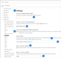
Thetitle 1️⃣️ of a category is the heading used for that category.
{ "configuration": { "title":"GitMagic" }}For an extension with multiple categories of settings, if the title of one of the categories is the same as the extension's display name, then the settings UI will treat that category as a "default category", ignoring theorder field for that category and placing its settings below the main extension heading.
For both thetitle anddisplayName fields, words like "Extension", "Configuration", and "Settings" are redundant.
- ✔
"title": "GitMagic" - ❌
"title": "GitMagic Extension" - ❌
"title": "GitMagic Configuration" - ❌
"title": "GitMagic Extension Configuration Settings"
properties
Theproperties 2️⃣ in yourconfiguration object will form a dictionary where the keys are setting IDs and the values give more information on the setting. Though an extension can contain multiple categories of settings, each setting of the extension must still have its own unique ID. A setting ID cannot be a complete prefix of another setting ID.
Properties without an explicitorder field will appear in lexicographical order in the settings UI (not the order in which they're listed in the manifest).
Setting titles
In the settings UI, multiple fields will be used to construct a display title for each setting. Capital letters in your key are used to indicate word breaks.
Display titles for single-category and default category configurations
If the configuration has a single category of settings, or if the category has the same title as the extension's display name, then for settings within that category, the settings UI will use the settings ID and the extensionname field to determine the display title.
As an example, for settings IDgitMagic.blame.dateFormat and extension nameauthorName.gitMagic, because the prefix of the settings ID matches with the suffix of the extension name, thegitMagic part of the settings ID will be removed in the display title: "Blame:Date Format".
Display titles for multi-category configurations
If the configuration has multiple categories of settings, and the category does not have the same title as the extension's display name, then for settings within that category, the settings UI will use the settings ID and the categoryid field to determine the display title.
As an example, for settings IDcss.completion.completePropertyWithSemicolon and category IDcss, because the prefix of the settings ID matches with the suffix of the category ID, thecss part of the settings ID will be removed in the settings UI, and the generated title for the setting will be "Completion:Complete Property With Semicolon".
Configuration property schema
Configuration keys are defined using a superset ofJSONSchema.
description / markdownDescription
Yourdescription 3️⃣ appears after the title and before the input field, except for booleans, where the description is used as the label for the checkbox. 6️⃣
{ "gitMagic.blame.heatMap.enabled": { "description":"Specifies whether to provide a heatmap indicator in the gutter blame annotations" }}If you usemarkdownDescription instead ofdescription, your setting description will be parsed as Markdown in the settings UI.
{ "gitMagic.blame.dateFormat": { "markdownDescription":"Specifies how to format absolute dates (e.g. using the `${date}` token) in gutter blame annotations. See the [Moment.js docs](https://momentjs.com/docs/#/displaying/format/) for valid formats" }}FormarkdownDescription, in order to add newlines or multiple paragraphs, use the string\n\n to separate the paragraphs instead of just\n.
type
Entries of typenumber 4️⃣ ,string 5️⃣ ,boolean 6️⃣ can be edited directly in the settings UI.
{ "gitMagic.views.pageItemLimit": { "type":"number", "default":20, "markdownDescription":"Specifies the number of items to show in each page when paginating a view list. Use 0 to specify no limit" }}A string setting can be rendered with a multiline text input if it sets"editPresentation": "multilineText" on the configuration entry.
Forboolean entries, themarkdownDescription (ordescription ifmarkdownDescription is not specified) will be used as the label next to the checkbox.
{ "gitMagic.blame.compact": { "type":"boolean", "description":"Specifies whether to compact (deduplicate) matching adjacent gutter blame annotations" }}Someobject andarray type settings will be rendered in the settings UI. Simple arrays ofnumber,string, orboolean will be rendered as editable lists. Objects that have properties of typestring,number,integer, and/orboolean will be rendered as editable grids of keys and values. Object settings should also haveadditionalProperties set to eitherfalse, or an object with an appropriatetype property, to render in the UI.
If anobject orarray type setting can also contain other types like nested objects, arrays, or null, then the value won't be rendered in the settings UI and can only be modified by editing the JSON directly. Users will see a link toEdit in settings.json as shown in the screenshot above. 8️⃣
order
Both categories and the settings within those categories can take an integerorder type property, which gives a reference to how they should be sorted relative to other categories and/or settings.
If two categories haveorder properties, the category with the lower order number comes first. If a category is not given anorder property, it appears after categories that were given that property.
If two settings within the same category haveorder properties, the setting with the lower order number comes first. If another setting within that same category is not given anorder property, it will appear after settings in that category that were given that property.
If two categories have the sameorder property value, or if two settings within the same category have the sameorder property value, then they will be sorted in increasing lexicographical order within the settings UI.
enum / enumDescriptions / markdownEnumDescriptions / enumItemLabels
If you provide an array of items under theenum 7️⃣ property, the settings UI will render a dropdown menu of those items.
You can also provide anenumDescriptions property, an array of strings of the same length as theenum property. TheenumDescriptions property provides a description in the settings UI at the bottom of the dropdown menu corresponding to eachenum item.
You can also usemarkdownEnumDescriptions instead ofenumDescriptions, and your descriptions will be parsed as Markdown.markdownEnumDescriptions takes precedence overenumDescriptions.
To customize the dropdown option names in the settings UI, you can useenumItemLabels.
Example:
{ "settingsEditorTestExtension.enumSetting": { "type":"string", "enum": ["first","second","third"], "markdownEnumDescriptions": [ "The *first* enum", "The *second* enum", "The *third* enum" ], "enumItemLabels": ["1st","2nd","3rd"], "default":"first", "description":"Example setting with an enum" }}
deprecationMessage / markdownDeprecationMessage
If you setdeprecationMessage, ormarkdownDeprecationMessage, the setting will get a warning underline with your specified message. Also, the setting will be hidden from the settings UI unless it is configured by the user. If you setmarkdownDeprecationMessage, the markdown will not be rendered in the setting hover or the problems view. If you set both properties,deprecationMessage will be shown in the hover and the problems view, andmarkdownDeprecationMessage will be rendered as Markdown in the settings UI.
Example:
{ "json.colorDecorators.enable": { "type":"boolean", "description":"Enables or disables color decorators", "markdownDeprecationMessage":"**Deprecated**: Please use `#editor.colorDecorators#` instead.", "deprecationMessage":"Deprecated: Please use editor.colorDecorators instead." }}Other JSON Schema properties
You can use any of the validation JSON Schema properties to describe other constraints on configuration values:
defaultfor defining the default value of a propertyminimumandmaximumfor restricting numeric valuesmaxLength,minLengthfor restricting string lengthpatternfor restricting strings to a given regular expressionpatternErrorMessagefor giving a tailored error message when a pattern does not match.formatfor restricting strings to well-known formats, such asdate,time,ipv4,email,andurimaxItems,minItemsfor restricting array lengtheditPresentationfor controlling whether a single-line inputbox or multi-line textarea is rendered for the string setting in the Settings editor
Unsupported JSON Schema properties
Not supported in the configuration section are:
$refanddefinition: The configuration schemas needs to be self-contained and cannot make assumptions how the aggregated settings JSON schema document looks like.
For more details on these and other features, see theJSON Schema Reference.
scope
A configuration setting can have one of the following possible scopes:
application- Settings that apply to all instances of VS Code and can only be configured in user settings.machine- Machine specific settings that can be set only in user settings or only in remote settings. For example, an installation path which shouldn't be shared across machines. The value of these settings will not be synchronized.machine-overridable- Machine specific settings that can be overridden by workspace or folder settings. The value of these settings will not be synchronized.window- Windows (instance) specific settings which can be configured in user, workspace, or remote settings.resource- Resource settings, which apply to files and folders, and can be configured in all settings levels, even folder settings.language-overridable- Resource settings that can be overridable at a language level.
Configuration scopes determine when a setting is available to the user through the Settings editor and whether the setting is applicable. If noscope is declared, the default iswindow.
Below are example configuration scopes from the built-in Git extension:
{ "contributes": { "configuration": { "title":"Git", "properties": { "git.alwaysSignOff": { "type":"boolean", "scope":"resource", "default":false, "description":"%config.alwaysSignOff%" }, "git.ignoredRepositories": { "type":"array", "default": [], "scope":"window", "description":"%config.ignoredRepositories%" }, "git.autofetch": { "type": ["boolean","string"], "enum": [true,false,"all"], "scope":"resource", "markdownDescription":"%config.autofetch%", "default":false, "tags": ["usesOnlineServices"] } } } }}You can see thatgit.alwaysSignOff hasresource scope and can be set per user, workspace, or folder, while the ignored repositories list withwindow scope applies more globally for the VS Code window or workspace (which might be multi-root).
ignoreSync
You can setignoreSync totrue to prevent the setting from being synchronized with the user's settings. This is useful for settings that are not user-specific. For example, theremoteTunnelAccess.machineName setting is not user-specific and should not be synchronized. Please note that if you have set thescope tomachine ormachine-overridable, the setting will not be synchronized regardless of the value ofignoreSync.
{ "contributes": { "configuration": { "properties": { "remoteTunnelAccess.machineName": { "type":"string", "default":"", "ignoreSync":true } } } }}```json{ "remoteTunnelAccess.machineName": { "type":"string", "default":'', "ignoreSync":true }}Linking to settings
You can insert a link to another setting, which will be rendered as a clickable link in the settings UI, by using this special syntax in the markdown-type properties:`#target.setting.id#`. This will work inmarkdownDescription,markdownEnumDescriptions, andmarkdownDeprecationMessage. Example:
"files.autoSaveDelay": { "markdownDescription":"Controls the delay in ms after which a dirty editor is saved automatically. Only applies when `#files.autoSave#` is set to `afterDelay`.", // ... }In the settings UI, this is rendered as:

contributes.configurationDefaults
Contribute default values for other registered configurations and override their defaults.
The following example overrides the default behavior offiles.autoSave setting to AutoSave files on focus change.
"configurationDefaults": { "files.autoSave":"onFocusChange"}You can also contribute default editor configurations for the provided language. For example, the following snippet contributes default editor configurations for themarkdown language:
{ "contributes": { "configurationDefaults": { "[markdown]": { "editor.wordWrap":"on", "editor.quickSuggestions": { "comments":"off", "strings":"off", "other":"off" } } } }}contributes.customEditors
ThecustomEditors contribution point is how your extension tells VS Code about the custom editors that it provides. For example, VS Code needs to know what types of files your custom editor works with as well as how to identify your custom editor in any UI.
Here's a basiccustomEditor contribution for thecustom editor extension sample:
"contributes": { "customEditors": [ { "viewType":"catEdit.catScratch", "displayName":"Cat Scratch", "selector": [ { "filenamePattern":"*.cscratch" } ], "priority":"default" } ]}customEditors is an array, so your extension can contribute multiple custom editors.
viewType- Unique identifier for your custom editor.This is how VS Code ties a custom editor contribution in the
package.jsonto your custom editor implementation in code. This must be unique across all extensions, so instead of a genericviewTypesuch as"preview"make sure to use one that is unique to your extension, for example"viewType": "myAmazingExtension.svgPreview".displayName- Name that identifies the custom editor in VS Code's UI.The display name is shown to the user in VS Code UI such as theView: Reopen with dropdown.
selector- Specifies which files a custom editor is active for.The
selectoris an array of one or moreglob patterns. These glob patterns are matched against file names to determine if the custom editor can be used for them. AfilenamePatternsuch as*.pngwill enable the custom editor for all PNG files.You can also create more specific patterns that match on file or directory names, for example
**/translations/*.json.priority- (optional) Specifies when the custom editor is used.prioritycontrols when a custom editor is used when a resource is open. Possible values are:"default"- Try to use the custom editor for every file that matches the custom editor'sselector. If there are multiple custom editors for a given file, the user will have to select which custom editor they want to use."option"- Do not use the custom editor by default but allow users to switch to it or configure it as their default.
You can learn more in theCustom Editors extension guide.
contributes.debuggers
Contribute a debugger to VS Code. A debugger contribution has the following properties:
typeis a unique ID that is used to identify this debugger in a launch configuration.labelis the user visible name of this debugger in the UI.programthe path to the debug adapter that implements the VS Code debug protocol against the real debugger or runtime.runtimeif the path to the debug adapter is not an executable but needs a runtime.configurationAttributesis the schema for launch configuration arguments specific to this debugger. Please note that the JSON schema constructs$refanddefinitionare not supported.initialConfigurationslists launch configurations that are used to populate an initial launch.json.configurationSnippetslists launch configurations that are available through IntelliSense when editing a launch.json.variablesintroduces substitution variables and binds them to commands implemented by the debugger extension.languagesthose languages for which the debug extension could be considered the "default debugger".
debugger example
{ "contributes": { "debuggers": [ { "type":"node", "label":"Node Debug", "program":"./out/node/nodeDebug.js", "runtime":"node", "languages": ["javascript","typescript","javascriptreact","typescriptreact"], "configurationAttributes": { "launch": { "required": ["program"], "properties": { "program": { "type":"string", "description":"The program to debug." } } } }, "initialConfigurations": [ { "type":"node", "request":"launch", "name":"Launch Program", "program":"${workspaceFolder}/app.js" } ], "configurationSnippets": [ { "label":"Node.js: Attach Configuration", "description":"A new configuration for attaching to a running node program.", "body": { "type":"node", "request":"attach", "name":"${2:Attach to Port}", "port":9229 } } ], "variables": { "PickProcess":"extension.node-debug.pickNodeProcess" } } ] }}For a full walkthrough on how to integrate adebugger, go toDebugger Extension.
contributes.grammars
Contribute a TextMate grammar to a language. You must provide thelanguage this grammar applies to, the TextMatescopeName for the grammar and the file path.
Note: The file containing the grammar can be in JSON (filenames ending in .json) or in XML plist format (all other files).
grammar example
{ "contributes": { "grammars": [ { "language":"markdown", "scopeName":"text.html.markdown", "path":"./syntaxes/markdown.tmLanguage.json", "embeddedLanguages": { "meta.embedded.block.frontmatter":"yaml" } } ] }}See theSyntax Highlight Guide to learn more about how to register TextMate grammars associated with a language to receive syntax highlighting.
contributes.icons
Contribute a new icon by ID, along with a default icon. The icon ID can then be used by the extension (or any other extensions that depend on the extension) anywhere aThemeIcon can be usednew ThemeIcon("iconId"), inMarkdown strings ($(iconId)), and as icons in certain contribution points.
{ "contributes": { "icons": { "distro-ubuntu": { "description":"Ubuntu icon", "default": { "fontPath":"./distroicons.woff", "fontCharacter":"\\E001" } }, "distro-fedora": { "description":"Ubuntu icon", "default": { "fontPath":"./distroicons.woff", "fontCharacter":"\\E002" } } } }}contributes.iconThemes
Contribute a file icon theme to VS Code. File icons are shown next to file names, indicating the file type.
You must specify an id (used in the settings), a label and the path to the file icon definition file.
file icon theme example
{ "contributes": { "iconThemes": [ { "id":"my-cool-file-icons", "label":"Cool File Icons", "path":"./fileicons/cool-file-icon-theme.json" } ] }}
See theFile Icon Theme Guide on how to create a File Icon Theme.
contributes.jsonValidation
Contribute a validation schema for a specific type ofjson file. Theurl value can be either a local path to a schema file included in the extension or a remote server URL such as ajson schema store.
{ "contributes": { "jsonValidation": [ { "fileMatch":".jshintrc", "url":"https://json.schemastore.org/jshintrc" } ] }}contributes.keybindings
Contribute a key binding rule defining what command should be invoked when the user presses a key combination. See theKey Bindings topic where key bindings are explained in detail.
Contributing a key binding will cause the Default Keyboard Shortcuts to display your rule, and every UI representation of the command will now show the key binding you have added. And, of course, when the user presses the key combination the command will be invoked.
Note: Because VS Code runs on Windows, macOS and Linux, where modifiers differ, you can use "key" to set the default key combination and overwrite it with a specific platform.
Note: When a command is invoked (from a key binding or from the Command Palette), VS Code will emit an activationEvent
onCommand:${command}.
keybinding example
Defining thatCtrl+F1 under Windows and Linux andCmd+F1 under macOS trigger the"extension.sayHello" command:
{ "contributes": { "keybindings": [ { "command":"extension.sayHello", "key":"ctrl+f1", "mac":"cmd+f1", "when":"editorTextFocus" } ] }}
contributes.languages
Contribute definition of a programming language. This will introduce a new language or enrich the knowledge VS Code has about a language.
The main effects ofcontributes.languages are:
- Define a
languageIdthat can be reused in other parts of VS Code API, such asvscode.TextDocument.languageIdand theonLanguageActivation Events.- You can contribute a human-readable using the
aliasesfield. The first item in the list will be used as the human-readable label.
- You can contribute a human-readable using the
- Associate file name extensions (
extensions), file names (filenames), file nameglob patterns (filenamePatterns), files that begin with a specific line (such as hashbang) (firstLine), andmimetypesto thatlanguageId. - Contribute a set ofDeclarative Language Features for the contributed language. Learn more about the configurable editing features in theLanguage Configuration Guide.
- Contribute an icon which can be used as in file icon themes if theme does not contain an icon for the language
language example
{ "contributes": { "languages": [ { "id":"python", "extensions": [".py"], "aliases": ["Python","py"], "filenames": [], "firstLine":"^#!/.*\\bpython[0-9.-]*\\b", "configuration":"./language-configuration.json", "icon": { "light":"./icons/python-light.png", "dark":"./icons/python-dark.png" } } ] }}contributes.menus
Contribute a menu item for a command to the editor or Explorer. The menu item definition contains the command that should be invoked when selected and the condition under which the item should show. The latter is defined with thewhen clause, which uses the key bindingswhen clause contexts.
Acommand property indicates which command to run when selecting a menu item. Asubmenu property indicates which submenu to render in this location.
When declaring acommand menu item, an alternative command can also be defined using thealt-property. It will be shown and invoked when pressingAlt while opening a menu. On Windows and LinuxShift also does this, which is useful in situations whereAlt would trigger the window menu bar.
Last, agroup property defines sorting and grouping of menu items. Thenavigation group is special as it will always be sorted to the top/beginning of a menu.
Note that
whenclauses apply to menus andenablementclauses to commands. Theenablementapplies to all menus and even keybindings while thewhenonly applies to a single menu.
Currently extension writers can contribute to:
commandPalette- global Command Palettecomments/comment/title- Comments title menu barcomments/comment/context- Comments context menucomments/commentThread/title- Comments thread title menu barcomments/commentThread/context- Comments thread context menudebug/callstack/context- Debug Call Stack view context menudebug/callstack/contextgroupinline- Debug Call Stack view inline actionsdebug/toolBar- Debug view toolbardebug/variables/context- Debug Variables view context menueditor/context- editor context menueditor/lineNumber/context- editor line number context menueditor/title- editor title menu bareditor/title/context- editor title context menueditor/title/run- Run submenu on the editor title menu barexplorer/context- Explorer view context menuextension/context- Extensions view context menufile/newFile- New File item in the File menu and Welcome pageinteractive/toolbar- Interactive Window toolbarinteractive/cell/title- Interactive Window cell title menu barnotebook/toolbar- notebook toolbarnotebook/cell/title- notebook cell title menu barnotebook/cell/execute- notebook cell execution menuscm/title-SCM title menuscm/resourceGroup/context-SCM resource groups menusscm/resourceFolder/context-SCM resource folders menusscm/resourceState/context-SCM resources menusscm/change/title-SCM change title menusscm/sourceControl-SCM source control menuterminal/context- terminal context menuterminal/title/context- terminal title context menutesting/item/context- Test Explorer item context menutesting/item/gutter- menu for a gutter decoration for a test itemtimeline/title- Timeline view title menu bartimeline/item/context- Timeline view item context menutouchBar- macOS Touch Barview/title-View title menuview/item/context-View item context menuwebview/context- anywebview context menu- Anycontributed submenu
Note 1: When a command is invoked from a (context) menu, VS Code tries to infer the currently selected resource and passes that as a parameter when invoking the command. For instance, a menu item inside the Explorer is passed the URI of the selected resource and a menu item inside an editor is passed the URI of the document.
Note 2: Commands of menu items contributed to
editor/lineNumber/contextare also passed the line number. Additionally these items can reference theeditorLineNumbercontext key in theirwhenclauses, for example by using theinornot inoperators to test it against an array-valued context key managed by the extension.
In addition to a title, a contributed command can specify the icon which VS Code will show when the invoking menu item is represented as a button, for example on a title menu bar.
menu example
Here's a command menu item:
{ "contributes": { "menus": { "editor/title": [ { "when":"resourceLangId == markdown", "command":"markdown.showPreview", "alt":"markdown.showPreviewToSide", "group":"navigation" } ] } }}
Similarly, here's a command menu item added to a particular view. The example below contributes to an arbitrary view like the terminal:
{ "contributes": { "menus": { "view/title": [ { "command":"terminalApi.sendText", "when":"view == terminal", "group":"navigation" } ] } }}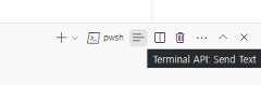
Here's a submenu menu item:
{ "contributes": { "menus": { "scm/title": [ { "submenu":"git.commit", "group":"2_main@1", "when":"scmProvider == git" } ] } }}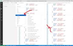
Context specific visibility of Command Palette menu items
When registering commands inpackage.json, they will automatically be shown in theCommand Palette (⇧⌘P (Windows, LinuxCtrl+Shift+P)). To allow more control over command visibility, there is thecommandPalette menu item. It allows you to define awhen condition to control if a command should be visible in theCommand Palette or not.
The snippet below makes the 'Hello World' command only visible in theCommand Palette when something is selected in the editor:
{ "commands": [ { "command":"extension.sayHello", "title":"Hello World" } ], "menus": { "commandPalette": [ { "command":"extension.sayHello", "when":"editorHasSelection" } ] }}Sorting of groups
Menu items can be sorted into groups. They are sorted in lexicographical order with the following defaults/rules.You can add menu items to these groups or add new groups of menu items in between, below, or above.
Theeditor context menu has these default groups:
navigation- Thenavigationgroup comes first in all cases.1_modification- This group comes next and contains commands that modify your code.9_cutcopypaste- The second last default group with the basic editing commands.z_commands- The last default group with an entry to open the Command Palette.

Theexplorer context menu has these default groups:
navigation- Commands related to navigation across VS Code. This group comes first in all cases.2_workspace- Commands related to workspace manipulation.3_compare- Commands related to comparing files in the diff editor.4_search- Commands related to searching in the search view.5_cutcopypaste- Commands related to cutting, copying, and pasting of files.6_copypath- Commands related to copying file paths.7_modification- Commands related to the modification of file.
Theeditor tab context menu has these default groups:
1_close- Commands related to closing editors.3_preview- Commands related to pinning editors.
Theeditor title menu has these default groups:
navigation- Commands related to navigating.1_run- Commands related to running and debugging the editor.1_diff- Commands related to working with diff editors.3_open- Commands related to opening editors.5_close- Commands related to closing editors.
navigation and1_run are shown in the primary editor title area. The other groups are shown in the secondary area - under the... menu.
Theterminal tab context menu has these default groups:
1_create- Commands related to creating terminals.3_run- Commands related to running/executing something in the terminal.5_manage- Commands related to managing a terminal.7_configure- Commands related to terminal configuration.
Theterminal context menu has these default groups:
1_create- Commands related to creating terminals.3_edit- Commands related to manipulating text, the selection or the clipboard.5_clear- Commands related to clearing the terminal.7_kill- Commands related to closing/killing the terminal.9_config- Commands related to terminal configuration.
TheTimeline view item context menu has these default groups:
inline- Important or frequently used timeline item commands. Rendered as a toolbar.1_actions- Commands related to working with timeline items.5_copy- Commands related to copying timeline item information.
TheExtensions view context menu has these default groups:
1_copy- Commands related to copying extension information.2_configure- Commands related to configuring an extension.
Sorting inside groups
The order inside a group depends on the title or an order-attribute. The group-local order of a menu item is specified by appending@<number> to the group identifier as shown below:
{ "editor/title": [ { "when":"editorHasSelection", "command":"extension.Command", "group":"myGroup@1" } ]}contributes.problemMatchers
Contribute problem matcher patterns. These contributions work in both the output panel runner and in the terminal runner. Below is an example to contribute a problem matcher for the gcc compiler in an extension:
{ "contributes": { "problemMatchers": [ { "name":"gcc", "owner":"cpp", "fileLocation": ["relative","${workspaceFolder}"], "pattern": { "regexp":"^(.*):(\\d+):(\\d+):\\s+(warning|error):\\s+(.*)$", "file":1, "line":2, "column":3, "severity":4, "message":5 } } ] }}This problem matcher can now be used in atasks.json file via a name reference$gcc. An example looks like this:
{ "version":"2.0.0", "tasks": [ { "label":"build", "command":"gcc", "args": ["-Wall","helloWorld.c","-o","helloWorld"], "problemMatcher":"$gcc" } ]}Also see:Defining a Problem Matcher
contributes.problemPatterns
Contributes named problem patterns that can be used in problem matchers (see above).
contributes.productIconThemes
Contribute a product icon theme to VS Code. Product icons are all icons used in VS Code except file icons and icons contributed from extensions.
You must specify an id (used in the settings), a label and the path to the icon definition file.
product icon theme example
{ "contributes": { "productIconThemes": [ { "id":"elegant", "label":"Elegant Icon Theme", "path":"./producticons/elegant-product-icon-theme.json" } ] }}
See theProduct Icon Theme Guide on how to create a Product Icon Theme.
contributes.resourceLabelFormatters
Contributes resource label formatters that specify how to display URIs everywhere in the workbench. For example here's how an extension could contribute a formatter for URIs with schemeremotehub:
{ "contributes": { "resourceLabelFormatters": [ { "scheme":"remotehub", "formatting": { "label":"${path}", "separator":"/", "workspaceSuffix":"GitHub" } } ] }}This means that all URIs that have a schemeremotehub will get rendered by showing only thepath segment of the URI and the separator will be/. Workspaces which have theremotehub URI will have the GitHub suffix in their label.
contributes.semanticTokenModifiers
Contributes new semantic token modifiers that can be highlighted via theme rules.
{ "contributes": { "semanticTokenModifiers": [ { "id":"native", "description":"Annotates a symbol that is implemented natively" } ] }}See theSemantic Highlighting Guide to read more about semantic highlighting.
contributes.semanticTokenScopes
Contributes mapping between semantic token types & modifiers and scopes either as a fallback or to support language-specific themes.
{ "contributes": { "semanticTokenScopes": [ { "language":"typescript", "scopes": { "property.readonly": ["variable.other.constant.property.ts"] } } ] }}See theSemantic Highlighting Guide to read more about semantic highlighting.
contributes.semanticTokenTypes
Contributes new semantic token types that can be highlighted via theme rules.
{ "contributes": { "semanticTokenTypes": [ { "id":"templateType", "superType":"type", "description":"A template type." } ] }}See theSemantic Highlighting Guide to read more about semantic highlighting.
contributes.snippets
Contribute snippets for a specific language. Thelanguage attribute is thelanguage identifier and thepath is the relative path to the snippet file, which defines snippets in theVS Code snippet format.
The example below shows adding snippets for the Go language.
{ "contributes": { "snippets": [ { "language":"go", "path":"./snippets/go.json" } ] }}contributes.submenus
Contribute a submenu as a placeholder onto which menu items can be contributed. A submenu requires alabel to be shown in the parent menu.
In addition to a title, commands can also define icons that VS Code will show in the editor title menu bar.
submenu example
{ "contributes": { "submenus": [ { "id":"git.commit", "label":"Commit" } ] }}
contributes.taskDefinitions
Contributes and defines an object literal structure that allows to uniquely identify a contributed task in the system. A task definition has at minimum atype property but it usually defines additional properties. For example a task definition for a task representing a script in a package.json file looks like this:
{ "taskDefinitions": [ { "type":"npm", "required": ["script"], "properties": { "script": { "type":"string", "description":"The script to execute" }, "path": { "type":"string", "description":"The path to the package.json file. If omitted the package.json in the root of the workspace folder is used." } } } ]}The task definition is defined using JSON schema syntax for therequired andproperties property. Thetype property defines the task type. If the above example:
"type": "npm"associates the task definition with the npm tasks"required": [ "script" ]defines thatscriptattributes as mandatory. Thepathproperty is optional."properties" : { ... }defines the additional properties and their types.
When the extension actually creates a Task, it needs to pass aTaskDefinition that conforms to the task definition contributed in the package.json file. For thenpm example a task creation for the test script inside a package.json file looks like this:
let task =new vscode.Task({type: 'npm',script: 'test' }, ....);contributes.terminal
Contribute a terminal profile to VS Code, allowing extensions to handle the creation of the profiles. When defined, the profile should appear when creating the terminal profile
{ "activationEvents": ["onTerminalProfile:my-ext.terminal-profile"], "contributes": { "terminal": { "profiles": [ { "title":"Profile from extension", "id":"my-ext.terminal-profile" } ] } }}When defined, the profile will show up in the terminal profile selector. When activated, handle the creation of the profile by returning terminal options:
vscode.window.registerTerminalProfileProvider('my-ext.terminal-profile', { provideTerminalProfile( token:vscode.CancellationToken ):vscode.ProviderResult<vscode.TerminalOptions |vscode.ExtensionTerminalOptions> { return {name: 'Profile from extension',shellPath: 'bash' }; }});contributes.themes
Contribute a color theme to VS Code, defining workbench colors and styles for syntax tokens in the editor.
You must specify a label, whether the theme is a dark theme or a light theme (such that the rest of VS Code changes to match your theme) and the path to the file (JSON format).
theme example
{ "contributes": { "themes": [ { "label":"Monokai", "uiTheme":"vs-dark", "path":"./themes/monokai-color-theme.json" } ] }}
See theColor Theme Guide on how to create a Color Theme.
contributes.typescriptServerPlugins
ContributesTypeScript server plugins that augment VS Code's JavaScript and TypeScript support:
{ "contributes": { "typescriptServerPlugins": [ { "name":"typescript-styled-plugin" } ] }}The above example extension contributes thetypescript-styled-plugin which adds styled-component IntelliSense for JavaScript and TypeScript. This plugin will be loaded from the extension and must be installed as a normal NPMdependency in the extension:
{ "dependencies": { "typescript-styled-plugin":"*" }}TypeScript server plugins are loaded for all JavaScript and TypeScript files when the user is using VS Code's version of TypeScript. They are not activated if the user is using a workspace version of TypeScript, unless the plugin explicitly sets"enableForWorkspaceTypeScriptVersions": true.
{ "contributes": { "typescriptServerPlugins": [ { "name":"typescript-styled-plugin", "enableForWorkspaceTypeScriptVersions":true } ] }}Plugin configuration
Extensions can send configuration data to contributed TypeScript plugins through an API provided by VS Code's built-in TypeScript extension:
// In your VS Code extensionexport async function activate(context:vscode.ExtensionContext) { // Get the TS extension const tsExtension =vscode.extensions.getExtension('vscode.typescript-language-features'); if (!tsExtension) { return; } await tsExtension.activate(); // Get the API from the TS extension if (!tsExtension.exports || !tsExtension.exports.getAPI) { return; } const api =tsExtension.exports.getAPI(0); if (!api) { return; } // Configure the 'my-typescript-plugin-id' plugin api.configurePlugin('my-typescript-plugin-id', { someValue: process.env['SOME_VALUE'] });}The TypeScript server plugin receives the configuration data through anonConfigurationChanged method:
// In your TypeScript pluginimport * as ts_module from 'typescript/lib/tsserverlibrary';export =function init({typescript }: {typescript:typeof ts_module }) { return { create(info:ts.server.PluginCreateInfo) { // Create new language service }, onConfigurationChanged(config:any) { // Receive configuration changes sent from VS Code } };};This API allows VS Code extensions to synchronize VS Code settings with a TypeScript server plugin, or dynamically change the behavior of a plugin. Take a look at theTypeScript TSLint plugin andlit-html extensions to see how this API is used in practice.
contributes.views
Contribute a view to VS Code. You must specify an identifier and name for the view. You can contribute to following view containers:
explorer: Explorer view container in the Activity Barscm: Source Control Management (SCM) view container in the Activity Bardebug: Run and Debug view container in the Activity Bartest: Test view container in the Activity Bar- Custom view containers contributed by Extensions.
When the user opens the view, VS Code will then emit an activationEventonView:${viewId} (onView:nodeDependencies for the example below). You can also control the visibility of the view by providing thewhen context value. Theicon specified will be used when the title cannot be shown (e.g. when the view is dragged to the Activity Bar). ThecontextualTitle is used when the view is moved out of its default view container and needs additional context.
{ "contributes": { "views": { "explorer": [ { "id":"nodeDependencies", "name":"Node Dependencies", "when":"workspaceHasPackageJSON", "icon":"media/dep.svg", "contextualTitle":"Package Explorer" } ] } }}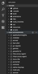
The content of a view can be populated in two ways:
- With aTreeView by providing adata provider through
createTreeViewAPI or register thedata provider directly throughregisterTreeDataProviderAPI to populate data. TreeViews are ideal for showing hierarchical data and lists. Refer to thetree-view-sample. - With aWebviewView by registering aprovider with
registerWebviewViewProvider. Webview views allow rendering arbitrary HTML in the view. See thewebview view sample extension for more details.
contributes.viewsContainers
Contribute a view container into whichCustom views can be contributed. You must specify an identifier, title, and an icon for the view container. At present, you can contribute them to the Activity Bar (activitybar) and Panel (panel). Below example shows how thePackage Explorer view container is contributed to the Activity Bar and how views are contributed to it.
{ "contributes": { "viewsContainers": { "activitybar": [ { "id":"package-explorer", "title":"Package Explorer", "icon":"resources/package-explorer.svg" } ] }, "views": { "package-explorer": [ { "id":"package-dependencies", "name":"Dependencies" }, { "id":"package-outline", "name":"Outline" } ] } }}
Icon specifications
Size:Icons should be 24x24 and centered.Color:Icons should use a single color.Format:It is recommended that icons be in SVG, though any image file type is accepted.States:All icons inherit the following state styles:State Opacity Default 60% Hover 100% Active 100%
contributes.viewsWelcome
Contribute welcome content toCustom views. Welcome content only applies to empty tree views. A view is considered empty if the tree has no children and noTreeView.message. By convention, any command links that are on a line by themselves are displayed as a button. You can specify the view that the welcome content should apply to with theview property. Visibility of the welcome content can be controlled with thewhen context value. The text to be displayed as the welcome content is set with thecontents property.
{ "contributes": { "viewsWelcome": [ { "view":"scm", "contents":"In order to use git features, you can open a folder containing a git repository or clone from a URL.\n[Open Folder](command:vscode.openFolder)\n[Clone Repository](command:git.clone)\nTo learn more about how to use git and source control in VS Code [read our docs](https://aka.ms/vscode-scm).", "when":"config.git.enabled && git.state == initialized && workbenchState == empty" } ] }}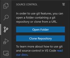
Multiple welcome content items can be contributed to one view. When this happens, the content that come from VS Code core comes first, followed by content from built-in extensions, followed by content from all other extensions.
contributes.walkthroughs
Contribute walkthroughs to appear on the Getting Started page. Walkthroughs are automatically opened on install of your extension and provide a convenient way to introduce users to features of your extension.
Walkthroughs consist of a title, description, id, and a series of steps. Additionally, awhen condition can be set to hide or show the walkthrough based on context keys. For example, a walkthrough to explain setup on a Linux platform could be givenwhen: "isLinux" to only appear on Linux machines.
Each step in a walkthrough has a title, description, id, and media element (either an image or Markdown content), along with an optional set of events that will cause the step to be checked (shown in the example below). Step descriptions are Markdown content, and support**bold**,__underlined__, and``code`` rendering, as well as links. Similar to walkthroughs, steps can be given when conditions to hide or show them based on context keys.
SVGs are recommended for images given their ability to scale and their support for VS Code's theme colors. Use theVisual Studio Code Color Mapper Figma plugin to easily reference theme colors in the SVGs.
{ "contributes": { "walkthroughs": [ { "id":"sample", "title":"Sample", "description":"A sample walkthrough", "steps": [ { "id":"runcommand", "title":"Run Command", "description":"This step will run a command and check off once it has been run.\n[Run Command](command:getting-started-sample.runCommand)", "media": {"image":"media/image.png","altText":"Empty image" }, "completionEvents": ["onCommand:getting-started-sample.runCommand"] }, { "id":"changesetting", "title":"Change Setting", "description":"This step will change a setting and check off when the setting has changed\n[Change Setting](command:getting-started-sample.changeSetting)", "media": {"markdown":"media/markdown.md" }, "completionEvents": ["onSettingChanged:getting-started-sample.sampleSetting"] } ] } ] }}
Completion events
By default, if nocompletionEvents events are provided, the step will be checked off when any of it's buttons are clicked, or if the step has no buttons, when it is opened. If finer control is required, a list ofcompletionEvents can be provided.
Available completion events include:
onCommand:myCommand.id: Check off step when a command has been run.onSettingChanged:mySetting.id: Check off step once the given setting has been modified.onContext:contextKeyExpression: Check off step when a context key expression evaluates true.extensionInstalled:myExt.id: Check off step if the given extension is installed.onView:myView.id: Check off step once a given view becomes visible.onLink:https://...: Check off step once a given link has been opened via a Walkthrough.
Once a step has been checked off, it will remain checked off until the user explicitly unchecks the step or resets their progress (via theGetting Started: Reset Progress command).