
サクサク読めて、
アプリ限定の機能も多数!
アプリで開く
Chrome 137で追加された、CSSの新しい機能7個を紹介します。 今回のアップデートで目玉は、if else文の条件付きでCSSの値を設定できるif()関数がついに使用できるようになりました。また、CSS GridやFleboxで見た目の順序とtabキーの順序が異なるのを制御できる新しいプロパティもサポートされるなど、Web制作者は要チェックです! ちなみに、先日紹介したCSSのカスタム変数はChrome 139(7月頃)に実装される予定です。 New inChrome 137Chrome 137 beta 下記は各ポイントを意訳したものです。 ※元サイト様のライセンスに基づいて翻訳しています。基づいてというのは、貢献部分に関して同ライセンスも含みます。 はじめに if else文の条件付きでCSSの値を設定できるif()関数 reading-flowとreading-order


Theme 第 168 回のテーマは 2024 年の Yearly Platform です。 ShowNote 今年の mozaic.fm 10 周年記念イベント mozaic.fm renewal WIP 通常回なし 2024 年チェックポイント Module Harmony Shared Dictionary Transport without Yoav Baseline OHTTP/DoH/ECH/over QUIC/MLS などですべの暗号化が終わったあとの管理や保安の話CookieBisApple のブラウザエンジン規制 DOMParts + Module Harmoney = WebComponents 元年v6 ? NavigationAPI Manifest v3 移行と AdBlocker どうなるのか light-dark() /CSS Color v4 R

First, we need to constrain the element's width; by default, elements in Flow layout will expand horizontally to fill the available space, and we can't really center something that is full-width. I could constrain the width with a fixed value (eg. 200px), but really what I want in this case is for the element to shrinkwrap aroundits content. fit-content is a magical value that does exactly this.

CSSで要素の重なりを表現する時はスタッキングコンテキストによって決められています。スタッキングコンテキスト(Stacking Context)はウェブページ上の仮想的な奥・手前方向の概念であり、「重ね合わせコンテキスト」、あるいは「スタック文脈」とも言います。 z-indexによる重なり位置の指定もこのスタッキングコンテキストのうちの1つです。今回はz-indexより広い概念のスタッキングコンテキストの深淵を覗いてみます。 z-index:5がz-index:53万に勝つ方法 重なりといえば、z-indexです。z-indexはWeb初心者キラーなプロパティで、その値が必ずしも重なりの順序になりません。たとえば次のようなz-indexが53万と5の要素があったとします。この場合、53万の要素が上にきます。 <div class="wrapper wrapper-freeza"> <div

本日(2023/2/14)、ついに Firefox でコンテナクエリ(container query)に対応しました。Chrome・Edge・Safari はすでに現行ブラウザで対応済みのため、全ブラウザにてコンテナクエリが使えることになります💐 従来、レスポンシブ対応でレイアウトを変えるには @media を使ってウインドウサイズを基準にするかありませんでした。コンテナクエリ @containerを使うと任意の要素を基準にできるので、「A要素の横幅が 500px 以下のとき、子要素のレイアウトを変える」などが手軽に実現できます。 とくにコンポーネントベース開発が主流の現在においては、コンテナクエリをマスターすることで、より柔軟でラクなレスポンシブ対応が可能になります。本記事では、コンテナクエリの基本、メリット、デモまでをできるだけ詳しく解説し、コンテナクエリを理解することを目標としま

Permalink: https://comicss.art/comics/205 Image link: https://comicss.art/comics/205/initials.png Source code: https://comicss.art/comics/205/initials.html This work is licensed under aCreative Commons Attribution-NonCommercial 4.0 License. You are free to copy and share these comics, but not to sell them. More details on the license and use rights.

2022年になりました。矢倉眞隆(@myakura)と申します。昨年に引き続き、新春特別企画のブラウザとウェブ標準を担当させていただきます。 なお、取り上げるトピックの数やインパクトの大きさもあり、CSSについては別記事となりました。あわせて読んでいただければ幸いです。ChromeとFirefoxがバージョン100に到達 昨年の新春企画でもすこし触れましたが、今年はChromeとFirefoxのバージョンが100になります。Chrome 100は、今年の3月29日にリリース予定です。もともとはもう少し先だったのですが、Chrome 94からリリースサイクルが4週間に短縮されたため、Chrome 100のリリースが早まりました。Chromeよりも早く4週間のリリースサイクルに移行していたFirefoxも、5月3日にFirefox 100がリリース予定です。 バージョンが3桁になることで

Propshaft is an asset pipeline library forRails.It's built for an era wherebundling assets to save on HTTP connections is no longer urgent, whereJavaScript andCSS are either compiled by dedicated Node.jsbundlers or served directly to the browsers, and where increases inbandwidth have made the need for minification less pressing. These factors allow for a dramaticallysimpler and faster asse
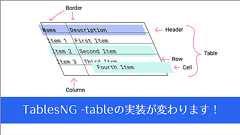
GoogleではCSSの新機能を導入するだけでなく、既存の機能を向上することにも取り組んでいます。その中の一つ「TablesNG」で、HTMLのtableの実装がこれまでと変わるのでその変更点を紹介します。 tableは古くからあり、その後さまざまなCSSの機能がブラウザに実装されました。当然、それらの新しい機能にtableは対応していません。それらに対応し、不整合を修正するのが今回の取り組みです。 TablesNG Resolves 72Chromium Bugs for Better Interoperability by Una Kravets, Aleks Totic 下記は各ポイントを意訳したものです。 ※当ブログでの翻訳記事は、元サイト様にライセンスを得て翻訳しています。 はじめに TablesNGの取り組み 1. テーブルの行にposition: sticky 2. バック
JavaScript Style Sheets (JSSS) was a stylesheet languagetechnology proposed byNetscape Communications in 1996 to provide facilities for defining the presentation of webpages.[1]It was an alternative to the Cascading Style Sheets (CSS)technology.[1] AlthoughNetscape submittedit to the World Wide Web Consortium (W3C), thetechnology was never accepted as a formal standard andit never gained a
Forget everything you know aboutCSS. Or at least, be ready to reconsider a lot ofit. If like me you've been writingCSS for over a decade,CSS in 2020 looks nothing like what you were used to. Instead ofbreakpoints, we can now leverageCSS Grid to make dynamic, responsive layouts that adapt to any viewport size with fewerlines of code. Instead of relying on global stylesheets,CSS-in-JS lets u

CSS for the <Component> AgeStyling your way with speed, strong typing, and flexibility. const Button = styled.a<{ $primary?: boolean; }>` --accent-color: white; /* This renders the buttons above... Edit me! */ background: transparent; border-radius: 3px; border: 1pxsolid var(--accent-color); color: var(--accent-color); display: inline-block; margin: 0.5rem 1rem; padding: 0.5rem 0;transition: all

はじめに 自分は普段フロントエンドエンジニアとして、React Reduxなアーキテクチャのアプリを作ることが多いのですが、stylingにstyled-componentsを導入しています。今回は、styled-componentsでのCSS設計について書いてみたいと思います。styled-componentsとは JSでstyleを記述するCSS in JSのライブラリで、2019年8月現在最も人気のあるライブラリです。タグ付きテンプレートリテラルをうまく使った独自性と、明快なAPIでCSS in JSの火付け役にもなり、同じ思想を持った亜種ライブラリ(paypal/glamorous, zeit/styled-jsx等)が続々と出て来るなどある種のブームを巻き起こしました。 そもそも、Reactの登場でフロントエンド開発が「jQueryによるhtmlへの振る舞いの後付け」というスク

リリース、障害情報などのサービスのお知らせ
最新の人気エントリーの配信
処理を実行中です
j次のブックマーク
k前のブックマーク
lあとで読む
eコメント一覧を開く
oページを開く


