Android 9 Pie, thoroughly reviewed
The time has come for our annual deep dive (~19,000 words) into the latest Android release.


It’s time for another big Android release—and another big review to go along with it. The latest update for the world’s most popular operating system is Android 9 (not 9.0) Pie. While last year’s Android 8.0 Oreo release focused on under-the-hood changes, Android 9 Pie ships a ton of user-facing features and UI changes, making it feel like the “tock” to Oreo’s “tick.”
Android 9 Pie brings Google’s updated Material Design spec (don’t call it “Material Design 2”) to Android OS, and it begins a wave of UI updates that will spread across Google’s entire portfolio. In Android, that means revamped interfaces for the notification panel, Recent Apps, settings, and various bits of system UI. For future smartphone designs (like, say, the Pixel 3), Android 9 includes an experimental gesture navigation system and built-in notch support. There’s also a new screenshot editor, lots of improvements for text selection, and changes to the way rotation works.
Under the hood, more changes have come, too, with AI-powered battery usage controls, new rules for Play Store developers, and changes to how apps get distributed.
We have a lot to cover with this release, so grab a snack, find a comfy chair, and let’s dive in.
Material Design refresh
This year, Google will roll out the next generation of its design style, Material Design, across its product lineup. The update was once referred to internally as “Material Design 2,” but officially it’s still just “Material Design” without the numbered sequel. We’ve already seen big design revamps for Desktop Gmail,Chrome, the Google Search app, and tons of other Google apps; with Android 9.0, this new design style now comes to the base OS.
The initial version of Material Design, which launched in 2014 with Android 5.0, wasn’t just a design system for Google’s apps and OS; it also became a recommendation for third-party Android app developers. It was the first time Google published a comprehensive set of design guidelines, and the new style really did get traction with developers. To date, millions of apps have adopted Material Design. With official guidance for icons, navigation, layout, text, and colors, Material Design brought a new level of consistency to the Android app ecosystem. Perhaps it was a littletoo consistent, though—the designs let you play with color and not much else.
A design system for making design systems


At I/O 2018, Rich Fulcher, the UX director of Google’s Material Design team, said developers “didn’t always see Material Design as flexible enough” and that “products from different brands looked too similar.” In response, Google developed “Material Theming,” a guided way for third-parties to use the Material Design fundamentals to create a custom design system. Google then used this new system to create a Google-specific version of Material Design called the “Google Material Theme.”
This new incarnation of Material Design separates fundamental usability and understandability concerns from the individual styling of elements. For instance, button styles can have varying shapes, colors, shadows, and typography and can live in a few different locations, but the fundamentals (like minimum touch sizes, padding, font sizes, contrast, and display size responsiveness) are dictated by the Material guidelines.
Matias Duarte, the head of Google’s Material group, calls Material Theming “a design system for making design systems”—a set of guidelines for making your own design language.
The best way to get a handle on it is to try out Google’s newMaterial Theme Editor, which is a plugin for Sketch, the popular Mac-only design app. Start the Material Theme Editor and you’ll be presented with an interface creation system that suggests a video game character creation screen. Rather than picking from skin colors and hairdos, though, you craft an app design language, picking from a curated selection of color palettes, shapes, fonts, and icons.
First, you’ll create a theme color palette, picking a primary color, a secondary color, and a background color (usually white or black). For all these options, you can pick a white or black text color, and the system also generates light and dark color variants, which get used in some UI elements. The system even checks for contrast problems and will warn you if, for instance, you come up with a hard-to-read “dark-on-dark” combo.
Next come fonts, and the editor can either intelligently apply an entire family of fonts across the design, or you can use several fonts for things like a standout title and normal body text. Before this design revamp, the only recommended font wasRoboto.
After fonts, you can pick a shape motif (round or angled), set all the corner angles or radii individually, and pick the number of corners. The shape gets automatically applied to some action buttons and cards, but of course you can go in and tweak whatever you want. Finally, you can pick from several pre-baked system icon sets.


These choices are then applied throughout the design. A basic theme is generated with a ton of different layouts (more on those later) and some sane defaults. From here, you can do further tweaking, adjusting the layout, shadows, buttons styles, and iconography. It’s like a big Lego set. Google even calls Material Theming “infinite possibilities with guard rails.”
This isn’t something Google imagines large companies using, but it allows small app developers to get up and running quickly with a competent, customizable design system.
Another major new push in this new version of Material Design is engineering support. Creating cool mockups and animations for UI design is one thing; turning them into functional apps is another. The first wave of Material Design guidance didn’t come with much advice to translate these designs into working code. Duarte recently revealed that his Material group now has more engineers than designers, however, and this group is pumping out real code to make Material easier to implement.
This has led to things like the Material Theme Editor, along with a whole open source repository of “Material Components” that covers many of the common needs of a Material Theme, like tabs, action buttons, and toolbars. This isn’t just for Android, either—the components are available for iOS, the Web, and Flutter, too.
How does this play out in Android? Google uses the Google Material Theme in its apps and on the OS skin that ships with the Pixel phone. It looks like non-Google phones will get something very close to the Pixel skin but with (as we’ve seen in the past) slightly tweaked colors. Third parties will use Material Theming to create their own versions of Material Design and apply that to apps.
Material Theming was only announced in May, so it’s early to see how this will play out in the third-party ecosystem, but so far Google has called out Lyft, Genius, NPR, Pocket Casts, and Zappos as early partners.
Controls where you can reach them


Google also has new layout and navigation options for apps. Google isn’t advocating that all apps adopt these new layouts—it’s just adding them to the existing toolbox of layout options it recommends to developers. The screenshots above are all from the “Material Components” section of Google’s guidelines, which means there are detailed specs and code samples for each, making them easier to implement. Don’t be surprised if you see them in future Google or third-party apps.
There are now a lot of Material Components that place important controls at the bottom of the screen. Traditionally, Android’s controls have been at the top, but as devices reach ever-larger screen sizes (with extra-tall 18:9 aspect ratios), it gets harder even to reach the top of the display. Since your fingers are closer to the bottom of the phone, it makes sense to put the most important controls there.
The updated spec has crazy new design patterns, like a bottom app bar, which pins the menu bar—hamburger button and all—to the bottom of the screen. In addition, there’s a bottom navigation drawer, which (rather than sliding in from the left and sticking menu items at the top of the screen) slides in from the bottom. It only extends halfway up the screen until you start scrolling, making the most important top items easily reachable.
Another fun new layout option is the “Backdrop” pattern, which places a background control layer behind a foreground content layer. The background control is partially exposed as a bar at the top of the screen, displaying contextual information about the content layer (often search result options). You can scroll the front contextual layer like normal, but if you tap on the bar, the foreground content layer will slide down, exposing more of the background layer and more control and display options.
There are also some new capabilities for the floating action button (FAB). This traditionally circular button is meant to be a “primary action” button, giving users an obvious thing to do in a screen other than scrolling.
The FAB can now be centered on the screen, instead of being pinned to the bottom-right corner. This works well with a bottom menu bar, which usually has a left hamburger button, right action buttons, and a blank middle. The FAB can also be just about any similarly sized shape thanks to Material Theming, while a wider option called the “extended floating action button” (E-FAB?) provides room for text.
When Google.com is your design North Star


So, what exactly does the updated Material Design mean for Android? Well, it means putting the all-new Google Material Theme on the base OS (on Pixel phones, at least) and on a few lucky apps (for now). Don’t expect sweeping, coordinated changes across Google’s entire app portfolio, though. Just like the first Material Design launch in 2014, we can expect an agonizingly slow rollout of the new design style. Some of Google’s products, like Gmail.com, never even got an original Material redesign—redesigning the site took so long it jumped from a 2011 design all the way to this new Material Theme!
The quickest way to describe the Google Material Theme is “round and white.” While the original Material Design style threw around bold splashes of color for things like top action bars and buttons, Google Material Theme apps are almost entirely white. The inspiration for Google’s new color scheme seems to be: “What ifGoogle.com was an app design?”
The result is a lot of white. Expect white controls with a white action bar and a white background, with the occasional ingress of color from an icon, profile picture, or an accent on the currently selected item.
Of course, not everyone likes the hyper-whiteness of Google’s new design direction. With so few colors, it seems like it would be easy to flip a switch and invert the background and text colors. We have seen suspicious movement on the dark mode front (namelyAndroid Messages), but it is currently unknown if a dark mode is planned as a baseline consideration in Google Material Theme apps.
Nearly everything gets a rounded corner in Google’s Material Theme. Rounded rectangles are used to build the new notification panel, and all the Quick Settings buttons are round (just like the app icons on the Pixel phone). Search boxes in the Google app and in settings get rounded into a pill shape, and just about every box or pop-up window gets rounded corners. If we’re looking at the Material Theme Editor, Google appears to have picked “round corners,” applied it to everything, and called it a day.
Roboto is still used as the font for many screens, but Google is throwing in a heavy sprinkling of Google Sans—the font used in the Google logo—in many areas. In the settings, for instance, you’ll get Roboto for most of the text but Google Sans in the top action bar headings and in the search bar (if you’re using a Pixel phone). Google Sans seems to get used more heavily in Google interfaces that offer particularly Google-y features. The Google Assistant, for instance, is almost entirely Google Sans now. Ditto for Google’s Pixel setup app and update page.
Google’s Material Theme also brings a whole new collection of system icons in a new outlined style. You’ll find new icons to represent the quick settings buttons and all the various settings iconography.
The New Notification Panel


The development mantra for Android’s system UI team might be “Never Stop Building Notification Panels.” InAndroid 7.0, the notification panel got a new layout, notification bundling, quick replies, and customizable quick settings. InAndroid 8.0, it got new sorting, dynamic music notification colors, a snooze option, and variable notification sizes. In Android 9, the notification panel is getting a whole new coat of paint, along with improved chat notifications and new layouts for Quick Settings and ambient display.
All this iteration is worth it, though; in the great Mobile OS Wars, Android’s notification panel is a major differentiator, and it gets better with every release.
First up is the new Material Design, uh,design, applied to the notification panel and quick settings. White, rounded rectangles surround the notification and the quick settings sections, leaving a bit of transparent space in between each section. I was not a fan of Android 8.1’s semi-transparent background for the quick settings, which unnecessarily muddied the background (especially when there was text behind the panel), so I’m happy with the switch to a solid white.
As in Android 8.1, there’s also a dark mode for the quick settings only (notifications themselves are still white). Before, this would switch to dark automatically when you chose a dark wallpaper, but now the display settings let you pick a “Device Theme” of “Light,” “Dark,” or “Automatic (based on wallpaper).”
There are many tiny layout changes in the notification panel. First, the time (which is now on the right!) and the battery icon live above the quick settings panel. Rather than live on some kind of panel, they just hang out in the void space between the quick settings and the top of the screen. Then there’s kind of a second status bar on the compact quick settings panel, which shows the date and connectivity icons (like Wi-Fi, cellular, and “do not disturb”). Below the usual six quick settings buttons is a pull-down handle, which is a nice indicator that tells people, “Hey, you can expand this!”
The layout of the notifications themselves hasn’t changed much, but they are now in a rounded rectangle. Below them is the usual “clear all” button and a new “manage notifications link” that jumps you right into the app notifications settings.
The quick settings buttons are round now, too, with blue circles indicating “on” and gray circles indicating “off.” Most buttons were also outfitted with new icons that match the outlined style of Google’s Material Theme. This also has the bonus of better contrast compared to the dark gray/light gray buttons of Android 8.1.
Every year, it feels like Google changes the way quick settings works, and with Android 9 the company has greatly simplified everything. The drop-down panels of Android 8.1 are gone; everything is now a toggle, and a long press will warp you to the most relevant system setting. One loss: without the drop-down panels, you’re no longer able to do things like scan for Wi-Fi or Bluetooth devices directly from the quick settings. The panels allowed you to quickly connect to something without losing the current context of whatever you were doing, which was nice given how janky Android’s back button behavior can be.
Better message notifications


Messaging notifications—the kinds generated by texting with SMS, Hangouts, WhatsApp, and other apps—get a few special features in Android Pie. Message notifications are now threaded, so if you have a rapid-fire texting session, the last few replies will show up in the notification. The threaded notifications look just like a mini texting app, complete with contact pictures on either side of the message. The messaging notification can also show pictures in-line, so instead of a “picture,” you can see a tiny thumbnail right in the notification panel.
The one oddity with threaded messaging is that, while your contact’s picture will show up, there seems to be no way to set a contact icon for yourself. No matter what I do (in Android Messages, at least), I always get a placeholder image.
Earlier this year, Google released an experimental app called Reply, which would inject machine-learning-generated replies into an app’s notifications. Google’s magical AI would scan your message and generate a few custom responses based on things like the message text and sometimes even your location and the traffic. It was a neat idea, but as an app that glommed an unauthorized new feature onto a third-party app, it was a total hack job. After granting Reply a shocking number of permissions—like being able to read and reply to all your notifications—it basically became a man-in-the-middle notification hijacking scheme. Reply only used its powers for good, but it was definitely a scary proposition.
With Android Pie, Google is taking a second swing at supplying smart replies to all apps, but this time with enough OS and cloud support to make it a real feature. The easy part is already in Android Pie—notifications can have smart reply buttons that send pre-generated text to an app. Now you just need a chatbot-style AI that can read the messages and generate truly worthwhile responses.
The AI for Smart Replies doesn’t quite exist yet, but Google has said it will be part ofML Kit, a new toolkit designed to give developers easy-to-use machine learning APIs without having to learn something like TensorFlow. ML Kit launched in May of this year with APIs for text recognition, face detection, barcode scanning, image labeling, and landmark detection; eventually, smart replies will be part of the collection. For now, we wait.


Android Pie tries to help keep a lid on notification overload by suggesting that you block notifications that you rarely tap on. This works off of the notification channel system introduced in Android 8.0 Oreo, which allows developers to break down their notifications into several types. So, if you constantly dismiss the Google Maps “discovery” notifications, you’ll be asked if you want to block just this type of notification rather than all Google Maps notifications.
When you swipe away a notification, if it reaches the blocking threshold, a new notification will immediately pop up in its place, asking: “You usually dismiss these notifications. Keep showing them?” In action, this always feels a little strange. The question notification looks so much like the original notification that, at first, I always think the original notification has remained. I think it would be better if this was more visually distinctive from a normal notification.
The thinking behind the feature probably goes something like this: “Android’s ability to block individual notification channels from apps is really cool but very hard for a novice user to understand and access.” Surfacing the feature in a pop-up makes it much easier to use, so Google just needs to figure out which notifications aren’t useful so it can send a blocking suggestion.
Google’s metric for “usefulness” seems to be “tapping on a notification and opening the app,” though I don’t really agree with this. Sometimes, just reading the notification is enough to be useful. I’ve beennotified, so the notification has served its purpose. Still, I’m not sure what else you would use to help decide usefulness.
The other thing that worries me is that the “Stop notifications” button is easy to hit accidentally. It’s in the default “left” location, and there’s no confirmation along the lines of “Are you sure you never, ever want to see this notification again?” To me, banning a notification is a big deal; you should bereally sure that I want to do it. To make matters worse, there’s no way to see a list of apps with blocked notifications in Android 9 Pie. This used to be an option in Oreo, but the option has vanished. Hopefully this is just an oversight. (I filed a bug here.)
So, to recap: it’s easier than ever to ban a notification in Android Pie—but harder than ever to see what notifications are banned. I sure hope I don’t accidentally press this button on an important notification!
Official notch support


In the copycat world of Android-device design, more and more OEMs have opted for a notched smartphone design in 2018. This design cuts a big chunk out of the top center of the display (usually where the status bar is) and sticks various camera sensors in there. The first modern smartphone to launch with a display cutout was theEssential Phone, but really, the Android OEMs are doing their best to imitate Apple’siPhone X design, regardless of how much sense that makes for each individual phone design.
Carving out the top part of the screen requires some cooperation from the software to work correctly, so Google is responding to the OEM demand by baking official notch support into Android 9 Pie. Unimaginative Android OEMs can now clone the iPhone X with even less effort! Official notch support boils down to some status bar changes, new developer and OEM APIs, and a notch overlay in the developer settings.
The first thing you’ll notice when you boot the phone up is the new time location, which is now on the left side of the status bar. Before you had the time and all the permanent status icons (Wi-Fi, Bluetooth, battery, cellular, etc.) on the right, while nothing permanent lived on the left side of the status bar. This change applies to everyone, but really, it’s meant to better balance the status bar layout around a notch. When you are missing a large chunk out of the center of the status bar, it’s important that neither the left side of notification icons nor the right side of status icons gets too long.
Notch support means there are a few new behaviors built into the System UI. First, Android always contains the display cutouts inside the status bar for a top notch and inside the navigation bar for a bottom notch (yes, you can have bottom notches). This means, if a phone has a tall notch, the status or navigation bar will grow taller to accommodate it. An extra-tall status bar will vertically center the icons, while a bottom notch will push the navigation buttons up above the notch, just leaving dead space to the left and right.
The default behavior to contain any notches inside the system UI bars means that apps don’t have to think about notch support. They get a normal rectangular area to draw in, so by default, everything is fine. App developers can choose to engage with the notch by selecting a different “cutout mode” for their app. One mode gives an app full control over the notch area, allowing them to make a full-screen app. It’s the developer’s responsibility to query the system for the notch dimensions and work around them.
OEMs can define the shape of the display cutout, which Android can pass to apps if they ask for it. There are a few new rules for OEMs using these features: you’re allowed only one cutout on the top and one on the bottom—side cutouts are not supported, and there’s a max of two cutouts. You don’t have to center the cutouts, though—a corner notch is possible, which will just push the whole status bar over a bit. There was evidence of aprototype Xiaomi phone with a corner notch, but so far there hasn’t been a commercial release of such a design. You can see some examples of these designs by heading to the developer options in the system settings, where a new “simulate a display with a cutout” setting will emulate different notch designs.
Recent Apps


Recent Apps has been totally revamped in Android 9 Pie. There’s a new scrolling direction and thumbnail layout, a new predictive apps bar, a search bar, an always-accessible app drawer, and a nasty gotcha for anyone with a third-party home screen.
App thumbnails now scroll horizontally instead of vertically. They are now full-screen thumbnails rather than the vertically truncated thumbnails of Android 8.0, and they no longer overlap. You can now see the whole app thumbnail at once, but text is still big enough that it can be easily read, without re-opening the app. This is great for things like double-checking some navigation directions or quickly referencing an open note.
These thumbnails are always rectangles with sharp corners, which is a bit odd looking on screens that have rounded corners (basically all flagships since 2017). It would be a pleasant detail if the thumbnails were masked with the shape of your screen; that would also match better with the rounded motif in Google’s Material Theme. The notification panel uses rounded rectangles, the volume and other system UI parts use rounded rectangles, the screen is a rounded rectangle—it seems like Recent Apps thumbnails should be rounded rectangles. Some third parties, like OnePlus, have done this in their Android P developer previews, and it looks great.
If you are using the default launcher that comes with your phone, below the thumbnails there will be a transparent rectangle with a search bar and a row of predictive apps. This is actually the same row of predictive apps that lives above the app drawer, and if you swipe up on the transparent rectangle, you’ll actually open the full app drawer. This is the first time the app drawer has been available at a system level like this—normally, you can only open it from the home screen.
The title bars that accompanied each thumbnail in Android 8 are gone, replaced by a single centered icon above each screenshot. Tapping on an icon will bring up a menu with a handy shortcut to “App Info” and “Split Screen.” This is now the only way to enable split screen in Android 9. In Android 8, you could long-press on the Recent Apps button to trigger split screen, which was fast and easy. As someone who used split screen regularly, hiding the feature in a menu feels like killing it.
Not only do the bigger, unobstructed thumbnails make reading text easy, you can also highlight text and bring up the usual text controls like “Copy,” “Search,” and “Share.” This is a particularly neat trick given that the Recent Apps interface only shows screenshots of apps, not live, running apps with actual text. So, how do you pull text out of an app when you only have a picture? Optical Character Recognition (OCR), of course! That’s right, Android has real text, then throws out that text data by taking a screenshot for the Recent Apps thumbnail, then tries to get the text data back by scanning the screenshot for text.
Crazy?
This arrangement sounds crazy, but any other solution—like, say, keeping all the text rendering and layout information from your entire Recent Apps list—would take far too much memory. For something that is an on-demand action, and something you might not use all that often, having a small OCR CPU spike for the few times you want to copy text from a thumbnail seems like a better idea than storing all text and layout data 24/7. You can actually feel this happen when you long-press to highlight text in Recent Apps, since there will be a half-second delay while the OCR quickly runs. Since we’re working with a perfectly crisp screenshot with no artifacts (unlike the input from, say, a paper scanner), the OCR works flawlessly.
As an extra bonus, you can even use the Recent Apps OCR to quickly grab any UI text, even if it is not normally selectable. For instance, nothing on the Android “About Device” screen is copy-able (why Google?), but when I open Recent Apps, everything gets OCR’d, and I can easily tell you that my build number is “PPR1.180610.009.” Normally, that would take a bit of labor and double-checking.
The system will identify pictures, too, and if you long press on one you’ll get the “share” option rather than OCR. Keep in mind, this is an automatically cropped picture of a screenshot, so it will be low resolution, any UI overlays will be intact, and if it’s cropped in the Recent Apps thumbnail (like from zooming in on an image), it will be cropped when you share it. This also means you usually can’t OCR images of text—for that, you’re better off firing up Google Lens.
No API for third-party home apps

The new Recent Apps interface has also led to a major architectural change: the Recents UI is now part of the home screen app. Previously, Recent Apps lived in the System UI, which controls other system-level interfaces like the notification panel and navigation bar. With Recent Apps gaining new home screen-like abilities (like pulling up the app drawer and showing a predictive apps bar), you can see how a merger of the Recents UI and the home screen makes sense.
There is a big problem with this change. The home-screen app is a replaceable component in Android—anyone can jump over to the Play Store and download an alternative home launcher. For Android Pie, Google built a new Recent Apps interface, integrated it into the default system launcher, and then didn’t give any other home-screen developer a way to also use all of the new features. On the Pixel phones, this means you need to use the Pixel Launcher, while, on a third-party device, this means you need to use the pre-installed home-screen app.
If you install a third-party app from the Play Store, you’ll lose some functionality in the Recent Apps screen. The bottom predictive apps bar will be gone, as will the ability to pull up the app drawer on the Recents screen. They still pick up the new horizontal design, but the screen will only show thumbnails and nothing else.
Adam Cohen, the tech lead manager for the Android Launcher, revealed in a Reddit AMA that “There are no immediate plans to open up the necessary API for 3Ps to replace Overview [the Recent Apps interface], as it’s not stably well-defined and has security implications.” The “security implications” Cohen is referring to is most likely thumbnail handling. Replacing the Recent Apps interface would mean sending screenshots of all your apps to a third-party app, and these screenshots could contain things like bank account records, credit card numbers, or other personal information. I’m not sure anyone is asking toreplace the Recent Apps screen, though; I think most people just don’t want to lose features when they use a third-party home screen.
Gesture navigation—Ugly, lopsided, and pointless


Closely tied to the new Recent Apps interface are the new gesture controls. Android Pie ships with this as an optional extra navigation mode, which can be used instead of the usual single-tap software navigation buttons. So far in Android Pie, this is off by default, but Google has said it willbe the default (but still optional) mode for the Pixel 3. For now, anyone on Android Pie can turn it on by going to Settings -> Gestures -> “Swipe up on home button.”
The normal navigation system in Android places a black bar at the bottom of the screen with buttons for “Back,” “Home,” and “Recent Apps.” Gesture navigation in Android Pie doesn’t remove this bar or even make it smaller—instead, you’ll get a different set of on-screen buttons. The home button changes from a circle to a pill shape, sometimes the system will hide the back button, and gesture nav will completely remove the Recent Apps button.
Tapping on the center pill button will still act as “Home,” but now a swipe up will open up Recent Apps. Sliding the pill to the right will trigger a quick-scrolling Recent Apps view—a quick swipe will switch to the last used app, while holding your finger down and moving left and right will scroll through the list. While a normal swipe up will open Recent Apps, you can also make a really long swipe up to open the app drawer from any screen, provided you are using the default home app.
Gesture mode doesn’t really change how the back button works. It will hide itself on the home screen, but that’s about it. There’s no gesture for triggering the “Back” functionality, and swiping left on the pill doesn’t do anything. These two things seem like they would go well together, right? It would be nice if a swipe left triggered the “Back” functionality.
The only thing you could possibly call an advantage is the ability to open the app drawer from anywhere (which again, only applies to the default launcher). But the gesture for this is so awkward it’s not useful. Remember, a regular swipe up opens Recent Apps, so to make room for that, the swipe up to open the app drawer is now a huge distance. To do that reliably on a Pixel 2 XL, you have to cover about 50 percent of the vertical screen space with your swipe, or you’ll just get the Recent Apps interface. This applies to the home screen, too, so you can’t open the app drawer with a normal swipe anymore. Instead, you need a long, half-screen drag, which makes opening the app drawer more of a chore.
Usually what happens—even after having this on for months during the beta period—is that I fail the app drawer swipe and end up on the Recent Apps screen. On Recent Apps, a regular-size swipe will actually open the app drawer, so I’ve started doing this “double swipe up” gesture sometimes—once to open Recents, and again to open the app drawer. It’s slow but reliable.
Gestures
Android Pie’s gesture system leaves a lot to be desired. I’m not really sure what the goal of it is. The system feels half-finished, with gestures for some navigation functions but not for others. It doesn’t save any space on the display—the navigation bar is still there and still just as large. It’s also ugly—there’s still a black bar, but now it’s lopsided, with the Back and Home button showing on most screens and a blank space where the Recent Apps button used to be.
Android 9’s gesture navigation isn’t something that gets better when you stick with it either. Thanks to the lengthy developer-preview period, I’ve been able to use gesture navigation since May, and even after months of usage, my initial concerns never got any better. Turning it off was actually a relief.
When the iPhone X switched to gesture navigation, users needed to accept a big change, but it also came with a big advantage. Apple removed the hardware home button and gave the phone dramatically smaller bezels, leading to considerably more screen space in the same size body. Android’s gesture navigation isn’t offering users any kind of benefit in exchange for learning the new gesture controls. There’s no screen-space savings or speed improvements. At best, it’s change for change’s sake. At worst, it’s a pure downgrade.
While gesture navigation is bad, it’s not a huge deal in Android 9 Pie, since it’s off by default. Gesture navigation is something you won’t know about unless you hear about it somewhere. Even then, you have to go spelunking through the settings to find it. If the gesture navigation really is on by default for Google’s upcoming Pixel 3 smartphone, though,that would be a big negative for the device. Hopefully you’ll be able to turn it off.
There is hope for gesture navigation in the future. In a bug report asking why the new navigation system didn’t have a back gesture or save any space,Google released a statement saying, “We’re looking at various options to be more fully gestural and create more space by minimizing the navigation bar (as you say, we have an opportunity to create more space for users and/or better balance the navigation buttons)—but we’re also balancing that against our top priority, which is user and app expectations and compatibility.”
If Google was going to build a gesture-navigation system that dumped the navigation bar, it would probably run into the mentioned “app compatibility” problems concerning touch input. Google would need to carve out an area at the bottom of the screen for system-level gestures and somehow inform apps that this area was fine for drawing in but off limits for touch input. Currently, apps expect to have nearly the entire drawing area for touch input (save for the status bar). This will give us a good heads-up for future gesture-navigation changes: if Google starts dictating touch input restrictions to developers in a new API level, we know major gesture-navigation changes are probably on the way.
Hopefully, Google will take a second swing at gesture navigation and give users a reason to switch to it. In a perfect world, Google would do this before gesture navigation becomes default or (god forbid) mandatory.
System UI


The new design style means Android’s System UI is getting a fresh coat of paint, too, and even a few new features.
First up: the volume controls have a new look and new functions. You get, as usual, the volume controls’ round and white design. They’ve switched from an edge-to-edge horizontal UI with three expandable sliders to a smaller, simpler vertical layout. There’s only ever one volume slider now, and instead of defaulting to the notification and ringtone volume, the slider controls media volume.
Besides the slider, you get three buttons. The bell icon is a three-way toggle for the notification and ringtone volume, which switches between “on,” “vibrate,” and “silence.” The music-note button will instantly mute and un-mute the media volume. The settings gear will jump you to the sound settings, where you can still see volume sliders for everything.
I’m a fan of the simplified volume layout. I have never felt the need to have my notification or alarm volume at something like “68 percent,” so I don’t see the need for the sliders. I feel like I only ever want notifications to be at full volume or be silent, and the toggle lets me quickly do that. The only thing I really want fine-grain control over is the media volume, and that’s for things like starting up a YouTube video without blasting the sound at max volume.
I’ve always disliked how weirdly disconnected the volume UI is on smartphones. Most phones have physical “up” and “down” volume buttons, but the display has a UI slider that moves left and right. The new vertical volume controls make considerably more sense to me: the vertical slider lives right next to the vertical buttons on most phones, pressing the “up” volume button makes the slider go up, and pressing the “down” volume button makes the slider go down.
Sadly, this falls apart in landscape mode, where normal Android rotation means the volume slider doesn’t follow the volume buttons, and you have the “up=left” and “down=right” problem again. For the majority of the time you use a phone (in portrait mode), I think the new vertical style is great.
The awesome smart rotation switch

This new button on the right of the navigation bar is the new smart rotation switcher, which is a whole new way to manage device orientation. To see this button, you turn off auto-rotate and rotate the phone, and this handy button will pop up in the navigation bar. When you tap it, the phone switches to landscape, and the button disappears. When you’re done with landscape mode, just rotate the phone back to portrait, and the rotation switch will pop up again. Then just tap it to fix the orientation.
This smart rotation switcher is one of my favorite features of Android Pie and a way better alternative to finicky and slow auto-rotate functionality. Phones are primarily used in portrait mode, and unless you are playing a game, taking a picture, or watching a video, you probably want to be in portrait mode. One of the problems with auto rotate is that it treats portrait and landscape as two equally valid states even though portrait is the primary orientation and landscape is only for certain apps. Auto-rotate also always assumes that gravity will provide the correct screen orientation, but if you’re lying down and trying to use a phone, that’s not correct relative to your face.
Rotating on Android also isn’t a “free” process. It depends on how the app is built, but for some interfaces, rotating the screen means destroying the current activity and redrawing the entire screen. This takes time and processing power. You can lose any entered text data, and you can lose your scroll position.
This effect can snowball, too. Imagine a phone sitting upside-down in a pocket, and you go through the normal process of turning it on, pulling it out of your pocket, and rotating it up to your face. That’s three rotation states: portrait when the phone is upside down, landscape while you’re rotating it up to your face, and portrait when it’s right-side up again. Depending on how the app works, this could be two or three app reloads in rapid succession right when you’re trying to use the phone. Often this can take several seconds, cause a ton of lag, and cause a ton of user frustration.
So limiting the amount of unnecessary device rotations is a hefty benefit, and the smart rotation switch accomplishes that and still offers the easy flexibility of switching orientations. Rather than letting auto rotate change the screen orientation every time it detects a change, it now just quietly asks if you want to rotate by popping up a button in the navigation bar. The rotation switch puts you in full control of the device orientation. It’s less frustrating than auto-rotation detection and faster than pulling down the quick settings to switch between auto-rotate and rotation lock.
Better, smarter, and faster text handling


Text handling has undergone all manner of changes, too. A new text magnifier makes it really easy to place a cursor or highlight something. It works exactly like iOS’ text tools: just drag around a text handle and you’ll get a pop-up magnifier allowing you to zero in on the cursor location.
Android’s detection and linking of entities in text has improved, too, thanks to a new feature called “Smart Linkify.” This machine-learning-powered feature scans text for addresses, phone numbers, dates, emails, flight numbers, and URLs, and if it detects a match, it will turn the text into a link. A version of this feature has always existed in Android, but it was powered by a bunch of regexes that weren’t always accurate. So Google set about solving this problem the way it solves all problems lately: by sprinkling some AI on it.
Once an entire special string is selected and before the usual “Cut,” “Copy,” and “Paste,” you’ll find a direct link to a relevant app. For an address, you’ll get Google Maps. For a phone number, you’ll get the phone app or text app. For a URL, you’ll get Chrome. Tapping on the icon will jump right into the app and bring your highlighted data along with it.
In order for this feature to work, Android has to load some text-scanning AI model from the disk. That means the linking has to happen asynchronously. Because of the slower load times, the API is opt-in on an app-by-app basis.
The way text is rendered gets a major under-the-hood change in Android Pie. Believe it or not, text is one of the most intensive things to render in an Android app. AsGoogle’s blog post puts it, “TextView has to do a lot of work to measure and lay out the given text: reading the font file, finding a glyph, decide the shape, measure the bounding box, and caching the word in an internal word cache.” Letters need to be measured and placed, line breaks need to be decided, and hyphenation and justification needs to be calculated. Since all of this is text that needs to appear and disappear in the interface when scrolling or moving between screens, every bit of this calculation happens on the UI thread.
Doing anything on Android’s UI thread is a big deal, since if anything slows down, the whole phone UI will slow down with it. Any time you hear an Android phone described as “laggy,” chances are people are talking about an overburdened UI thread. A new API called “PrecomputedText” can do plenty of this layout work before it’s time to draw the screen, and developers can even move it off the UI thread and onto a background thread. PrecomputedText can do 90 percent of the text processing on a background thread, store the results in cache, and only have 10 percent of the usual workload to do when it’s rendering time. Doing less work on the UI thread should be a boon for performance.
Keep in mind this is a developer API, so PrecomputedText will only work if a developer chooses to use it. It won’t work for every app or every text field, since you need to have the text ahead of time in order to do background processing. The good news is that PrecomputedText is backwards compatible with older Android versions via thePrecomputedTextCompat library. It works all the way back to Android 4.0 Ice Cream Sandwich.
Better biometrics

Also new in Android Pie is a new biometric authentication API, which is replacing the fingerprint API introduced in Android 6.0. The Fingerprint API is being replaced because it simply wasn’t flexible enough. The old API was made when everyone was just catching up to Apple Touch ID, so it was designed around having a separate piece of hardware that would accept a fingerprint and not much else. Today, the world of biometric authentication is much more varied, so a new API was created to deal with the flood of new and non-fingerprint-based biometric options.
Besides the standard fingerprint hardware, the new API covers iris scanners, face scanners, and in-screen fingerprint readers. The new API also allows for more varied system-UI popups to match the more varied biometrics method. An in-screen fingerprint reader, for instance, needs to pop up not just a fingerprint-authentication dialog; it also needs to tell the userwhere the fingerprint-sensitive part of the screen actually is.
The really good news about this API as a baked in part of Android is that you’ll finally be able to use a non-standard biometrics option with third-party apps. Take something like a recent Samsung phone, for example, which comes with an iris or face scanner. You can use this to unlock the phone, because Samsung is in charge of the lock screen and can customize it to work with an iris scanner. Having the iris scanner work with a third-party app has been tough, though. Something like a banking app might go out of its way to support the official Android biometrics API, but supporting an extra API for every single OEM’s non-standard biometric solution isn’t a scalable option for many developers. With Google’s more flexible biometrics, all these OEMs can plumb their solutions into the new biometrics API, and third-party apps that support it should just work.
As usual, thanks to the Android ecosystem’s terrible update speed, any developer feature exclusive to the latest version will face an uphill battle for adoption. It’s good news, then, that Google is building another compatibility library for BiometricPrompt, which will support older Android versions.
Settings


Settings mostly just gets a new coat of paint in line with the Google Material Theme. That results in a white background, colored section icons, and a rounded search box. This is one of the few Google Material Theme refreshes that is actually more colorful, and it’s a nice change from the light gray, dark gray, and medium gray design of Android 8.
The existing settings screen gets a few little tweaks, and Bluetooth has had all of its checkbox settings wrapped up into a “Connection preferences” screen. Now, with only three lines of items, the first Bluetooth screen is oddly empty and kind of useless. It will show your currently connected devices, make your phone visible to other devices, and not much else. With Android P, you can now connect to five Bluetooth devices simultaneously, so you could make this screen look worthwhile if you connected to a ton of stuff at once.
Both the security and battery page get a new icon motif that shows green icons for good status, yellow for medium, and red for bad. The battery screen uses it for app behavior and will flag apps that are hogging the battery. The security page uses the red/yellow/green motif for your security-patch recentness, Google Play Protect, and Find My Phone. The other improvement to the battery options is that the battery saver no longer turns your navigation bar an obnoxious orange color. It’s now something you could theoretically leave on all the time if you really wanted to stretch the battery.
The “About Phone” screen has been totally rearranged and now features your profile picture at the top. All the version information has been moved into its own popup screen, rather than displaying in-line. At first, I was a little disappointed to see the security patch hidden in the popup. But then I remembered it’s not front and center on the security page, complete with a judgmental green, yellow, or red icon denoting how up to date it is.
The only major new addition to the developer options screen is a “feature flags” page that will let you toggle certain options on and off. The page gives off a very Chrome-like vibe, where chrome://flags has been a staple landing site for new features since time immemorial. On Android P though, most of these flags are already on by default, and toggling them off will just resurrect an old interface that has been replaced already. A few others, like “settings_systemui_theme” don’t seem to do anything.
Digital Wellbeing


Both Google and Apple are taking swings at “smartphone addiction” this year and are shipping tools that help users track and control their smartphone usage. In Android Pie, this feature is a beta called “Digital Wellbeing” that bears more than a passing resemblance to parental controls, but you set them for yourself.
Digital Wellbeing lives in the app store but hooks deeply into Android Pie. You won’t find Wellbeing as an app icon (at least, not by default)—it’s actually an extra section in the settings, which will appear when you install the app. Digital Wellbeing wraps up a few new features: a usage dashboard, app timers, a new “Do Not Disturb” mode, and a new “Wind Down” mode.
The Dashboard is the first thing that pops up when you open Digital Wellbeing. A big circular graph at the top shows the app you used, while a big number in the middle shows your screen-on time. It also shows the number of unlocks and number of received notifications.
Pretty much every piece of the circle graph is a jumping-off point to more detailed stats. You can tap on the screen-on time to see time broken down by app. You can tap on the app name in the circle graph to see daily and hourly usage for that app. Similarly, you can tap on the unlocks or notification numbers to see detailed breakdowns for those stats.
The difference between the Digital Wellbeing app usage dashboard and the Battery app usage dashboard seems minimal. They both show app usage charts and track app usage time, and they both make usage recommendations and serve as a jumping off point into various settings screens. The data shown between the two screens is almost redundant—it almost seems like they should be merged into a single page or at least use the same data source.
More on Digital Wellbeing
By the way: battery usage and Digital Wellbeing don’t use the same data source. I am extremely jealous that Digital Wellbeing saves your app usage history going back for weeks, while the battery-usage data is automatically deleted every time you charge your phone. Digital Wellbeing puts out a weekly bar graph that shows your screen-on time for each day, and tapping on a day will load up all the detailed stats for that day. You can even scroll through the weekly chart to view previous weekly charts.
It would be really handy to have this historical data for battery usage, too. Even Googlers will tell youpower usage varies greatly from day to day, so it would be nice to look at which apps have been sucking up power for the whole month rather than just the last charge. Since so many of the stats between the battery and Digital Wellbeing screens are redundant, it really seems like, if you are saving one for weeks, you should save the other, too.
Apps can plug into the Digital Wellbeing screen and link to stat-tracking screens of their own. YouTube, for instance, shows a link to its own dashboard, which shows combined watched hours across all devices. It also surfaces controls for relevant controls, like a reminder to take a break and the “autoplay” checkbox.
The Wellbeing dashboard also seems like it could be useful for reducing notification spam, if only it had a few tweaks. You can sort apps by number of notifications received that day, and it’s really interesting to see just how many notifications your apps generate and which ones are the noisiest. The problem is that it’s very hard to take action from this point. Many apps have several different “notification channels” that notifications are broken down into, but the dashboard only shows you information by app. I would prefer that the dashboard worked the way the notification settings work and that it would display notifications broken down by channel. It would also be nice to see a history of the notifications, since I often can’t recall what the app notifications were or if I wanted to block them or not.
Some of the notification counts seem largely inflated. I played music for a while, so that’s 37 Google Play Music notifications—one for each song I played or skipped. The Play Store had some app updates for me, and one press of the “update all” button somehow worked out to 21 notifications.


If you decide any of this data is so alarmingly high that you want to use your smartphone less, Digital Wellbeing has a number of features that aim to curtail smartphone usage. First, there’s a new “app timer” feature that you can set for any app. This is basically just applying parental controls to your own account. A timer will start up once per day when you open the app, and when the timer hits zero, the app is locked out. The app will close, the icon will turn gray, and notifications will be blocked.
The one thing about setting parental controls for your own account is that you can also unset them for your account and continue using the app. So while there’s no possibility for security here, if you find yourself wasting too much time viewing cat pictures on reddit, this is an easy way to keep track. You just have to hope that an overwhelming sense of shame keeps you from turning off the lockout and resuming your social media scrolling.
For night-time, a new “Wind Down” feature is designed to stop you from endlessly tweeting away your sleeping hours. You set a start and end time for the night, and when the time starts, the screen will switch to a grayscale mode. The idea is that a colorless phone will discourage usage when you should be sleeping.
Along with the f.lux-style “night mode,” there are now two competing “do stuff to your screen colors at night” modes—one turns the screen gray and another turns it brown. The brown night mode is more soothing, just because it gradually fades the screen to brown. The gray Wind Down feature is like a light switch—the time hits, and the colors drop instantly. A fade-in over a few minutes would be nicer.


Also part of the “Digital Wellbeing” bucket is a number of changes to the Do Not Disturb settings. Android used to have three different notification modes for DND: Normal, Priority, and total silence. This new revision does away with the three modes, so Do Not Disturb can either be “on” or “off.” The good news is that there are now five pages of settings for Do Not Disturb, so you can pretty much define Do Not Disturb to mean whatever you want it to mean.
If you want DND to mean “total, complete silence” you can still do that, but if you want to replicate the old priority mode, you can still do that, too. You can toggle sounds from alarms, media, and touch sounds in DND mode, and you can allow calls and messages from all contacts, no contacts, or only specific “starred” contacts. You can block reminders and event notifications while allowing repeat calls to punch through the silence. New in Android Pie are DND controls for the visual disturbances, too. You can block the intermittent visual notifications like the phone-notification LED and active display, and you can even block the static displays like the status bar icons. If you tick all the boxes, it’s basically the equivalent of activating Airplane mode—you’ll have no idea you have notifications until you turn off DND mode.
At some point in the future, DND mode is getting a new “shush” gesture that will allow you to enable Do Not Disturb just by flipping the phone face down. This feature isn’t out yet, though.
Adaptive Battery—Doze mode’s new AI overlord


With every new version of Android comes a new scheme to save more battery, and that usually means further restricting background apps in some capacity. This year the new feature is “Adaptive Battery,” and like all other recent Google projects, it uses artificial intelligence!The project was a collaboration between the Android team and Alphabet sister company DeepMind, one of the few companies using “AI” asmore than just a buzzword synonym for “algorithm.”
When on battery power, the new AI is supposed to dole out background access to the apps you use and restrict background access from the apps you don’t use. AsDeepMind puts it, Adaptive Battery “uses a deep convolutional neural net to predict which apps you’ll use in the next few hours and which you probably won’t use until later.” Google says the changes have resulted in a 30-percent reduction in app wakeups.
“A reduction in wakeups” is really the key description as to what Adaptive Battery does. It only delays lesser-used apps from waking up a device while it is in Android’s deep-sleep “Doze” mode. This means the screen will need to be off for some time, and you have to not be using the device. Only then will the AI kick in and start delaying app wakeups, saving power. If you tap the power button and turn the screen on, everything goes back to normal.
Apps that get smacked down by the AI have restricted access to background JobScheduler jobs, alarms (the pre-JobScheduler method for waking up for background work), networking, and cloud push messaging. This is a sliding scale that is broken down intofive “app standby” buckets that apps will be automatically placed in.
- Active—These are apps that are currently open, showing a foreground service notification, running a sync adapter, or apps that have had their notification tapped on by the user. Active apps don’t have any restrictions placed on them.
- Working Set—These are apps that run “often,” which Google defines as being launched on “most days.” These apps have no restrictions for network or push messaging, but background jobs will be deferred up to two hours while your device is in Doze mode.
- Frequent—Google says “Frequent” apps are “used regularly, but not necessarily every day.” In Doze mode these apps can have background jobs deferred up to 8 hours, and high-priority messages are limited to 10 per day.
- Rare—Google says “Rare” apps are “not often used. For example, a hotel app that the user only runs while they’re staying at that hotel.” Rare apps get Doze background jobs deferred up to 24 hours and are limited to five high-priority messages a day.
- Never—This one is self-explanatory: these are apps you have never opened. They don’t get to run any background jobs or do any background processing.
It sounds scary turning background work over to an AI—what if it screws up and I miss an important message or email?!—but I think the thing people really care about here are the push messaging restrictions. These will be things like text messages and email notifications. At the very most, if your app somehow ends up in the “rare” bucket, you’ll still get the first five messages a day, and then you’d have to not interact with any of them in order to miss message number six. If you’re getting high-priority notifications you aren’t interacting with, the app probably deserves to be smacked down by Google’s AI.

Again, as a user, it’s pretty easy to stop any of this by just using the phone. If you turn the screen on, Doze mode is off, and the AI stops working. If you open the app or interact with a notification, the AI will update the app as more important. If you plug the phone into power, all restrictions are off, and everything will update. If somehow this all still isn’t enough for you, you can manually flag apps as “not optimized” on the “battery optimization” screen (just search for “battery optimization”), which will let important apps do whatever they want in the background. You can also turn off the Adaptive Battery AI entirely.
The main purpose here, just like with app standby previously, is to demote apps you rarely or never use. If you have a skinned Android phone with a ton of unremovable crapware you never use, this should stop them from sucking up all your battery power.
If curious, you can take a peek under the hood and see the current classification for each app: head to Settings -> System -> Advanced -> Developer Options and scroll allllll the way down to the bottom where you’ll see “Standby apps.” Here you can see the categorization of every app, which is interesting to scroll through after a few days and see what apps get assigned to which buckets. If you really want to do some testing, you can tap on an app and assign it to a bucket.
Forcing developers to target modern Android
Every year in these Android reviews, we talk about new app-focused platform changes, and every year those features come with the same caveat—platform changes only apply to “apps targeting the latest API level.” Thanks to the extremely slow update adoption of Android devices, most developers don’t bother going out of their way to support the latest and greatest version of Android. That means these new platform changes typically only apply to a very small number of apps.
New Play Store rules going into effect around the time of the Android Pie launch will change this. For the first time ever, Google is applying something approaching a quality standard to Play Store app submissions and will only accept apps targeting a recent API level. This will force developers to adhere to new restrictions and support new features, or they won’t be able to update their apps or post new apps.
Before we get into the details, let’s recap Android API levels: the Android app platform is constantly changing, but to alleviate compatibility problems apps set a “target API Level.” This compatibility flag tells the system the highest version of Android that the app is aware of. Apps that target Android Pie are expected to be able to deal with all the latest Android Pie changes, while apps that target a lower API level won’t have breaking changes applied to them. Note that this doesn’t have anything to do with supporting an older version of Android—that’s a separate flag called the “minimum API level.” Apps targeting the latest release can still work on very old versions of Android by gracefully degrading.
A good example of API-level changes would be something like the à la carte permission system introduced inAndroid 6.0. Allowing users to individually block or allow access to certain hardware features (location, camera, microphone, etc.) could potentially break a ton of apps, so the system only applied to apps targeting Android 6.0 and higher. Non-updated apps targeting a lower API level get the old permission system, preventing any compatibility issues from popping up. API levels basically allow developers to opt-in to new features, knowing that they have changed their apps to deal with any new changes.
Unfortunately, this opt-in compatibility system is rife with abuse. Newer API levels add app restrictions developers might not be particularly fond of, like the permissions system,background processing restrictions, andblockable notification channels. If developers don’t want to have to deal with this, they can just not target the latest API level. Sure, that will mean they miss out on a few new features, but the majority of platform changes are usually bad for greedy apps and good for consumers. (If you’re trying to write malware, for instance, you almost always want to target the lowest API level possible. That ensures you’ll get the minimum amount of privacy and security restrictions.)
The new Google Play rules require developers to use an API level that is at maximum one year old. So, for this first rollout of the new rules, Android 8.0’s API level will be mandatory for Play Store apps. The restriction went into effect in August for new apps on Google Play, and in November, all updating apps will be required to use Oreo’s APIs, too.
In 2015, I took a survey of the top 200 apps in the Play Store (as defined by the most popular list) and found that 77 percent of the apps used an API level that was one year old or later. If that’s the “natural” update speed for developers, then Google’s changes are targeting the bottom 23 percent of the top 200 list.
It’s also worth noting that app developers are much faster to jump on board the latest version of Android compared to device manufacturers. Back when that survey was taken in late 2015, 77 percent of apps used an API level that was one year old or later, but only 23.5 percent of active Android devices could use them.
So, it’s the stubborn, the slow, and the malicious developers Google is targeting with this Play Store change. You’ve also got to hope the top 200 list represents the best Android has to offer, and it would be reasonable to assume less popular apps are not updated as frequently.
It remains to be seen how much this will encourage less enthusiastic Android developers to update their apps. Right now, the punishment for not updating your app to a recent API level is… not being allowed to update your app at all, which a lazy developer might be fine with. Something like penalizing old apps in search results might help more.

As for old applications already on the Play Store, Google hasn’t said anything about culling abandoned apps from its listings. What is going into effect with Pie is a warning when you try to install an old app. If you try to install an app targeting API Level 17 or lower (Android 4.2 Jelly Bean), you’ll get a pop-up warning you the app was “built for an older version of Android and might not work properly.”
In the future, the Play Store’s minimum app rules will increase every year, so Pie’s API level will be mandatory around this time in 2019. Also going into effect next year is a requirement for 64-bit support from apps.
App Bundles—Save space with cloud-powered app publishing

New rules aren’t the only big changes coming to the Play Store with Android Pie. Google is re-architecting the entire Google Play app-serving stack in a way that downplays Android’s ubiquitous and portable .APK app file. The new format for Android apps is called an “Android App Bundle,” and it has the extension “.AAB.” App Bundles promise to pass big space savings on to consumers, but upending the existing app distribution system has major implications for sideloading apps and third-party app stores.
Before we dive into what an app bundle is, let’s talk about the challenge of distributing apps for a platform asfragmented popular and varied as Android. There aretens of thousands of different Android devices out there, and that means supporting lots of different hardware and language combos. Android supports around six different CPU architectures, seven different display density buckets, and more than 150 languages—with just these three variables, you reach more than 6,000 combinations. If this was a desktop operating system, it would probably be fine to simplify distribution and ship most of these hardware/language combos to everyone, regardless of if they will need them. On mobile devices, though (especially on cheap mobile devices), space is at a premium, so the less unnecessary code and resources you can ship, the better.
Traditionally, with APK files, developers ship every language and several display densities to everyone, with CPU architectures often being the only individually targeted feature of an APK. As you would expect, this APK generation is all handled by the Android SDK. The developer hits the “compile” button, a handful of differently configured APKs are produced, and each one gets uploaded to the Play Store. This developer burden is a big reason APKs haven’t traditionally been targeted at individual device/language combos—more versions mean more work for developers in terms of compiling, uploading, and keeping track of files. No one wants to compile and upload thousands of different APKs for different configurations.
The Android App Bundle (AAB) is a new publishing format for Android developers, but it isn’t an installable format—Android users will still get an APK. The magic of an app bundle is that it moves the targeting, compiling, and configuration burden to the cloud in a process Google calls “Google Play Dynamic Delivery.” Rather than shipping a finished APK to the Play Store, an app bundle contains all the ingredients to make an APK. So, once a developer uploads their bundle and their encryption key to the Play Store, Google’s cloud servers take over. From there, the sky’s the limit in terms of device configuration targeting.
With an app bundle and the developer’s encryption key, Google servers handle all of the targeting, versioning, and compiling at a scale that would be untenable for a single developer. Do you need an APK for every CPU/display/language combo on Earth? With app bundles, it’s no problem—Google’s servers can probably pump out 6,000 APKs in the time it takes you to read this sentence. The Play Store app knows exactly what hardware and language combo a user is running, and Google’s servers can generate an app that matches only the user’s individual language, density, and CPU combo.


Google can do a bit better than the brute force tactic of generating 6,000 complete APK files, though. Dynamic Delivery actually delivers apps in the modular “Split APK” format, which allows for multiple APK files to make up a single app. This means Google analyzes the app bundle and generates a starting “base” APK, which makes up everything that is common to every device and language configuration. Then, it generates a different modular APK “configuration split” for each display density, each CPU architecture, and each language. When a device requires a download from the Play Store, Dynamic delivery grabs the base APK and one CPU, display, and language APK from the pile, and ships them all to the device. If you’re a developer supporting four CPU architectures, six display densities, and six languages, split APKs are the difference between multiplying these numbers or just adding them—it can turn your 144 combinations into just 17 APK files.
Don’t think Dynamic Delivery limits you to one language, either. You can specify multiple device languages in Android settings, and the Dynamic Delivery system will have no problem shipping you several different language configuration splits when you go to download something. If you add a language after installing several apps, the system will even go out and download the new language configuration split for every app on your device.
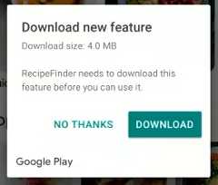
Another fun trick enabled by bundles and cloud-powered APK generation is a “Dynamic Feature.” For app features that aren’t used often—or are only used by a subset of users (for instance, an optional VR feature)—a feature can be pulled out of the base APK and live in the cloud as an on-demand split APK file. When the app is first installed, the APK for the dynamic feature won’t be downloaded with the rest of the app, saving the majority of users from having to store a possibly unwanted feature. If (and onlyif) the user tries to use the feature, the split APK will be downloaded and installed in the background in a matter of seconds. It’s kind of like Google’sinstant app scheme, but instead of an instant app, it’s an instant optional feature.
Google says this new app delivery scheme can dramatically reduce the size of APK files—on average it was finding a 20-percent savings. At Google I/O 2018, the company said that if every Play Store app switched over to app bundles, it could save10 petabytes of bandwidth per day. (What is Google’s Internet bill like?) In this all-app-bundle world, Google says users could save 300MB of disk space on average. With projects likeAndroid Go focusing on squeezing every megabyte out of cheap devices with only 8GB of internal storage, app bundles and dynamic delivery would be a huge boon. And since the app bundle scheme still results in APKs being spit out and installed on devices, there are almost no compatibility issues—Google says app bundles are compatible with 99 percent of the Android devices out there.
Since app bundles are used to make APKs, it should be no surprise that the two formats are closely related. Both are zip archives with funny extensions that you can open with any archiving program. A bundle looks a lot like a traditional APK with roughly the same folder structure. Compiling happens differently, though. Android apps use XML files for the manifest, layout, languages, animations, and a ton of other stuff. And for APKs, these get turned into a difficult-to-read binary file. With a bundle, the XML files are compiled into the “Protocol buffer” format—a Google-developed format that the company describes as a “language-neutral, platform-neutral, extensible mechanism for serializing structured data—think XML, but smaller, faster, and simpler.”
For developers, there’s not a lot of work to do. The new bundle scheme is already built into the Android SDK, and everything that used to say something like “Build APK” now says “Build Bundle / APK.” Anywhere that would normally deal with an APK now has the option to also generate a bundle. If developers take advantage of all the features offered by Google’s app bundles and dynamic delivery, you’ll have an optimized app produced for each device, with only the languages, hardware support, and features that each individual user needs.
In the future, Google says it will add targeting and split APK for supported texture compression formats, platform features, and different graphics APIs, like various OpenGL versions or the new Vulkan graphics API.
What about third-party app stores and sideloading?

Google has a new app publishing format, server, and app support to make the app publishing format work and an SDK that seamlessly supports exporting your developer key and uploading a bundle securely to Google’s servers. The space savings and easier development is great for users and developers, provided no one dares step foot outside of Google’s walled garden. But if you’re trying to get an app outside of the Google Play ecosystem, life will get a bit—possibly a lot—harder.
App bundles will really challenge the existing sideloading method of redistributing APKs downloaded from the Play Store. When you pull a split APK off your device, you still end up with a monolithic APK file. APKMirror gives us a great example of what sideloading compatibility looks like today, where even large third-parties like Facebook are only shipping aroundseven app configurations, while extreme Google distributions like YouTube can reach as many as20 variants. It’s more work than a single APK file, but with crowdsourcing and fancy tricks like automated signature checks, it’s a workable number of variants for dedicated sideloaders. In an app bundle world, however, the number of variants will greatly increase: you really will have hundreds or thousands of APKs out there for a single app.
Since APKs from the Play Store won’t be as widely compatible as before, sideloaders looking for Play Store apps will be limited to popular hardware/language combos. This is all theoretical at this point, but you’ll probably see apps limited to things like “flagship-class phone in English,” and anyone not on that hardware/language pair will have a harder time finding the download they want. It will be a lot like the modding community—popular devices will get support in the form of sideloadable apps, and unpopular devices (or even less popular language settings) will mean less support.
Another possible method instead of ripping APKs from the Play Store would be to replicate all the fancy app bundle work Google has done. To Google’s credit, it is not trying to fully crush third-party app stores and sideloaders with app bundles. It hasopen sourced a tool that can create app bundles without the need to go through Google Play—something the company did not need to do. With this open source tool, third-parties could theoretically figure out how app bundles work and implement something similar to what Google has created.
A third-party app store could make its own app store client that does all the targeting detection; it could maybe handle APK creation in the cloud; and it could maybe ship these APKs to users. That’s still not good enough. The key is, well, the key.
App bundles aren’t signed, so for store-configured app bundles to work, developers have to turn over their cryptographic signatures to the app store owner. These developer keys are the security mechanism for ensuring an app update is from the same source as the original app. Anyone can make a malicious “Facebook” update with a Blue “f” icon and the same package name, but if the cryptographic signatures on the new and old APKs don’t match, the update will fail, and the malicious app won’t install. If anyone were to steal a developer’s key, they would be able to make valid app updates that would install over legitimate versions. Exporting the encryption key to Google Play is part of the magic that makes app bundles work, though. With the developer’s original key, Google’s cloud servers can reconfigure the app bundles as much as it needs and generate valid APKs that will update over top of the original, old-school APK.
Turning over your cryptographic key to someone else will give any developer pause. Google is probably one of the few entities that developers would be comfortable sharing a key with, since Google already controls the Android code and the Play Store developer accounts, and the company has secure transfer integration in the Android SDK. While Google can be trusted to secure these keys—because if Google gets owned, the Internet is probably doomed anyway—how comfortable would you be with turning a key over to the Samsung app store or one of the tens of Chinese OEMs running their own app stores? What about the smaller Android stores that cover a specific niche, like the all-FOSSF-Droid store orAPKMirror? Would you give them a key?
Sharing your critical developer key with every app store under the sun probably won’t fly with developers. But if you have a developer on board with selling in your third-party store, the one thing they could do is generate a “universal” APK specifically for non-Google Play Stores. This is an old school app that contains all the languages and hardware combos in one big file. It will be inferior to the app bundle app in terms of space usage, but it will be highly compatible.
Again, we’re back to the “more work for developers” plan with universal APKs. Third-party app stores would only get widely compatible APKs if developers went out of their way to provide them. With the limited customer base outside of Google Play, I would guess third-party stores will find fewer and fewer developers motivated to do the extra compiling and listing work.
Slices and App Actions—Meh?


We’re now moving onto the “purely theoretical” part of the review where we can talk about “App Actions” and “Slices.” These are both features that let developers extend their app functionality to other parts of Android, but Google hasn’t actually implemented a compelling use for them yet in the OS. These are both unfinished, either by virtue of totally not existing yet or being in beta.
“App Actions” area list of actions created by Google—things like “Play music,” “Make a dinner reservation,” “Buy tickets,” or “call a rideshare.” Google confusingly calls these actions “Intents,” but Android already has a different concept called an “intent” that it uses for default app selection. Don’t confuse Android Intents with Google App Action Intents, I guess. Anyway, developers can sign up as a provider for these new app actions, and when a Google product calls on one of these actions, the third-party app might be listed as a provider. The idea is that rather than just opening an app, a link from an App Action will open an app and actually do something right away.
Currently, App Actions will show up in the app drawer, in Google Search’s autocomplete, and as a text selection popup. In the Pixel launcher app drawer, two app actions can appear below the predictive app bar and before the alphabetical app list. The idea is that the Android tracks your routine in the background and uses context like the time, your location, headphone connectivity, and other signals to predict what actions you want. From here, it might suggest things like playing some music when you plug headphones in, or navigating home if you’re at work and your shift will be over soon. In Google Search and the text highlight pop up, app actions get the extra context of the specific subject or action you’re typing in or highlighting, and the feature will suggest apps that can help. For something like searching or highlighting an artist name, it might suggest playing the artist in a music app. For a location, it might suggest navigating there or calling a rideshare to that location.
In the future, App Actions will also show up in the Google Assistant results screen as follow-up actions. Currently, the Google Assistant shows a horizontally scrollable list of follow-up queries, but in the future, this will include direct links to apps. There’s also a plan to integrate App Actions into the Play Store.
It sounds like a decent idea, but right now there are a few problems. First, the UI locations for App Actions also make them really easy to miss. The app drawer, search bar, and text highlight pop up are all really transient interfaces—you open them with a predetermined plan and are usually on your way to some other location. For instance, I usually finish typing a search entry and mash “enter” without reading the suggestions or highlight text and quickly mash “copy.” It’s hard to stop what you planned to do and read the constantly changing App Action suggestion—usually I find myself just blazing by them and not even registering what they said.
Second, developer support is so poor, it’s hard to use App Actions or even tell if it is a good idea. App Actions are in beta, judging by Google’s “Get notified when App Actions are available” button in the App Actions docs. They are not freely open to developers yet. Even among Google apps, App Actions are poorly supported, and mostly I get suggestions to open a new Chrome Tab or play the “Recent Music” playlist in Google Music. The combination of not being useful and being easy to miss means I’ve never trained myself to actually use an App Action, and I can’t recall a time when they have ever saved me time. By contrast, sticking suggested actions on an interface I actually spend time in might help (like the home screen, for instance).
It’s way too early to make a judgement on App Actions, but it seems odd to push them on Android Pie when they are clearly so unfinished. I would say the App Actions should be removed from the app drawer since they barely work right now, but I think that happens automatically. Inever use App Actions, and they’ve disappeared from the app drawer on my daily driver.
App Slices—it seems like some day these will be really important


Another totally theoretical feature is “App Slices,” which is like a next-level version of App Actions. Where App Actions are only a deep link into an app, an App Slice actually has an app provide a chunk of interactive UI to display in another app. For instance, instead of popping up a link to a music app, an App Slice could provide a tiny music player UI that you could just tap play on. Slices can be almost anything, displaying interactive buttons and sliders, pictures, real-time data, and more.
Like App Actions, deciding when and where you are actually going to use these is a bit of a mystery right now. Google has said they are destined for the super-transient Google Search autocomplete screen and the Google Assistant results. Slices are not actually active currently, but previously Google has promised they would work before the end of the year.
One of the most exciting App Slice slides from Google I/O states that the end goal is to make Slices an all-encompassing API for “all remote app content in Android.” The slide shows the Slices APIreplacing the separate UI work currently done for notifications and widgets. So, one day a music app could construct a tiny music player UI, and that interface would show up as the “currently playing music” notification. You could pin it to your home screen as a music player widget, or it could pop up when you long press on the music app. As someone who really likes home screen widgets and laments how few developers actually make good widgets, it would be nice to have all these remote UIs tied together.
Even more ART improvements


ART—or the Android RunTime—is the engine that powers Android apps. The new runtime was introduced in Android 5.0 Lollipop as a “platform for the future,” and, in pretty much every release since then, ART has gotten faster and more memory-efficient. The fun part of ART improvements is that any changes automatically apply on nearly all 2D apps, since they all run through ART.
This year the ART team has worked to reduce the size of the dex files that appear in APKs. Dex files are Android’s executable bytecode format, so making them smaller is a big deal. Dex files are stored twice on an Android device, once in the APK and again in an extracted form that ART keeps around for faster startup. They are also loaded into memory, so smaller dex files mean you’re saving storage space and reducing the memory an app takes up. A new feature in Android P called “CompactDex” aims to help reduce the size of these dex files.
The dex files still exist in an APK, but now when ART extracts an APK it rewrites the dex files into “cdex” files, which is a smaller format with better layout optimization and deduplicated files when dealing with multiple dex files. Android’s dex files have a 64k method limit, so it’s not unusual for large applications to have more than one dex file. One of the inefficiencies of multiple dex files is that a lot of information is duplicated across these multiple files. As part of the Compact Dex rewriting into a .cdex file, a new shared data section is created for the multi-dex applications. The duplicate data across dex files gets thrown in the shared data section, so it exists only once. With CompactDex, the dex files (which, remember, get loaded in storage and memory) are around 11.6-percent smaller.
Google also improved the dex file layout in Android P. This was a process that started in Android Oreo by grouping up frequently accessed code and code for the startup together. In Android P, this has been further refined with more flexible profiling information. The startup code is now exclusively laid out in the beginning of the dex file. With the startup code isolated, it can now be loaded into memory faster for startup and then discarded once the app has turned on. Rarely used and unused code is tossed into the end of the file. With this level of organization, if you never need the code, you can just opt to not load it into memory. All of these layout changes mean Android can load less of the dex file into memory.


Android 7.0 Nougat addedprofile-guided optimizationto ART, which, while you were using the app, would gather data about the app code and about your phone hardware to better optimize the ahead-of-time compiling process. With information about how the app works and what code is most accessed, Android would continually recompile the app (while idle and on power) to produce a more optimized version. Profile-guided optimization meant app performance improved over time, but it also meant the first impression was the worst impression. On first launch, ART simply doesn’t know as much about how the app works.
In Android Pie, Google is aiming to fix the “first impression” problem with cloud-based profiles. That’s right, rather than being locally generated, ART’s app profiles will be shared across the Android user base over the Internet. Google says that most apps share a good amount of code paths that are used across different users and devices, and these can be globally optimized for everyone. For developers who use Google Play’s beta channels and app rollout system, the devices of early users can create profile information for the rest of the user base.
The conduit for all of this information is, of course, Google Play. ART’s profile information is now stored in a “.dm” file (for Dex Metadata), and early users of a new version of an app will have their devices upload these DM files to the Play Store. When other users download an app update, the global profiling data will get passed down to them along with the APK, and they’ll have a head start on the profiling process. This global profiling won’t be as good as the unique device and user-specific profiling that still happens on the phone, but it will give ART a head start on making an app run faster. Google tested cloud-based profiling on a few of its own apps, and, on the first boot, it got anywhere from a 12 to 33 percent decrease in startup time.
157 new emojis


If ART compiler talk felt too technical, it’s time for a hard left turn to talk about emojis! There are new ones.
Android Pie brings support for Unicode Emoji 11.0, which adds 157 new glyphs to the pile. We’re now up to 2,823 total emojis in the Unicode standard. New this year are smileys for hot, cold, partying, and drinking; sciency things like a lab coat, goggles, and DNA; and new animals, sports, and food. For people there are now curly, red, white, and bald hairstyles, along with superheroes and supervillains.
Four existing emojis have been changed in Android Pie. The salad emoji used to feature a hard-boiled egg, but now that has been tossed out for a vegan plating. For meat eaters, the bacon emoji has been changed to look like it was actually cooked, and the turtle and cricket got redesigns.
Grab bag
We’re almost out of stuff to talk about for Android Pie. (Congrats if you’ve made it this far!) Before we go, though, it’s time for the grab bag. These are changes that are worth mentioning, but there’s not a whole lot to say about them.
The new Adaptive brightness—Adaptive brightness is another feature that has been AI infused. Thanks to DeepMind, it supposedly remembers your preferred brightness level in various lighting conditions. I often still find auto brightness to be too dim in the daylight and too bright at night, so I’m constantly futzing with the brightness slider. I can’t say I have noticed an improvement. The other change is that the brightness slider moves by itself now in response to lighting changes, which is neat.
Indoor Positioning with Wi-Fi RTT—GPS is great for your outdoor location, but it doesn’t work inside. For indoor positioning, Android Pie supports IEEE 802.11mc, also known as “Wi-Fi round-trip-time,” which basically turns Wi-Fi routers into mini GPS stations. Wi-Fi RTT works a lot like GPS—your phone sends a ping to the access point (AP), the AP timestamps it and sends it back to you, and with some math you can figure out the distance. Just like GPS, you’re doing triangulation, so you need multiple 802.11mc-compatible APs for this to work. Android Pie has an API for direct control of 802.11mc, and eventually Google will include it in the easier-to-use Fused Location Provider in Android. That way any developer can just ask the OS for the current location, and they’ll get a mashup of data from GPS, cellular, and Wi-Fi.
We’re still a long way out from having Wi-Fi RTT actually work and be useful in real life. First, there’s really no consumer routers that support RTT yet, although Google says its own router, Google Wi-Fi, will be updated with support by the end of the year. Second, you need to actually know where these routers are in real life in order to do triangulation with them. This means it’s not as easy as just plugging in a router and having everything work; you have to place the routers on some kind of map. Google said it plans to crowdsource the location of RTT routers in the future, probably through Google Maps. And speaking of maps, you’d actually need indoor maps in order for indoor positioning to actually work. I can’t imagine RTT would be very useful at a home, but for complex buildings like airports and big box stores, it may be.
Simultaneous camera stream access—There are a few new under-the-hood camera changes in Android P. The first is simultaneous stream access for devices with two or more cameras. The idea is that camera apps will be able to access multiple cameras simultaneously, which could lead to interesting new features. If you access two cameras pointing in the same direction, you could build an app with 3D stereo vision, which sounds like it would be great for Google’s ARCore toolkit. It’s worth noting that the Pixel 3 leaks show twofront-facing cameras, so it would not surprise me to see augmented reality stuff happening on your face.
More media formats—Move over JPEG, there’s a new photo format on the block, and it’s not 20 years old. Android Pie supports High Efficiency Image Format (HEIF), which promises to store double the information of JPEG in the same size file. Of course, the big advantage of JPEG is that it is basically universally compatible, but HEIF is making good strides in this area. Apple is already on board the HEIF train withiOS 11 andMac OS High Sierra, andMicrosoft is working on building support into Windows 10. Don’t expect automatic HEIF support in all Android Pie devices, though. HEIF needsHEIF-compatible hardware, and you need to pay three (!) different companies to square away all the patents and licensing rights.
If you’re looking for a media format that’s more open and royalty free, Android Pie also supports HDR video via Google’s VP9 Profile 2 format.

Privacy changes—There are a few privacy loopholes that have been closed in Android Pie. Believe it or not, apps have been able to access the microphone and camera while they are running in the background. This seems like a terrible idea and has been fixed in Android 9.0. Remember “background” in Android means a very specific thing: namely accessing the camera and microphone silently, with no notice to the user. If you want to have an app record something without filling up the screen, you can still do that. The app just needs to generate a foreground service, which will spawn a notification letting the user know the app is running in the background.
There’s a new developer option to randomize MAC addresses, which allow you to connect to networks with less of a chance of being tracked. Similarly, serial number access without a permission has been disabled for apps targeting Android 9. The serial number is now locked behind the READ_PHONE_STATE permission.
Lockdown Mode—In Settings -> Security & Location -> Lock screen preferences, you can turn on the “Lockdown” option. This will add a new Lockdown button to the power menu, and pressing it will temporarily turn off fingerprint unlock, smart lock, and lock screen notifications. After you unlock with your designated PIN, pattern, or password, everything will go back to normal.
The “tock” to Oreo’s “tick”
After Oreo’syear of foundational improvements, Android Pie is a release with a whole lot of user-facing changes. The biggest change is Google kicking off the new Material Design style launching across its products. Just like the first Material Design rollout, for a while Android is going to be stuck with a mix of new and old apps that really don’t go together. You’ve got the “colorful and square” old Material Design versus the “white and round” new Material Design—nothing matches and it’s really obvious.
I’m still not quite sure how I feel about the new Material Design. There’s not much in the way of solid third-party examples, and Google hasn’t switched over many of its major apps yet. It’svery early. Online, there’s a large contingent that dislikes the all-white design of the new Google apps, since it’s the exact opposite of what many people have been asking for(read:darkmode). There have been some Google apps (Messages and the Google feed) that have gotten a dark mode, but it’s hard to tell if this is a new standard Material thing or just a few Google apps going rogue.
As usual, there are also a ton of changes that we won’t see the full implications of for some time. The messaging notification changes seem great, but we still need apps to actually support the new features and for Google to release the Smart Reply API in ML Kit. Google’s plan to turn the new Slices API into the single API for displaying remote content in Android sounds really important. Having one API replace the notification builder, widget API, and plug in to the Google Assistant makes a ton of sense, and it would really cement support for Android’s often-neglected widget system. The Slices API is barely supported by Google or third-parties right now, though, so the soonest we could see this remote UI utopia is in Android Q.
After actually using Android P in various betas and the final version for about a month, there are a few things that really stand out in day-to-day usage. First, the battery life is fantastic on my Pixel 2 XL with Android Pie. The changes to background processing and CPU usage really do make a difference. I’m at the point where, on light usage days, I don’t feel the need to charge my phone every night. The other big-impact change, as small as it might seem, is the smart rotation switcher. It’s awesome to finally have a good solution to phone rotation—the phone doesn’t rotate when I don’t want it to, and for the times when I want to play a game or watch a video in landscape, it’s just a tap away.
But to close, we should address the elephant in the room of “no one will actually get this update thanks to Android’s terrible update system!” While the prognosis still isn’t great, there has been some improvement. Thanks to Android Oreo’s Project Treble, we have seen tons of third parties participate in the Android P beta, and we’ve already seen the first modernday one update from a third party. That’s better than it has ever been… but still, if you want timely updates, your only solid bets remain a Pixel or an iPhone.
The Good
- The smart rotation button is awesome—there is finally a good, reliable, predictable way to manage phone orientation.
- There is a real, noticeable improvement in battery life (on the Pixel 2 XL, at least).
- Google is finally taking steps to improve the app ecosystem with the new target API rules. Forcing apps to support the modern Android APIs means a faster, safer, more consistent app selection.
- New Material Theme layouts that put controls at the bottom, where you can easily reach them.
- I can’t imagine using Android with the “normal” notification mode on, so hopefully digital wellness and notification banning helps normal people get better control of their notifications.
The Bad
- Tying the new Recent Apps interface to the Pixel launcher means third-party launchers miss out on some features.
- Split-screen shortcut (long-pressing on the Recent Apps button) no longer works.
- The gesture controls are an incredible mess—ugly, lopsided, and without any upside. And despite five Android P betas, Google never really responded to the overwhelmingly negative feedback.
The Ugly
- The general disorganized nature of Google means we’ll be seeing a mix of “Old Material” and “New Material” apps for the next few years.

 Loading comments...