- Notifications
You must be signed in to change notification settings - Fork1
Take back full control of icons within stylesheets.
ethantw/font-handsome
Folders and files
| Name | Name | Last commit message | Last commit date | |
|---|---|---|---|---|
Repository files navigation
‘Font Handsome’ aims to improve messy presentational classes and the huge predefined CSS fileFont Awesome provides. Font Handsome lets you assign icons onto the very elements you need them to be.
Semantic issue aside, the main purpose of the project is to take back full control within style sheets. We don’t need no changing the HTML structure every time we want a different icon or modifying the DOM tree for other interactional effects, anymore.
Check out the demo →
Current version:0.3.0, with all icons from Font Awesome4.3.0.
Font Handsome currently supports two CSS preprocessors, Sass and Stylus. The API documentation below indicates the usage of the Sass syntax.
- NPM
npm i --S font-handsome
npm test(compiling in Sass)npm run test-stylus(compiling in Stylus)
Font Handsome supports allmodern browsers.
Font Handsome is released under MIT license.
Font Handsome currently supports Sass format. Import Font Handsome in your sheet,
@import'../node_modules/font-handsome/index';
Font Handsome uses Bootstrap CDN webfonts by default. You can overwrite the path by the variable$fh-fa-path.
$fh-fa-path:'/font';@import'../node_modules/font-handsome/index';
Move the presentational classesfa-* into your Sass style sheets with the prefixfh-*.
[container] {@includefh($icon,$color: false ) {// icon's own styles };@extend %fh-*;// Optional utility(ies)}
Icons of Font Handsome uses the same namespaces as those of Font Awesome. Check them out athttp://fontawesome.io/icons/. You'll have to lose the prefixfa-.

An old form in Font Awesome syntax to the example above would look like,
<spanclass="share"><iclass="fa fa-share-alt"></i> Share</span><buttonclass="share-twitter"><iclass="fa fa-twitter"></i> Share to Twitter</button><buttonclass="share-fb"><iclass="fa fa-facebook-square"></i> Share to Twitter</button>
With Font Handsome, write no more presentational markups and classes,
<spanclass="share">Share</span><buttonclass="share-twitter">Share to Twitter</button><buttonclass="share-fb">Share to Twitter</button>
Import icons and assign colours to them with Sass mixinfh( $icon[, $color] ).
span.share +fh($icon: share-alt )button.share-twitter+fh($icon:twitter,$color:#50aaf1 )button.share-fb+fh(facebook-square,#405b9d )
Font Handsome smartly avoids code bloat. The @mixin syntax is equal to the @extend one below.
button.share-twitter@extend%fh,%fh-twitter+fh-color(#50aaf1 )
Defaultly Font Handsome uses::before pseudo element for placing icons, which places icon at the starting point of an element. Assign icons onto::after pseudo element with the prefixfha-*. This normally makes the icon appear in the end point of its container.
[container] {@includefha($icon,$color ) {// icon's own styles };@extend %fha-*;// Optional utility(ies)}

<buttonclass="config">Preference</button><buttonclass="logout">Logout</button>
button.config +fh( cog )button.logout +fha(sign-out,#d9534f )
For accessibility reasons, it is strongly recommended to put related text inside icon or image containers, which screen readers would naturally read.
Hide the textpresentationally with the @extend%fh-hide-text.
If an icon isn’t assigned with colour, hiding its text automatically makes the icon inherit the default colour$fh-color.

<divid="media-control"data-state="paused"><buttonclass="backward"><iclass="fa fa-backward"></i></button><buttonclass="play-pause"><iclass="fa fa-play"></i><ihiddenclass="fa fa-pause"></i></button><buttonclass="forward"><iclass="fa fa-forward"></i></button></div>
<divid="media-control"data-state="paused"><buttonclass="backward">Backward</button><buttonclass="play-pause">Play/Pause</button><buttonclass="forward">Forward</button></div>
#media-controlbutton@extend%fh,%fh-hide-text //hide the originaltext on the selector.backward @extend%fh-backward.forward @extend%fh-forward&[data-state="paused"].play-pause @extend%fh-play&[data-state="playing"].play-pause @extend%fh-pause
With this approach, we don’t even need semantic attributes likearia-label.It is semantic and accessible itself.
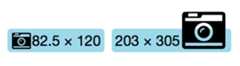
To increase the icon sizes, extend the selector with%fh-lg (33% larger),%fh-2x,%fh-3x,%fh-4x or%fh-5x.
.photo +fh(camera-retro )@extend%fh-lg
Onto::after pseudo element,
.huge-photo +fha(camera-retro )@extend%fha-3x
Use mixinfh() orfha()’s second parametre$color to assign icons’ colour while including them.
Use mixinfh-color( $color ) orfha-color( $color ) to alternate the colour in different inherited situations.
.airport +fha( wifi,#666 )&:hover +fha-color(#ac586f )&.off +fha-color(#ccc )

Extend the selector with%fh-fw to set icons at a predefined fixed width.
End point —%fha-fw.
<navclass="main"><ol><liclass="home"><ahref="#">Home</a><liclass="lib"><ahref="#">Library</a><liclass="app"><ahref="#">Applications</a><liclass="config"><ahref="#">Settings</a></ol></nav>
nav.mainli@extend%fh,%fh-fw&.home @extend%fh-home&.lib @extend%fh-book&.app @extend%fh-pencil&.config @extend%fh-cog
Mix an unordered list with @mixinfh-ul( $icon, $color ) to assign an icon as the list item marker, and with @mixinfh-li( $icon, $color ) to assign a certain icon to a certain item.
Note: There areno end point support for lists.
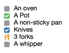
<articleclass="recipe"><p>Here are what you need to cook a delicious pake,<ulclass="cooker"><li>An oven<liclass="checked">A Pot<li>A non-sticky pan<li>Knives<liclass="cutlery">3 forks<li>A whipper</ul> …</article>
articleul.cooker +fh-ul( square,#999 )li:hover,li.checked +fh-li(check-square,#337ab7 )li.checked:before color:#5cb85cli.cutlery +fh-li( cutlery,#f0ad4e )
Extend a selector with%fh-border and%fh-pull-right or%fh-pull-left for bordered and pulled icon.
End point —%fha-border,%fha-pull-right or%fha-pull-left.
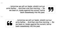
<divclass="entry"> …<blockquote><p>…tomorrow we will run faster, stretch out our arms farther… And then one fine morning— So we beat on, boats against the current, borne back ceaselessly into the past.</blockquote> …<blockquote></blockquote></div>
.entryblockquote&:nth-child(odd)p:first-child +fh(quote-right )@extend%fh-border,%fh-pull-right,%fh-3xtext-align:right&:nth-child(even)p:first-child+fh(quote-left ) @extend%fh-border,%fh-pull-left,%fh-3xtext-align:left
Extend a selector with%fh-spin to get any icon to spin. Works well with iconsspinner,circle-o-notch,refresh andcog.
Use%fh-pulse to have it rotate with 8 steps.
End point —%fha-spin or%fha-pulse.
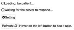
p.loading +fh( spinner )@extend%fh-spinp.pulse-loading+fh(spinner ) @extend%fh-pulsep.waiting+fh(circle-o-notch ) @extend%fh-spinspan.setting+fh(cog ) @extend%fh-spin
On::after pseudo element,
button.refresh +fha( refresh )&:hover,&.ing@extend%fha-spin
Extend a selector with%fh-rotate-* and%fh-flip-* to rotate and flip.
End point —%fha-rotate-* and%fha-flip-*.
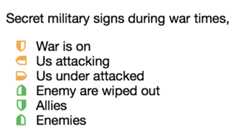
.military-code list-style: none padding-left:.5emli,span +fh( shield,#f0ad4e )@extend%fh-fw&:beforemargin-right:.5em.attacking @extend%fh-rotate-90.attacked @extend%fh-rotate-270.wiped-out @extend%fh-rotate-180+fh-color(#5cb85c ).ally @extend%fh-flip-horizontal+fh-color(#5cb85c ).enemy @extend%fh-flip-vertical+fh-color(#d9534f )
Use mixinfh-stack() to stack double icons. The first parametre$i1x is the icon of regular size while the second one$i2x is of double size.
Note: There areno end point support for stacked icons.
fh-stack($i1x,$i2x,$i1x-color: false,$i2x-color: false,$i2x-on-top: false )
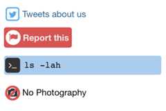
a.tweet +fh-stack( twitter,square-o )
Switch to the inverse colour ($fh-inverse) with @extend%fh-1x-inverse or%fh-2x-inverse.
Alternatively%fh-inverse or%fha-inverse, choose whichever matches the context.
button.report +fh-stack( flag,circle,#d9534f )@extend%fh-2x-inversebackground-color:#d9534fcolor:#f3f3f3
pre.cli +fh-stack( terminal, square )@extend%fh-1x-inversepadding:.5em.5em.55em2.3em
The mixinfh-stack()’s third/forth parametres$i1x-color/$i2x-color are optional. Assign the colours of the two icons seperately or just use the inherited one.
Originally icon-1x is put on top of icon-2x, set the fifth parametre$i2x-on-top totrue to put the icon-2x on top.
p.no-photo +fh-stack( camera, ban, false,#d9534f, true )
- Import icons
fh( $icon[, $color] )/fha( $icon[, $color] ) - Assign colour
fh-color( $color )/fha-color( $color ) - Unordered lists
- Entire list item
fh-ul( $icon[, $color] ) - Certain list item
fh-li( $icon[, $color] )
- Entire list item
- Double icon stack
fh-stack( $i1x, $i2x[, $i1x-color, $i2x-color, $i2x-on-top] )
- Font and basic declaration
%fh/%fha - Icons
%fh-[icon-name]/%fha-[icon-name] - Hide original text
%fh-hide-text/%fha-hide-text - Larger sizes
%fh-lg,%fh-2x,%fh-3x,%fh-4xor%fh-5x%fha-lg,%fha-2x,%fha-3x,%fha-4xor%fha-5x
- Fixed-width
%fh-fw/%fha-fw - Bordered icon
%fh-border/%fha-border - Pull right or left
%fh-pull-rightor%fh-pull-left%fha-pull-rightor%fha-pull-left
- Spining
%fh-spin/%fha-spin%fh-pulse/%fha-pulse
- Rotate (90, 180 or 270 deg.)
%fh-rotate-*/%fha-rotate-* - Flip
%fh-flip-horizontal,%fh-flip-vertical%fha-flip-horizontal,%fha-flip-vertical
- Inverse colour
%fh-inverseor%fh-1x-inverse%fha-inverseor%fh-2x-inverse
About
Take back full control of icons within stylesheets.
Resources
Uh oh!
There was an error while loading.Please reload this page.
Stars
Watchers
Forks
Packages0
Uh oh!
There was an error while loading.Please reload this page.