


numpy.datetime64 valuesshow()Contents
numpy.datetime64 valuesshow()numpy.datetime64 values¶For Matplotlib to plot dates (or any scalar with units) a converterto float needs to be registered with thematplolib.units module. Thecurrent best converters fordatetime64 values are inpandas. Simplyimportingpandas
importpandasaspd
should be sufficient aspandas will try to install the converterson import. If that does not work, or you need to resetmunits.registryyou can explicitly install thepandas converters by
frompandas.tseriesimportconverteraspdtcpdtc.register()
If you only want to use thepandas converter fordatetime64 values
frompandas.tseriesimportconverteraspdtcimportmatplotlib.unitsasmunitsimportnumpyasnpmunits.registry[np.datetime64]=pdtc.DatetimeConverter()
Every Matplotlib artist (seeArtist tutorial) has a methodcalledfindobj() that can be used torecursively search the artist for any artists it may contain that meetsome criteria (e.g., match allLine2Dinstances or match some arbitrary filter function). For example, thefollowing snippet finds every object in the figure which has aset_color property and makes the object blue:
defmyfunc(x):returnhasattr(x,'set_color')foroinfig.findobj(myfunc):o.set_color('blue')
You can also filter on class instances:
importmatplotlib.textastextforoinfig.findobj(text.Text):o.set_fontstyle('italic')
The default formatter will use an offset to reducethe length of the ticklabels. To turn this featureoff on a per-axis basis:
ax.get_xaxis().get_major_formatter().set_useOffset(False)
set the rcParamaxes.formatter.useoffset, or use a differentformatter. Seeticker for details.
Thesavefig() command has a keyword argumenttransparent which, if ‘True’, will make the figure and axesbackgrounds transparent when saving, but will not affect the displayedimage on the screen.
If you need finer grained control, e.g., you do not want full transparencyor you want to affect the screen displayed version as well, you can setthe alpha properties directly. The figure has aRectangle instance calledpatchand the axes has a Rectangle instance calledpatch. You can setany property on them directly (facecolor,edgecolor,linewidth,linestyle,alpha). e.g.:
fig=plt.figure()fig.patch.set_alpha(0.5)ax=fig.add_subplot(111)ax.patch.set_alpha(0.5)
If you needall the figure elements to be transparent, there iscurrently no global alpha setting, but you can set the alpha channelon individual elements, e.g.:
ax.plot(x,y,alpha=0.5)ax.set_xlabel('volts',alpha=0.5)
Many image file formats can only have one image per file, but someformats support multi-page files. Currently only the pdf backend hassupport for this. To make a multi-page pdf file, first initialize thefile:
frommatplotlib.backends.backend_pdfimportPdfPagespp=PdfPages('multipage.pdf')
You can give thePdfPagesobject tosavefig(), but you have to specifythe format:
plt.savefig(pp,format='pdf')
An easier way is to callPdfPages.savefig:
pp.savefig()
Finally, the multipage pdf object has to be closed:
pp.close()
For subplots, you can control the default spacing on the left, right,bottom, and top as well as the horizontal and vertical spacing betweenmultiple rows and columns using thematplotlib.figure.Figure.subplots_adjust() method (in pyplot itissubplots_adjust()). For example, to movethe bottom of the subplots up to make room for some rotated x ticklabels:
fig=plt.figure()fig.subplots_adjust(bottom=0.2)ax=fig.add_subplot(111)
You can control the defaults for these parameters in yourmatplotlibrc file; seeCustomizing matplotlib. Forexample, to make the above setting permanent, you would set:
figure.subplot.bottom:0.2# the bottom of the subplots of the figure
The other parameters you can configure are, with their defaults
If you want additional control, you can create anAxes using theaxes() command (or equivalently the figureadd_axes() method), which allows you tospecify the location explicitly:
ax=fig.add_axes([left,bottom,width,height])
where all values are in fractional (0 to 1) coordinates. Seepylab_examples example code: axes_demo.py for an example of placing axes manually.
Note
This is now easier to handle than ever before.Callingtight_layout() can fix many commonlayout issues. See theTight Layout guide.
The information below is kept here in case it is useful for otherpurposes.
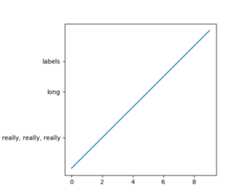
In most use cases, it is enough to simply change the subplots adjustparameters as described inMove the edge of an axes to make room for tick labels. But in somecases, you don’t know ahead of time what your tick labels will be, orhow large they will be (data and labels outside your control may bebeing fed into your graphing application), and you may need toautomatically adjust your subplot parameters based on the size of thetick labels. AnyText instance can reportits extent in window coordinates (a negative x coordinate is outsidethe window), but there is a rub.
TheRendererBase instance, which isused to calculate the text size, is not known until the figure isdrawn (draw()). After the window isdrawn and the text instance knows its renderer, you can callget_window_extent(). One way to solvethis chicken and egg problem is to wait until the figure is draw byconnecting(mpl_connect()) to the“on_draw” signal (DrawEvent) andget the window extent there, and then do something with it, e.g., movethe left of the canvas over; seeEvent handling and picking.
Here is an example that gets a bounding box in relative figure coordinates(0..1) of each of the labels and uses it to move the left of the subplotsover so that the tick labels fit in the figure
importmatplotlib.pyplotaspltimportmatplotlib.transformsasmtransformsfig=plt.figure()ax=fig.add_subplot(111)ax.plot(range(10))ax.set_yticks((2,5,7))labels=ax.set_yticklabels(('really, really, really','long','labels'))defon_draw(event):bboxes=[]forlabelinlabels:bbox=label.get_window_extent()# the figure transform goes from relative coords->pixels and we# want the inverse of thatbboxi=bbox.inverse_transformed(fig.transFigure)bboxes.append(bboxi)# this is the bbox that bounds all the bboxes, again in relative# figure coordsbbox=mtransforms.Bbox.union(bboxes)iffig.subplotpars.left<bbox.width:# we need to move it overfig.subplots_adjust(left=1.1*bbox.width)# pad a littlefig.canvas.draw()returnFalsefig.canvas.mpl_connect('draw_event',on_draw)plt.show()
In Matplotlib, the ticks aremarkers. AllLine2D objects support a line (solid,dashed, etc) and a marker (circle, square, tick). The tick linewidthis controlled by the “markeredgewidth” property:
importmatplotlib.pyplotaspltfig=plt.figure()ax=fig.add_subplot(111)ax.plot(range(10))forlineinax.get_xticklines()+ax.get_yticklines():line.set_markersize(10)plt.show()
The other properties that control the tick marker, and all markers,aremarkerfacecolor,markeredgecolor,markeredgewidth,markersize. For more information on configuring ticks, seeAxis containers andTick containers.
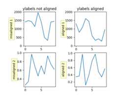
If you have multiple subplots over one another, and the y data havedifferent scales, you can often get ylabels that do not alignvertically across the multiple subplots, which can be unattractive.By default, Matplotlib positions the x location of the ylabel so thatit does not overlap any of the y ticks. You can override this defaultbehavior by specifying the coordinates of the label. The examplebelow shows the default behavior in the left subplots, and the manualsetting in the right subplots.
importnumpyasnpimportmatplotlib.pyplotaspltbox=dict(facecolor='yellow',pad=5,alpha=0.2)fig=plt.figure()fig.subplots_adjust(left=0.2,wspace=0.6)# Fixing random state for reproducibilitynp.random.seed(19680801)ax1=fig.add_subplot(221)ax1.plot(2000*np.random.rand(10))ax1.set_title('ylabels not aligned')ax1.set_ylabel('misaligned 1',bbox=box)ax1.set_ylim(0,2000)ax3=fig.add_subplot(223)ax3.set_ylabel('misaligned 2',bbox=box)ax3.plot(np.random.rand(10))labelx=-0.3# axes coordsax2=fig.add_subplot(222)ax2.set_title('ylabels aligned')ax2.plot(2000*np.random.rand(10))ax2.set_ylabel('aligned 1',bbox=box)ax2.yaxis.set_label_coords(labelx,0.5)ax2.set_ylim(0,2000)ax4=fig.add_subplot(224)ax4.plot(np.random.rand(10))ax4.set_ylabel('aligned 2',bbox=box)ax4.yaxis.set_label_coords(labelx,0.5)plt.show()
When plotting time series, e.g., financial time series, one often wantsto leave out days on which there is no data, e.g., weekends. By passingin dates on the x-xaxis, you get large horizontal gaps on periods whenthere is not data. The solution is to pass in some proxy x-data, e.g.,evenly sampled indices, and then use a custom formatter to formatthese as dates. The example below shows how to use an ‘index formatter’to achieve the desired plot:
importnumpyasnpimportmatplotlib.pyplotaspltimportmatplotlib.mlabasmlabimportmatplotlib.tickerastickerr=mlab.csv2rec('../data/aapl.csv')r.sort()r=r[-30:]# get the last 30 daysN=len(r)ind=np.arange(N)# the evenly spaced plot indicesdefformat_date(x,pos=None):thisind=np.clip(int(x+0.5),0,N-1)returnr.date[thisind].strftime('%Y-%m-%d')fig=plt.figure()ax=fig.add_subplot(111)ax.plot(ind,r.adj_close,'o-')ax.xaxis.set_major_formatter(ticker.FuncFormatter(format_date))fig.autofmt_xdate()plt.show()
Within an axes, the order that the various lines, markers, text,collections, etc appear is determined by theset_zorder() property. The defaultorder is patches, lines, text, with collections of lines andcollections of patches appearing at the same level as regular linesand patches, respectively:
line,=ax.plot(x,y,zorder=10)
You can also use the Axes propertyset_axisbelow() to control whether the gridlines are placed above or below your other plot elements.
The Axes propertyset_aspect() controls theaspect ratio of the axes. You can set it to be ‘auto’, ‘equal’, orsome ratio which controls the ratio:
ax=fig.add_subplot(111,aspect='equal')
A frequent request is to have two scales for the left and righty-axis, which is possible usingtwinx() (morethan two scales are not currently supported, though it is on the wishlist). This works pretty well, though there are some quirks when youare trying to interactively pan and zoom, because both scales do not getthe signals.
The approach usestwinx() (and its sistertwiny()) to use2 different axes,turning the axes rectangular frame off on the 2nd axes to keep it fromobscuring the first, and manually setting the tick locs and labels asdesired. You can use separatematplotlib.ticker formatters andlocators as desired because the two axes are independent.

The easiest way to do this is use a non-interactive backend (seeWhat is a backend?) such as Agg (for PNGs), PDF, SVG or PS. Inyour figure-generating script, just call thematplotlib.use() directive before importing pylab orpyplot:
importmatplotlibmatplotlib.use('Agg')importmatplotlib.pyplotaspltplt.plot([1,2,3])plt.savefig('myfig')
See also
Matplotlib in a web application server for information about running matplotlib insideof a web application.
show()¶When you want to view your plots on your display,the user interface backend will need to start the GUI mainloop.This is whatshow() does. It tellsMatplotlib to raise all of the figure windows created so far and startthe mainloop. Because this mainloop is blocking by default (i.e., scriptexecution is paused), you should only call this once per script, at the end.Script execution is resumed after the last window is closed. Therefore, ifyou are using Matplotlib to generate only images and do not want a userinterface window, you do not need to callshow (seeGenerate images without having a window appearandWhat is a backend?).
Note
Because closing a figure window invokes the destruction of its plottingelements, you should callsavefig()beforecallingshow if you wish to save the figure as well as view it.
New in version v1.0.0:show now starts the GUI mainloop only if it isn’t already running.Therefore, multiple calls toshow are now allowed.
Havingshow block further execution of the script or the pythoninterpreter depends on whether Matplotlib is set for interactive modeor not. In non-interactive mode (the default setting), execution is pauseduntil the last figure window is closed. In interactive mode, the executionis not paused, which allows you to create additional figures (but the scriptwon’t finish until the last figure window is closed).
Note
Support for interactive/non-interactive mode depends upon the backend.Until version 1.0.0 (and subsequent fixes for 1.0.1), the behavior ofthe interactive mode was not consistent across backends.As of v1.0.1, only the macosx backend differs from other backendsbecause it does not support non-interactive mode.
Because it is expensive to draw, you typically will not want Matplotlibto redraw a figure many times in a script such as the following:
plot([1,2,3])# draw here ?xlabel('time')# and here ?ylabel('volts')# and here ?title('a simple plot')# and here ?show()
However, it ispossible to force Matplotlib to draw after every command,which might be what you want when working interactively at thepython console (seeUsing matplotlib in a python shell), but in a script you want todefer all drawing until the call toshow. This is especiallyimportant for complex figures that take some time to draw.show() is designed to tell Matplotlib thatyou’re all done issuing commands and you want to draw the figure now.
Note
show() should typically only be called atmost once per script and it should be the last line of yourscript. At that point, the GUI takes control of the interpreter.If you want to force a figure draw, usedraw() instead.
Many users are frustrated byshow because they want it to be ablocking call that raises the figure, pauses the script until theyclose the figure, and then allow the script to continue running untilthe next figure is created and the next show is made. Something likethis:
# WARNING : illustrating how NOT to use showforiinrange(10):# make figure ishow()
This is not what show does and unfortunately, because doing blockingcalls across user interfaces can be tricky, is currently unsupported,though we have made significant progress towards supporting blocking events.
New in version v1.0.0:As noted earlier, this restriction has been relaxed to allow multiplecalls toshow. Inmost backends, you can now expect to beable to create new figures and raise them in a subsequent call toshow after closing the figures from a previous call toshow.
Tukey’sbox plots (Robert McGill, John W. Tukey and Wayne A. Larsen: “The American Statistician” Vol. 32, No. 1, Feb., 1978, pp. 12-16) are statistical plots that provide useful information about the data distribution such as skewness. However, bar plots with error bars are still the common standard in most scientific literature, and thus, the interpretation of box plots can be challenging for the unfamiliar reader. The figure below illustrates the different visual features of a box plot.

Violin plots are closely related to box plots but add useful information such as the distribution of the sample data (density trace).Violin plots were added in Matplotlib 1.4.
Is there a feature you wish Matplotlib had? Then ask! The bestway to get started is to email the developermailinglist for discussion.This is an open source project developed primarily in thecontributors free time, so there is no guarantee that yourfeature will be added. Thebest way to get the featureyou need added is to contribute it your self.
The development of Matplotlib is organized throughgithub. If you would liketo report a bug or submit a patch please use that interface.
To report a bugcreate an issue on github(this requires having a github account). Please include aShort,Self Contained, Correct (Compilable), Exampledemonstrating what the bug is. Including a clear, easy to testexample makes it easy for the developers to evaluate the bug. Expectthat the bug reports will be a conversation. If you do not want toregister with github, please email bug reports to themailing list.
The easiest way to submit patches to Matplotlib is through pullrequests on github. Please see theThe Matplotlib Developers’ Guide forthe details.
Matplotlib is a big library, which is used in many ways, and thedocumentation has only scratched the surface of everything it cando. So far, the place most people have learned all these features arethrough studying the examples (Search examples), which is arecommended and great way to learn, but it would be nice to have moreofficial narrative documentation guiding people through all the darkcorners. This is where you come in.
There is a good chance you know more about Matplotlib usage in someareas, the stuff you do every day, than many of the core developerswho wrote most of the documentation. Just pulled your hair outcompiling Matplotlib for windows? Write a FAQ or a section for theInstallation page. Are you a digital signal processing wizard?Write a tutorial on the signal analysis plotting functions likexcorr(),psd() andspecgram(). Do you use Matplotlib withdjango or other popular webapplication servers? Write a FAQ or tutorial and we’ll find a placefor it in theUser’s Guide. Bundle Matplotlib in apy2exe app? ... I think you get the idea.
Matplotlib is documented using thesphinx extensions to restructured text(ReST). sphinx is anextensible python framework for documentation projects which generatesHTML and PDF, and is pretty easy to write; you can see the source for thisdocument or any page on this site by clicking on theShow Source linkat the end of the page in the sidebar.
The sphinx website is a good resource for learning sphinx, but we haveput together a cheat-sheet atDeveloper’s tips for documenting matplotlib whichshows you how to get started, and outlines the Matplotlib conventionsand extensions, e.g., for including plots directly from external code inyour documents.
Once your documentation contributions are working (and hopefullytested by actuallybuilding the docs) you can submit them as a patchagainst git. SeeInstall git andReporting a bug or submitting a patch.Looking for something to do? Search forTODOor look at the open issues on github.
Many users report initial problems trying to use maptlotlib in webapplication servers, because by default Matplotlib ships configured towork with a graphical user interface which may require an X11connection. Since many barebones application servers do not have X11enabled, you may get errors if you don’t configure Matplotlib for usein these environments. Most importantly, you need to decide whatkinds of images you want to generate (PNG, PDF, SVG) and configure theappropriate default backend. For 99% of users, this will be the Aggbackend, which uses the C++antigrainrendering engine to make nice PNGs. The Agg backend is alsoconfigured to recognize requests to generate other output formats(PDF, PS, EPS, SVG). The easiest way to configure Matplotlib to useAgg is to call:
# do this before importing pylab or pyplotimportmatplotlibmatplotlib.use('Agg')importmatplotlib.pyplotasplt
For more on configuring your backend, seeWhat is a backend?.
Alternatively, you can avoid pylab/pyplot altogether, which will giveyou a little more control, by calling the API directly as shown inapi example code: agg_oo.py.
You can either generate hardcopy on the filesystem by calling savefig:
# do this before importing pylab or pyplotimportmatplotlibmatplotlib.use('Agg')importmatplotlib.pyplotaspltfig=plt.figure()ax=fig.add_subplot(111)ax.plot([1,2,3])fig.savefig('test.png')
or by saving to a file handle:
importsysfig.savefig(sys.stdout)
Here is an example usingPillow.First, the figure is saved to a BytesIO object which is then fed toPillow for further processing:
fromioimportBytesIOfromPILimportImageimgdata=BytesIO()fig.savefig(imgdata,format='png')imgdata.seek(0)# rewind the dataim=Image.open(imgdata)
TODO; seeContribute to Matplotlib documentation.
TODO; seeContribute to Matplotlib documentation.
TODO; seeContribute to Matplotlib documentation.
Andrew Dalke ofDalke Scientifichas written a nicearticleon how to make html click maps with Matplotlib agg PNGs. We wouldalso like to add this functionality to SVG. If you are interested incontributing to these efforts that would be great.
The nearly 300 codeMatplotlib Examples included with the Matplotlibsource distribution are full-text searchable from theSearch Pagepage, but sometimes when you search, you get a lot of results from theThe Matplotlib API or other documentation that you may not be interestedin if you just want to find a complete, free-standing, working pieceof example code. To facilitate example searches, we have tagged everycode example page with the keywordcodex forcode example whichshouldn’t appear anywhere else on this site except in the FAQ.So if you want to search for an example that uses anellipse,Search Page forcodexellipse.
If you want to refer to Matplotlib in a publication, you can use“Matplotlib: A 2D Graphics Environment” by J. D. Hunter In Computingin Science & Engineering, Vol. 9, No. 3. (2007), pp. 90-95 (seethisreference page):
@article{Hunter:2007, Address = {10662 LOS VAQUEROS CIRCLE, PO BOX 3014, LOS ALAMITOS, CA 90720-1314 USA}, Author = {Hunter, John D.}, Date-Added = {2010-09-23 12:22:10 -0700}, Date-Modified = {2010-09-23 12:22:10 -0700}, Isi = {000245668100019}, Isi-Recid = {155389429}, Journal = {Computing In Science \& Engineering}, Month = {May-Jun}, Number = {3}, Pages = {90--95}, Publisher = {IEEE COMPUTER SOC}, Times-Cited = {21}, Title = {Matplotlib: A 2D graphics environment}, Type = {Editorial Material}, Volume = {9}, Year = {2007}, Abstract = {Matplotlib is a 2D graphics package used for Python for application development, interactive scripting, and publication-quality image generation across user interfaces and operating systems.}, Bdsk-Url-1 = {http://gateway.isiknowledge.com/gateway/Gateway.cgi?GWVersion=2&SrcAuth=Alerting&SrcApp=Alerting&DestApp=WOS&DestLinkType=FullRecord;KeyUT=000245668100019}}