- Notifications
You must be signed in to change notification settings - Fork33
An extensible input number spinner component for react-native highly customizable. This component enhance a text input for entering numeric values, with increase and decrease buttons.
License
marcocesarato/react-native-input-spinner
Folders and files
| Name | Name | Last commit message | Last commit date | |
|---|---|---|---|---|
Repository files navigation
Author: Marco Cesarato
Github:https://github.com/marcocesarato/react-native-input-spinner
An extendible input number spinner component for react-native highly customizable.This component enhance a text input for entering numeric values, with increase and decrease buttons.
Try it on the published demo web app:https://marcocesarato.github.io/react-native-input-spinner/
Compatible with: Android, iOS, Windows, Web and Expo.
Install the library from npm or yarn just running one of the following command lines:
| npm | yarn |
|---|---|
npm install react-native-input-spinner --save | yarn add react-native-input-spinner |
importInputSpinnerfrom"react-native-input-spinner";// Example<InputSpinnermax={10}min={2}step={2}colorMax={"#f04048"}colorMin={"#40c5f4"}value={this.state.number}onChange={(num)=>{console.log(num);}}/>;
For more examples check theExample directory theApp.js file
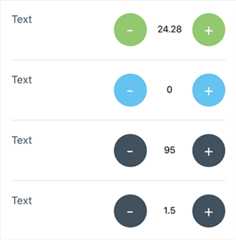
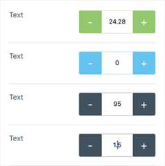
| Default props + Min & Max colors | Not rounded, showBorder, Min & Max colors |
|---|---|
 |  |
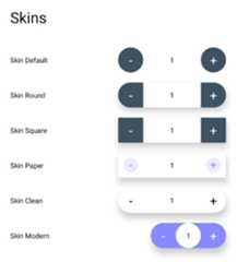
| Skins | Customization |
|---|---|
 |  |
https://marcocesarato.github.io/react-native-input-spinner/
Clone or download repo and after:
cd Exampleyarn install# or npm installexpo start
Open Expo Client on your device. Use it to scan the QR code printed byexpo start. You may have to wait a minute while your project bundles and loads for the first time.
Check the "Props List" file to have the complete list of component props ordered by name.
| Handler | Description | Func |
|---|---|---|
onBlur | Callback that is called when the text input is blurred. | (e) => { ... } |
onChange | Callback that is called when the number of the Spinner change. | (num) => { ... } |
onDecrease | Callback that is called when decrease button is clicked get value decreased. | (decreased) => { ... } |
onFocus | Callback that is called when the text input is focused. | (e) => { ... } |
onIncrease | Callback that is called when increase button is clicked get value increased . | (increased) => { ... } |
onKeyPress | Callback that is called when a key is pressed. | (e) => { ... } |
onLongPress | Callback that is called when holding the right or the left button | Function |
onMax | Callback that is called when max is reached get max number permitted. | (max) => { ... } |
onMin | Callback that is called when min is reached get min number permitted. | (min) => { ... } |
onSubmitEditing | Callback that is called when the text input's submit button is pressed | (e) => { ... } |
| Property | Description | Type | Default | Note |
|---|---|---|---|---|
accelerationDelay | Delay time before start theonLongPress event and increase or decrease and continually | Number | 1000 | |
append | Custom element before right button | Component | ||
autoFocus | Iftrue, focuses the input oncomponentDidMount. | false | ||
continuity | On min value is reached next decrease value will be the max value, if max is reached next increase value will be the min value | Boolean | false | |
disabled | Disable the Spinner or not | Boolean | false | |
editable | Set if input number field is editable or not | Boolean | true | |
emptied | Set if input can be empty | Boolean | false | |
initialValue | Initial value of the Spinner | String Number | 0 | |
inputProps | Customized TextInput Component props | Object | null | Could overwrite other props |
leftButtonProps | Customized left button (Touchable Component) props | Object | null | Could overwrite other props |
maxLength | Limits the maximum number of characters that can be entered. | Number | ||
max | Max number permitted | String Number | null | |
min | Min value permitted | String Number | 0 | |
placeholder | The string that will be rendered when text input value is equal to zero | String | null | |
placeholderTextColor | The text color of the placeholder string. | String | null | |
precision | Max numbers permitted after comma | Integer | 2 | |
prepend | Custom element after left button | Component | ||
returnKeyLabel | Sets the return key to the label. Use it instead ofreturnKeyType. | String | ||
returnKeyType | Determines how the return key should look. On Android you can also usereturnKeyLabel | String | ||
rightButtonProps | Customized right button (Touchable Component) props | Object | null | Could overwrite other props |
selectTextOnFocus | Iftrue, all text will automatically be selected on focus. | Bool | false | |
selectionColor | The highlight and cursor color of the text input. | String | null | |
step | Value to increment or decrement the current spinner value | String Number | 1 | |
longStep | Value to increment or decrement the current spinner valueonLongPress | String Number | step | |
speed | Speed acceleration ratio of increase or decreaseonLongPress | Number | 7 | (value from1 to10) |
buttonTextProps | Customized text button props | Object | null | |
typingTime | Time before debounce and triggeronChange event | Number | 750 | |
type | Type of spinner | String | int | Can beint orreal/float... |
value | Controlled value of the Spinner | String Number | 0 | |
formatter | An optional function that is called to format the value for display | Function | null | Should return astring.editable must befalse. |
- Top spinner with a child
- Bottom spinner with
prependandappend
| Property | Description | Type | Default | Note |
|---|---|---|---|---|
buttonPressStyle | Button style on Pressed state | Object | Could overwrite other props | |
buttonStyle | Button style | Object | Could overwrite other props | |
inputStyle | Text Input style | Object | Could overwrite other props | |
skin | Skin layout | String | clean,modern,paper,round,square | |
style | Container style | Object | Could overwrite other props |
| Property | Description | Type | Default | Note |
|---|---|---|---|---|
background | Custom input text background color | String | transparent | |
buttonPressTextColor | Custom color of the button of the Spinner on Pressed state | String | Auto | |
buttonTextColor | Custom color of the label's button of the Spinner | String | Auto | |
colorAsBackground | Use color as background | Bool | false | |
colorLeft | Custom color of the Spinner left button | String | #3E525F | |
colorMax | Custom color of the Spinner when reach max value | String | ||
colorMin | Custom color of the Spinner when reach min value | String | ||
colorPress | Custom color of the Spinner button on touch press | String | #3E525F | |
colorRight | Custom color of the Spinner right button | String | #3E525F | |
color | Custom color of the Spinner | String | #3E525F | |
textColor | Custom input text number color | String | Auto |
- Spinner with
color,buttonTextColor,colorPressandbuttonPressTextColorcustom colors
| Property | Description | Type | Default | Note |
|---|---|---|---|---|
height | Custom height of the Spinner | Number | 50 | |
shadow | Show container shadow | Boolean | false | Use withbackground likebackground={"#FFF"} |
showBorder | Show the border of the Spinner or not | Boolean | false | Use withrounded={false} |
style | Container style | Object | Could overwrite other props | |
width | Custom width of the Spinner | Number | 150 |
| Property | Description | Type | Default | Note |
|---|---|---|---|---|
activeOpacity | Opacity of underlay on pressed button | Number | 0.85 | |
arrows | Labels on button will be (< and >) instead of (+ and -) | Boolean | false | |
buttonFontFamily | Custom fontFamily of buttons of the Spinner | String | System Default | |
buttonFontSize | Custom fontSize of buttons of the Spinner | Number | 14 | |
buttonLeftDisabled | Disable left button | Boolean | false | |
buttonLeftImage | Custom element on the button left of the spinner | Component | Could overwrite other props | |
buttonLeftText | Custom text on the button left of the spinner | String | ||
buttonPressLeftImage | Custom element on the button left of the spinner on pressed state | Component | Could overwrite other props | |
buttonPressRightImage | Custom element on the button right of the spinner on pressed state | Component | Could overwrite other props | |
buttonPressStyle | Button Style on Pressed state (Plus and Minus buttons) | Object | ||
buttonPressTextColor | Custom color of the button of the Spinner on Pressed state | String | #FFFFFF | |
buttonRightDisabled | Disable right button | Boolean | false | |
buttonRightImage | Custom element on the button right of the spinner | Component | Could overwrite other props | |
buttonRightText | Custom text on the button right of the spinner | String | ||
buttonStyle | Button Style (Plus and Minus buttons) | Object | ||
buttonTextColor | Custom color of the labels's button of the Spinner | String | #FFFFFF | |
buttonPressTextStyle | Button Style on Pressed state (Plus and Minus buttons) | Object | Could overwrite other props | |
buttonTextStyle | Button text Style state (Plus and Minus buttons) | Object | Could overwrite other props | |
rounded | Use circular button | Boolean | true |
| Property | Description | Type | Default | Note |
|---|---|---|---|---|
background | Custom input text background color | String | transparent | |
fontFamily | Custom fontFamily of the text input of the Spinner | String | System Default | |
fontSize | Custom fontSize of the text input of the Spinner | Number | 14 | |
inputStyle | Text Input style | Object | Can overwrite other props | |
textColor | Custom input text number color | String | #000000 |
Have an idea? Found a bug? Please raise toISSUES.Contributions are welcome and are greatly appreciated! Every little bit helps, and credit will always be given.
About
An extensible input number spinner component for react-native highly customizable. This component enhance a text input for entering numeric values, with increase and decrease buttons.
Topics
Resources
License
Uh oh!
There was an error while loading.Please reload this page.
Stars
Watchers
Forks
Uh oh!
There was an error while loading.Please reload this page.
Contributors15
Uh oh!
There was an error while loading.Please reload this page.


