Uh oh!
There was an error while loading.Please reload this page.
- Notifications
You must be signed in to change notification settings - Fork396
React Native Date Picker is datetime picker for Android and iOS. It includes date, time and datetime picker modes. The datepicker is customizable and is supporting different languages. It's written with native code to achieve the best possible look, feel and performance.
License
henninghall/react-native-date-picker
Folders and files
| Name | Name | Last commit message | Last commit date | |
|---|---|---|---|---|
Repository files navigation
This is a React Native Date Picker with following main features:
📱 Supports iOS, Android and Expo
🕑 3 different modes: Time, Date, DateTime
🌍 Various languages
🎨 Customizable
🖼 Modal or Inlined
Thanks to the sponsors 🩷
| Expo | Nordic Brain Tech | moraex | hesenger | hamxahussain | lepadatumihail |
The first option is to use the built-in modal.See code.
 |  |
| iOS | Android |
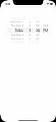
The second option is to use the inlined picker. Place it in a View or a custom made modal.See code.
 |  |
| iOS | Android |
- Xcode >= 11.6
- React Native >= 0.57.
- If using React Native 0.64, 0.64.2 or later must be used.
- If using Expo, SDK 42 or later must be used. If using Expo SDK 44, 44.0.4 or later must be used.
- ✅ You can use this library withDevelopment Builds. No config plugin is required.
- ❌ This library can't be used in the "Expo Go" app because itrequires custom native code.
- Download package
# npmnpm install react-native-date-picker# yarnyarn add react-native-date-picker# pnpmpnpm add react-native-date-picker
- Install pods (skip for expo projects)
cd ios && pod install- Rebuild the project
# expo projectsnpx expo run:androidnpx expo run:ios# non-expo projectsnpx react-native run-androidnpx react-native run-ios
If you're having troubles after following these steps, there might be alinking issue.
importReact,{useState}from'react'import{Button}from'react-native'importDatePickerfrom'react-native-date-picker'exportdefault()=>{const[date,setDate]=useState(newDate())const[open,setOpen]=useState(false)return(<><Buttontitle="Open"onPress={()=>setOpen(true)}/><DatePickermodalopen={open}date={date}onConfirm={(date)=>{setOpen(false)setDate(date)}}onCancel={()=>{setOpen(false)}}/></>)}
importReact,{useState}from'react'importDatePickerfrom'react-native-date-picker'exportdefault()=>{const[date,setDate]=useState(newDate())return<DatePickerdate={date}onDateChange={setDate}/>}
| Prop | Description | Screenshots iOS | Screenshot Android |
|---|---|---|---|
date | The currently selected date. | ||
onDateChange | Date change handler ( Inline only ) | ||
maximumDate | Maximum selectable date. Example: new Date("2021-12-31") | ||
minimumDate | Minimum selectable date. Example: new Date("2021-01-01") | ||
minuteInterval | The interval at which minutes can be selected. |  |  |
mode | The date picker mode."datetime","date","time" |  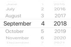 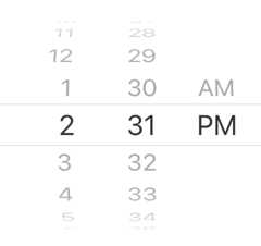 | 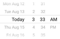 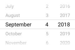 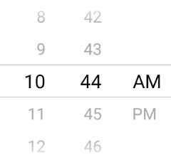 |
locale | The locale for the date picker. Changes language, date order and am/pm preferences. Value needs to be aLocale ID. |  |  |
timeZoneOffsetInMinutes | Timezone offset in minutes (default: device's timezone) | ||
is24hourSource | Change how the 24h mode (am/pm) should be determined, by device settings or by locale. {'locale', 'device'} (android only, default: 'device') | ||
modal | Boolean indicating if modal should be used. Default:"false". When enabled, the other modal props needs to be used.See example. | ||
theme | The theme of the modal."light","dark","auto". Defaults to"auto". | ||
open | Modal only: Boolean indicating if modal should be open. | ||
onConfirm | Modal only: Date callback when user presses confirm button | ||
onCancel | Modal only: Callback for when user presses cancel button or closing the modal by pressing outside it. | ||
title | Modal only: Title text. Can be set to null to remove text. | ||
confirmText | Modal only: Confirm button text. | ||
cancelText | Modal only: Cancel button text. | ||
buttonColor | Color of the confirm and cancel buttons. (android modal only) |  | |
dividerColor | Color of the divider / separator. (android only) |  | |
onStateChange | Spinner state change handler. Triggered on changes between "idle" and "spinning" state (Android inline only) |
To change the font size on Android. Openstyles.xml and place this code right above the</resources>. The font size is not possible to change in iOS out of the box, but there are someiOS workarounds.
<stylename="DatePickerTheme"parent="DatePickerBaseTheme"> <itemname="android:textSize">25sp</item></style>
This package supports React Native's new architecture (Fabric + Turbo Modules) from React Native 0.71 and forward. Support was introduced in version4.3.0 ofreact-native-date-picker.
This package supports automatic linking. Usually, the only thing you need to do is to install the package, the cocoapods dependencies (as described above). Then rebuild the project by runningreact-native run-ios,react-native run-android or start the build from within Xcode/Android Studio. If you're running a React Native version below 0.60 or your setup is having issues with automatic linking, you can runnpx react-native link react-native-date-picker and rebuild. In some occations you'll have to manually link the package. Instructions inthis issue.
The order is determined by thelocale prop. Set for instancelocale='fr'to get the french preference.locale to a different id won't change the title, confirm button and cancel button texts language.
On iOS the 12/24h preference is determined by thelocale prop. Set for instancelocale='fr'to get the french preference. On Android the 12/24h format is determined by the device setting by default. Addis24hourSource="locale" to let the locale determine the device setting on android as well. When using 12h mode the AM/PM part of the picker will be displayed. It is NOT recommended to force any specific 12/24h format, but this can be achieved by, choosing a locale which has the desired 24h preference and addis24hourSource="locale".
This is unfortunately not possible due to the limitation in DatePickerIOS. You should be able to create your own month-year picker with for instancehttps://github.com/TronNatthakorn/react-native-wheel-pick.
If you have enabledProguard for Android you might need to ignore some classes to get the the picker to work properly in android production/release mode. Add these lines to you proguard file (often calledproguard-rules.pro):
-keep public class net.time4j.android.ApplicationStarter-keep public class net.time4j.PrettyTimeThere are no breaking changes in v4, so just bump the version number in your package json.
Use theonStateChange prop to track the state of the spinning wheel.
const[state,setState]=useState("idle")...<DatePickeronStateChange={setState}/><ConfirmButtondisabled={state==="spinning"}/>
Here are some more info about the three different picker modes that are available.
Using the datetime mode gives you a react native date time picker where both date and time can be selected at the same time. The todays date will be replays with the string "Today" translated to the desired language. This is the default mode and look like this.
| iOS | Android |
 |  |
Add the optionaldatetime mode property to use this mode. Since datetime is default this could also be exclude.
<DatePicker...mode="datetime"/>
The date mode displays a react native datepicker with year month and date where the year-month-date order will be adjusted to the locale. If will look similar to this:
| iOS | Android |
 |  |
Just add the valuedate to mode property:
<DatePicker...mode="date"/>
The time mode can be used when only the time matters. AM/PM will be added depending on locale and user setting. It can be useful to add thetimeInterval to only display the time with for instance 15min intervals. The react native time picker look like this:
| iOS | Android |
 |  |
Set mode property totime to show the time picker:
<DatePicker...mode="time"/>
React Native Date Picker is a cross platform component for iOS and Android. It uses native code from respective platform to get the genuine look and feel the users expect. A strong motivation for creating this picker was the datetime mode on Android. It's quite unique for the platform and avoids two different picker popups, which normally is necessary. Instead, this datetime mode requires fewer user actions and enables a great user-experience.
If you like this package, considerbecoming a sponsor 🩷
About
React Native Date Picker is datetime picker for Android and iOS. It includes date, time and datetime picker modes. The datepicker is customizable and is supporting different languages. It's written with native code to achieve the best possible look, feel and performance.
Topics
Resources
License
Uh oh!
There was an error while loading.Please reload this page.
Stars
Watchers
Forks
Sponsor this project
Uh oh!
There was an error while loading.Please reload this page.