


Statistical models fit to compositional data are often difficult tointerpret due to the sum to one constraint on data variables.DImodelsVis provides novel visualisations tools to aid withthe interpretation for models where the predictor space is compositionalin nature. All visualisations in the package are created using theggplot2 plotting framework and can be extended like everyother ggplot object.
You can install the released version ofDImodelsVis fromCRAN by running:
install.packages("DImodelsVis")You can install the development version ofDImodelsVisfromGitHub with:
# install.packages("devtools")devtools::install_github("rishvish/DImodelsVis")While sometimes it is of interest to model a compositional dataresponse, there are times when the predictors of a response arecompositional, rather than the response itself. Diversity-Interactions(DI) models (Kirwan et al., 2009,Connolly et al., 2013,Moral et al., 2023) are aregression based modelling technique for analysing and interpreting datafrom biodiversity experiments that explore the effects of speciesdiversity on the different outputs (called ecosystem functions) producedby an ecosystem. Traditional techniques for analysing diversityexperiments quantify species diversity in terms of species richness(i.e., the number of species present in a community). The DI methodbuilds on top of this richness approach by taking the relativeabundances of the species within in the community into account, thus thepredictors in the model are compositional in nature. The DI approach candifferentiate among different species identities as well as betweencommunities with same set of species but with different relativeproportions, thereby enabling us to better capture the relationshipbetween diversity and ecosystem functions within an ecosystem. TheDImodelsandDImodelsMultiR packages are available to aid the user in fitting these models. TheDImodelsVis (DI models Visualisation) package is acomplimentary package for visualising and interpreting the results fromthese models. However, the package is versatile and can be used with anystandard statistical model object in R where the predictor space iscompositional in nature.
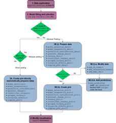
The functions in the package can be categorised as functions forvisualising model selection and validation or functions to aid withmodel interpretation. Here is a list of important visualisationfunctions present in the package along with a short description.
model_diagnostics: Create diagnosticsplots for a statistical model with the additional ability to overlay thepoints withpie-glyphsshowing the proportions of the compositional predictor variables.model_selection: Show a visualcomparison of selection criteria of different models. Can also show thesplit of an information criteria into deviance and penalty components tovisualise why a parsimonious model would be preferable over a complexone.prediction_contributions: Thepredicted response for observations is visualised as a stacked bar-chartshowing the contributions of each term in the regression model.gradient_change: The predictedresponse for specific observations are shown using pie-glyphs along withthe average change in the predicted response over the richness orevenness diversity gradients.conditional_ternary: Assuming we haven compositional variables, fixn-3 variablesto have specific values and visualise the change in the predictedresponse across the remaining three variables as a contour plot in aternary diagram.visualise_effects: Visualise theeffect of increasing or decreasing a predictor variable (from a set ofcompositional predictor variables) on the predicted response whilstkeeping the ratio of the othern-1 compositional predictorvariables constant.simplex_path: Visualise the change inthe predicted response along a straight line between two points in thesimplex space.add_prediction: A utility function toadd prediction and associated uncertainty to data using a statisticalmodel object or raw model coefficients.get_equi_comms: Utility function tocreate all possible combinations of equi-proportional communities at agiven level of richness from a set of n compositional variables.custom_filter: A handy wrapper aroundthe dplyrfilter()function enabling the user to filter rows which satisfy specificconditions for compositional data like all equi-proportionalcommunities, or communities with a given value of richness withouthaving to make any changes to the data or adding any additionalcolumns.prop_to_tern_proj andtern_to_prop_proj: Helper functions forconverting between 3-d compositional data and their 2-dprojection.ternary_data andternary_plot: Visualise the change in thepredicted response across a set of three compositional predictorvariables as a contour map within a ternary diagram.library(DImodels)library(DImodelsVis)This dataset originates from a grassland biodiversity experimentconducted in Switzerland as part of the “Agrodiversity Experiment”Kirwan et al 2014. Inthis study, 68 grassland plots consisting of 1 to 4 species wereestablished across a gradient of species diversity. The proportions offour species were varied across the plots: there were plots with 100% ofa single species (called the monoculture of a species), and 2- and4-species mixtures with varying proportions (e.g., (0.5, 0.5, 0, 0) and(0.7, 0.1, 0.1, 0.1)). Nitrogen fertilizer (at 50 or 150 kg/ha/yr) andseeding density (low or high) treatments were also manipulated acrossthe plots. The total annual yield per plot was recorded for the firstyear after establishment. The data is available in theDImodelsR package. An analysis of the this dataset can be found inKirwan et al., 2009. For our example weonly consider the plots that received the 150 kg nitrogen treatment. Thefour species proportions form our compositional predictors while theannual yield is our continuous response.
data(Switzerland)my_data<- Switzerland[Switzerland$nitrogen==150, ]head(my_data)#> plot nitrogen density p1 p2 p3 p4 yield#> 1 1 150 high 0.70 0.10 0.10 0.10 13.51823#> 2 2 150 high 0.10 0.70 0.10 0.10 13.16549#> 3 3 150 high 0.10 0.10 0.70 0.10 19.95682#> 4 4 150 high 0.10 0.10 0.10 0.70 17.93976#> 5 5 150 high 0.25 0.25 0.25 0.25 13.74719#> 6 6 150 high 0.40 0.40 0.10 0.10 15.11899We fit different models with different interaction structures asdescribed inMoral et al.,2023.
mod_ID<-DI(y ="yield",prop =4:7,DImodel ="ID",data = my_data)#> Fitted model: Species identity 'ID' DImodelmod_AV<-DI(y ="yield",prop =4:7,DImodel ="AV",data = my_data)#> Fitted model: Average interactions 'AV' DImodelmod_FG<-DI(y ="yield",prop =4:7,DImodel ="FG",data = my_data,FG =c("G","G","H","H"))#> Fitted model: Functional group effects 'FG' DImodelmod_ADD<-DI(y ="yield",prop =4:7,DImodel ="ADD",data = my_data)#> Fitted model: Additive species contributions to interactions 'ADD' DImodelmod_FULL<-DI(y ="yield",prop =4:7,DImodel ="FULL",data = my_data)#> Fitted model: Separate pairwise interactions 'FULL' DImodelWe can visualise model selection by passing our models as a list tothemodel_selection function and visualising the bestperforming metric across different information criteria. Run?model_selection or see the associatedvignettefor more information on customising the plot.
mods=list("ID"= mod_ID,"AV"= mod_AV,"FG"= mod_FG,"ADD"= mod_ADD,"FULL"= mod_FULL)model_selection(models = mods,metric =c("AIC","AICc","BIC","BICc"))
The modelmod_FG (labelled as “FG”) is the best model asit has the lowest value for all the information criteria. We proceedwith this model.
The coefficients are as follows
summary(mod_FG)#>#> Call:#> glm(formula = fmla, family = family, data = data)#>#> Coefficients:#> Estimate Std. Error t value Pr(>|t|)#> p1_ID 8.5406 0.7627 11.198 2.50e-14 ***#> p2_ID 8.7926 0.7627 11.528 9.70e-15 ***#> p3_ID 16.0825 0.7627 21.086 < 2e-16 ***#> p4_ID 11.9263 0.7627 15.637 < 2e-16 ***#> FG_bfg_G_H 17.3817 2.1713 8.005 4.66e-10 ***#> FG_wfg_G 7.6604 4.4234 1.732 0.0905 .#> FG_wfg_H 1.0119 4.4234 0.229 0.8201#> ---#> Signif. codes: 0 '***' 0.001 '**' 0.01 '*' 0.05 '.' 0.1 ' ' 1#>#> (Dispersion parameter for gaussian family taken to be 2.370592)#>#> Null deviance: 10290.75 on 50 degrees of freedom#> Residual deviance: 101.94 on 43 degrees of freedom#> AIC: 193.51#>#> Number of Fisher Scoring iterations: 2After choosing a model we can create diagnostics plot where thepoints are replaced by pie-glyphs showing the proportions of thecompositional variables. Run?model_diagnostics or see theassociatedvignettefor more information on customising the plot.
model_diagnostics(model = mod_FG)#> ✔ Created all plots.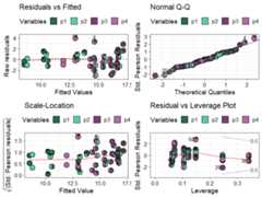
Replacing the points with pie-glyphs could help us to quicklyidentify any problematic observations in the model. For example, we cansee here that the diagnostics plots look fine and no assumptions seem tobe violated. However, we can quickly spot that the all monocultures(communities with only 1 species) and certain communities with 2 specieshave high leverage values compared to all other communities in thedata.
We visualise the predicted response for specific observations as astacked bar-chart showing the contribution (predictor coefficient *predictor value) of each term in the model.
prediction_contributions(model = mod_FG,data = my_data[c(1:5,12:15),])#> ✔ Finished data preparation.#> ✔ Created plot.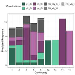
The coloured bars show the contributions of the different terms inthe model. The contribution is defined as the product of the coefficientand value for each predictor variable. Thus, the contribution for a termwould be zero if it’s value in an observation is zero regardless of it’scoefficient value (e.g. prediction bars for the monocultures at theright of the graph).
This plot would aid in understanding why certain observations havehigher predictions. For example, we can see that higher predictions areprimarily driven by thep3_ID andp4_ID termsand hence thep1 andp2 monocultures have lowpredictions as the all the other terms have a value of zero here.Similarly, we can also see that mixtures dominated byp3perform the best. Run?prediction_contributions or see theassociatedvignettefor more information on creating and customising the plot.
Next we show a scatterplot of the predicted response across allequi-proportional mixtures at each level of richness (number of speciesin a community). The points are replaced with pie-glyphs to show theproportions of the different species while the dashed black line showsthe average change in response over the richness gradient.
# Create data including all equi-proportional communities at# each level of richnessplot_data<-get_equi_comms(nvars =4,variables =paste0("p",1:4))# Show the average change over richnessgradient_change(mod_FG,data = plot_data)#> ✔ Finished data preparation#> ✔ Created plot.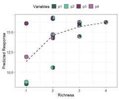
This shows that on average the predicted response increases asrichness increases but at a saturating rate. Run?gradient_change or see the associatedvignettefor more information on creating and customising the plot.
Ternary diagrams are a great tool for visualising the change in acontinuous response, however they can only be created for examples withthree compositional variables. If we have more than three compositionalvariables we create conditional ternary diagrams where fix n-3compositional variables to have specific values and visualise the changein the predicted response across the remaining three variables as acontour plot in a ternary diagram.
For this example, since we have four species we can condition one ofthe species (sayp2) to have a specific values 0.2, 0.5,and 0.8 and see how the response is affected as we change theproportions of the other three species whilst ensuring that the sum ofthe four species proportions is 1.
conditional_ternary(model = mod_FG,tern_vars =c("p1","p3","p4"),conditional =data.frame("p2"=c(0.2,0.5,0.8)))#> ✔ Finished data preparation.#> ✔ Created plot.
This figure shows that the predicted response decreases as weincrease the proportion ofp2 and is maximised as weincrease the proportion ofp3. Run?conditional_ternary or see the associatedvignettefor more information on creating and customising the plot.
Effects plots are great for visualising the average effect of apredictor in a model. However, if the predictors are compositional innature, then standard effects plots are not very useful because of thesum to 1 constraint. Thevisualise_effects function createseffects plot for the compositional predictors in a model by ensuringthat the sum to one constraint is respected as we increase or decreasethe proportion of a particular variable.
In this example we specify few communities using thedata argument and see the change in the predicted responseas we increase the proportions of the speciesp2 andp3in each community whilst keeping the ratio of the otherspecies constant.
visualise_effects(model = mod_FG,data = my_data[1:15, ],var_interest =c("p2","p3"))#> ✔ Finished data preparation.#> ✔ Created plot.
The grey lines show the effect (on the predicted response) ofincreasing the species of interest within a particular community whilethe solid black line shows the average effect of increasing theproportion of a species on the predicted response. It can be seen thatfor all communities increasingp2 results in a decrease inthe predicted response while increasingp3 has a positiveeffect on the predicted response. Run?visualise_effects orsee the associatedvignettefor more information on creating and customising the plot.
The concept used invisualise_effects can be extended tolook at the change in the predicted response as we move in a straightline between any two points within the simplex space. The interpolationconstant (shown on the X-axis) is a number between 0 and 1 identifyingpoints along the straight line between the start and end points. We caneven traverse a path comprising of multiple points within the simplexand see the change in the predicted response. In this example we showthe change in the response as we move from the centroid mixture to themonoculture of each of the four species.
simplex_path(model = mod_FG,starts = my_data[5, ],ends = my_data[12:15, ])#> ✔ Finished data preparation.#> ✔ Created plot.
We can see that moving from the centroid community top1,p2, andp4 decreases thepredicted response, while moving towards a monoculture ofp3 increases the response. Run?simplex_pathor see the associatedvignettefor more information on creating and customising the plot.