


brolgar helps youbrowseoverlongitudinaldatagraphically andanalytically inR, by providing toolsto:
This helps you go from the “plate of spaghetti” plot on the left, to“interesting observations” plot on the right.

Install fromGitHub with:
# install.packages("remotes")remotes::install_github("njtierney/brolgar")Or from theR Universewith:
# Enable this universeoptions(repos =c(njtierney ='https://njtierney.r-universe.dev',CRAN ='https://cloud.r-project.org') )# Install some packagesinstall.packages('brolgar')brolgar: We need to talk about dataThere are many ways to describe longitudinal data - from panel data,cross-sectional data, and time series. We define longitudinal dataas:
individuals repeatedly measured through time.
The tools and workflows inbrolgar are designed to workwith a special tidy time series data frame called atsibble. We can define our longitudinal data in terms of atime series to gain access to some really useful tools. To do so, weneed to identify three components:
Together, timeindex andkeyuniquely identify an observation.
The termkey is used a lot in brolgar, so it is animportant idea to internalise:
The key is the identifier of your individuals orseries
Identifying the key, index, and regularity of the data can be achallenge. You can learn more about specifying this in the vignette,“LongitudinalData Structures”.
Thewages data is an example dataset provided withbrolgar. It looks like this:
wages#> # A tsibble: 6,402 x 9 [!]#> # Key: id [888]#> id ln_wages xp ged xp_since_ged black hispanic high_grade#> <int> <dbl> <dbl> <int> <dbl> <int> <int> <int>#> 1 31 1.49 0.015 1 0.015 0 1 8#> 2 31 1.43 0.715 1 0.715 0 1 8#> 3 31 1.47 1.73 1 1.73 0 1 8#> 4 31 1.75 2.77 1 2.77 0 1 8#> 5 31 1.93 3.93 1 3.93 0 1 8#> 6 31 1.71 4.95 1 4.95 0 1 8#> 7 31 2.09 5.96 1 5.96 0 1 8#> 8 31 2.13 6.98 1 6.98 0 1 8#> 9 36 1.98 0.315 1 0.315 0 0 9#> 10 36 1.80 0.983 1 0.983 0 0 9#> # ℹ 6,392 more rows#> # ℹ 1 more variable: unemploy_rate <dbl>And under the hood, it was created with the following setup:
wages<-as_tsibble(x = wages,key = id,index = xp,regular =FALSE)Hereas_tsibble() takes wages, and akey,andindex, and we state theregular = FALSE(since there are not regular time periods between measurements). Thisturns the data into atsibble object - a powerful dataabstraction made available in thetsibble packagebyEaro Wang, if you would like to learnmore abouttsibble, see theofficial package documentationor readthe paper.
Exploring longitudinal data can be challenging when there are manyindividuals. It is difficult to look at all of them!
You often get a “plate of spaghetti” plot, with many lines plotted ontop of each other. You can avoid the spaghetti by looking at a randomsubset of the data using tools inbrolgar.
sample_n_keys()Indplyr, you can usesample_n() to samplen observations, orsample_frac() to look at afraction of observations.
brolgar builds on this providingsample_n_keys() andsample_frac_keys(). Thisallows you to take a random sample ofn keys usingsample_n_keys(). For example:
set.seed(2019-7-15-1300)wages%>%sample_n_keys(size =5)%>%ggplot(aes(x = xp,y = ln_wages,group = id))+geom_line()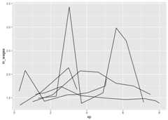
And what if you want to create many of these plots?
facet_sample()facet_sample() allows you to specify the number of keysper facet, and the number of facets withn_per_facet andn_facets.
By default, it splits the data into 12 facets with 5 per facet:
set.seed(2019-07-23-1937)ggplot(wages,aes(x = xp,y = ln_wages,group = id))+geom_line()+facet_sample()
Under the hood,facet_sample() is powered bysample_n_keys() andstratify_keys().
You can see more facets (e.g.,facet_strata()) and datavisualisations you can make in brolgar in theVisualisationGallery.
Sometimes you want to know what the range or a summary of a variablefor each individual. We call these summariesfeatures ofthe data, and they can be extracted using thefeaturesfunction, fromfabletools.
For example, if you want to answer the question “What is the summaryof wages for each individual?”. You can usefeatures() tofind the five number summary (min, max, q1, q3, and median) ofln_wages withfeat_five_num:
wages%>%features(ln_wages, feat_five_num)#> # A tibble: 888 × 6#> id min q25 med q75 max#> <int> <dbl> <dbl> <dbl> <dbl> <dbl>#> 1 31 1.43 1.48 1.73 2.02 2.13#> 2 36 1.80 1.97 2.32 2.59 2.93#> 3 53 1.54 1.58 1.71 1.89 3.24#> 4 122 0.763 2.10 2.19 2.46 2.92#> 5 134 2.00 2.28 2.36 2.79 2.93#> 6 145 1.48 1.58 1.77 1.89 2.04#> 7 155 1.54 1.83 2.22 2.44 2.64#> 8 173 1.56 1.68 2.00 2.05 2.34#> 9 206 2.03 2.07 2.30 2.45 2.48#> 10 207 1.58 1.87 2.15 2.26 2.66#> # ℹ 878 more rowsThis returns the id, and then the features.
There are many features in brolgar - these features all begin withfeat_. You can, for example, find those whoseln_wages values only increase or decrease withfeat_monotonic:
wages%>%features(ln_wages, feat_monotonic)#> # A tibble: 888 × 5#> id increase decrease unvary monotonic#> <int> <lgl> <lgl> <lgl> <lgl>#> 1 31 FALSE FALSE FALSE FALSE#> 2 36 FALSE FALSE FALSE FALSE#> 3 53 FALSE FALSE FALSE FALSE#> 4 122 FALSE FALSE FALSE FALSE#> 5 134 FALSE FALSE FALSE FALSE#> 6 145 FALSE FALSE FALSE FALSE#> 7 155 FALSE FALSE FALSE FALSE#> 8 173 FALSE FALSE FALSE FALSE#> 9 206 TRUE FALSE FALSE TRUE#> 10 207 FALSE FALSE FALSE FALSE#> # ℹ 878 more rowsYou can read more about creating and using features in theFindingFeatures vignette. You can also see other features for time seriesin thefeastspackage.
Once you have created these features, you can join them back to thedata with aleft_join, like so:
wages%>%features(ln_wages, feat_monotonic)%>%left_join(wages,by ="id")%>%ggplot(aes(x = xp,y = ln_wages,group = id))+geom_line()+gghighlight(increase)#> Warning: Tried to calculate with group_by(), but the calculation failed.#> Falling back to ungrouped filter operation...#> label_key: id#> Too many data series, skip labeling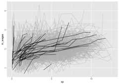
n_obs()Return the number of observations total withn_obs():
n_obs(wages)#> n_obs#> 6402n_keys()And the number of keys in the data usingn_keys():
n_keys(wages)#> [1] 888key.You can also usen_obs() inside features to return thenumber of observations for each key:
wages%>%features(ln_wages, n_obs)#> # A tibble: 888 × 2#> id n_obs#> <int> <int>#> 1 31 8#> 2 36 10#> 3 53 8#> 4 122 10#> 5 134 12#> 6 145 9#> 7 155 11#> 8 173 6#> 9 206 3#> 10 207 11#> # ℹ 878 more rowsThis returns a dataframe, with one row per key, and the number ofobservations for each key.
This could be further summarised to get a sense of the patterns ofthe number of observations:
library(ggplot2)wages%>%features(ln_wages, n_obs)%>%ggplot(aes(x = n_obs))+geom_bar()
wages%>%features(ln_wages, n_obs)%>%summary()#> id n_obs#> Min. : 31 Min. : 1.000#> 1st Qu.: 3332 1st Qu.: 5.000#> Median : 6666 Median : 8.000#> Mean : 6343 Mean : 7.209#> 3rd Qu.: 9194 3rd Qu.: 9.000#> Max. :12543 Max. :13.000brolgar provides other useful functions to explore yourdata, which you can read about in theexploratorymodelling andIdentifyInteresting Observations vignettes. As a taster, here are some ofthe figures you can produce:
#> Warning: Tried to calculate with group_by(), but the calculation failed.#> Falling back to ungrouped filter operation...#> label_key: id#> Too many data series, skip labeling#> Warning in left_join(., wages, by = "id"): Detected an unexpected many-to-many relationship between `x` and `y`.#> ℹ Row 1 of `x` matches multiple rows in `y`.#> ℹ Row 1077 of `y` matches multiple rows in `x`.#> ℹ If a many-to-many relationship is expected, set `relationship =#> "many-to-many"` to silence this warning.
One of the sources of inspiration for this work was thelasangar Rpackage by Bryan Swihart (andpaper).
For even more expansive time series summarisation, make sure youcheck out thefeastspackage (andtalk!).
Please note that thebrolgar project is released with aContributorCode of Conduct. By contributing to this project, you agree to abideby its terms.
This version of brolgar was been forked fromtprvan/brolgar, and hasundergone breaking changes to the API.
Thank you toMitchell O’Hara-WildandEaro Wang for many useful discussionson the implementation of brolgar, as it was heavily inspired by thefeastspackage from thetidyverts. I would alsolike to thankTaniaPrvan for her valuable early contributions to the project, as wellasStuart Lee for helpfuldiscussions. Thanks also toUrsulaLaa for her feedback on the package structure and documentation.Thank you toDi Cook for makingthe hex sticker - which is taken from an illustration byJohn Gould, drawn in1865, and is in the public domain as the drawing is over 100 yearsold.