A package that provides the functionforest_plotand anaccompanying Shiny App that facilitates the production of forest plotsto visualize covariate effects as commonly used in pharmacometricspopulation PK/PD reports.
# Install from CRAN:install.packages("coveffectsplot")# Or the development version from GitHub:#install.packages("devtools")devtools::install_github('smouksassi/coveffectsplot')Launch the app using this command then press the use sample data bluetext to load the app with a demo data:
coveffectsplot::run_interactiveforestplot()This will generate this plot: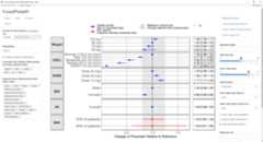
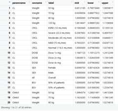
Several example data are provided to illustrate the variousfunctionality but the goal is that you simulate, compute and bring yourown data. The app will help you, using point and click interactions, todesign a plot that communicates your model covariate effects. The datathat is loaded to the app should have at a minimum the following columnswith the exact names: * paramname: Parameter on which the effects areshown e.g. CL, Cmax, AUC etc.
* covname: Covariate name that the effects belong to e.g. Weight, SEX,Dose etc.
* label: Covariate value that the effects of which is shown e.g. 50 kg,50 kg\90 kg (here the reference value is contained in the label).
* mid: Middle value for the effects usually the median from theuncertainty distribution.
* lower: Lower value for the effects usually the 2.5% or 5% from theuncertainty distribution.
* upper: Upper value for the effects usually the 97.5% or 95% from theuncertainty distribution.
You might also choose to have a covname with value All (or otherappropriate value) to illustrate and show the uncertainty on thereference value in a separate facet.
Additionally, you might want to have a covname with value BSV toillustrate and show the the between subject variability (BSV)spread.
The example data show where does 90 and 50% of the patients will bebased on the model BSV estimate for the selected paramname(s).
The vignetteIntroductionto coveffectsplot will walk you through the background and how tocompute and build the required data that the shiny app or the functionforest_plotexpects. There is some data management stepsthat the app does automatically. Choosing to call the function willrequire you to build the table LABEL and to control the ordering of thevariables. Theforest_plot help has several examples.
The package also include vignettes with several step-by-step detailedexamples:
PKexample
Pediatricexample
PKPD example
ExposureResponse
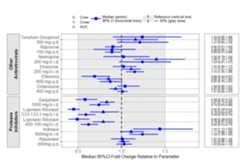
The prezista drug label data was extracted from the FDA label andcalling theforest_plot function gives:
library(coveffectsplot)plotdata<- dplyr::mutate(prezista,LABEL =paste0(format(round(mid,2),nsmall =2)," [",format(round(lower,2),nsmall =2),"-",format(round(upper,2),nsmall =2),"]"))plotdata<-as.data.frame(plotdata)plotdata<- plotdata[,c("paramname","covname","label","mid","lower","upper","LABEL")]plotdata$covname<-factor(plotdata$covname)levels(plotdata$covname)<-c ("Other\nAntiretrovirals","Protease\nInihibitors")#png("prezista.png",width =12 ,height = 8,units = "in",res=72,type="cairo-png")coveffectsplot::forest_plot(plotdata,ref_area =c(0.5,1.5),base_size =16 ,x_facet_text_size =13,y_facet_text_size =16,y_facet_text_angle =270,interval_legend_text ="Median (points)\n90% CI (horizontal lines)",ref_legend_text ="Reference (vertical line)\n+/- 50% (gray area)",area_legend_text ="Reference (vertical line)\n+/- 50% (gray area)",xlabel ="Median 90%CI Fold Change Relative to Parameter",facet_formula ="covname~.",facet_switch ="both",facet_scales ="free",facet_space ="free",strip_placement ="outside",paramname_shape =TRUE,table_position ="right",table_text_size =4,plot_table_ratio =4,vertical_dodge_height =0.8,legend_space_x_mult =0.1,legend_order =c("shape","pointinterval","ref","area"),legend_shape_reverse =TRUE,show_table_facet_strip ="none",return_list =FALSE)#dev.off()